
White Colour Schemes

School House White No.291 and Wimborne White No.239 in Estate Eggshell
With over twenty shades of white to choose from, even this most uncomplicated of neutrals has more to it than you might think. But while the different coloured undertones in white paint can create a surprising array of effects, that doesn’t mean choosing a shade to bring out the best in your space has to be difficult. With our top tips for different aspects, complementary pairings and more, we’re here to break down our collection of white paint colours from All White to Old White.
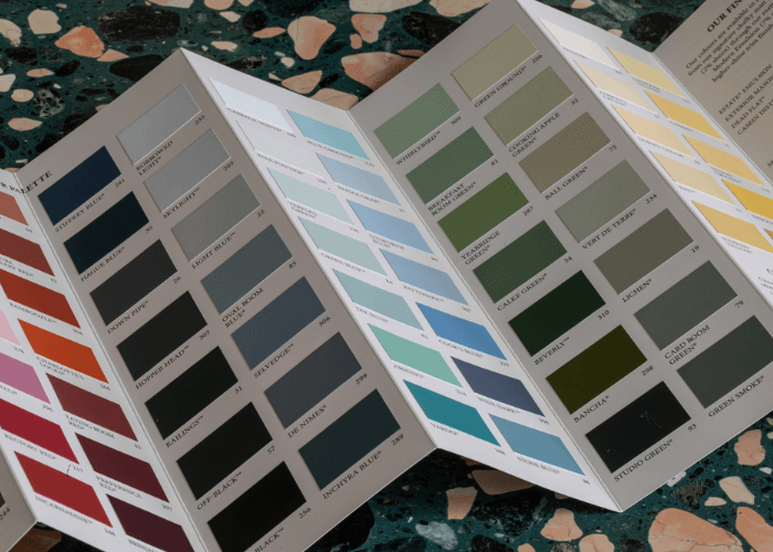
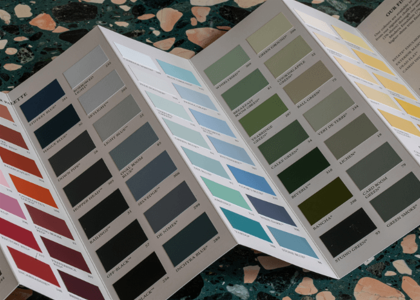
Complimentary Colour Card
Our coveted colour card is the perfect tool for starting your home transformation.
Order your complimentary colour card with free delivery.
White Paint with a Hint of Grey
White matt emulsion, whether it’s our chalky Estate or washable Modern finish, brings an instant feeling of freshness to any space, and the freshest of all are the whites that border on grey. Blackened is our coolest tone, ideally suited to a minimal, industrial scheme, while the almost translucent Wevet has a delicate, barely-there feel that allows it to fit in anywhere. If you’re leaning towards a white with a hint of grey, but are worried that the finished effect will be too cool or stark, you could reserve these cooler tones for a south-facing space, or cheat a warmer feel with soothing Skimming Stone.


Strong White No.2001 in Estate Emulsion | Worsted No.284 in Estate Eggshell
Image from Recipes for Decorating
White Paint with a Hint of Green
Adding just a hint of green to any white makes for extraordinarily soft hues, which in turn create calming spaces for rest and relaxation. Of these soothing shades, chalky white Slipper Satin is perhaps the most versatile, while Lime White and Off White are just as understated, but with a more traditional feel. To really bring out the subtle green tones in this group of whites, try them in a north facing room – the cooler light especially suits stronger Old White and James White.


White Paint with a Hint of Red
Red based whites are always welcoming and friendly, creating the most easygoing of schemes. The lightest of these is Pointing, a fresh and uncomplicated white with an almost imperceptible red base, which works beautifully on ceilings and woodwork. Dimity, which leans more strongly towards taupe, is similarly subdued, but adds a little more warmth, while Joa’s White has the most generous dose of red pigment, which works beautifully in a traditional setting.

Dead Salmon No.28 in Estate Emulsion | Joa’s White No.226 in Estate Eggshell
Image from Recipes for Decorating

White Paint with a Hint of Yellow
The revival of magnolia paint may be a way off yet, but choosing a yellow based white is a wonderful way to embody the nostalgic shade’s charms in a way that feels fresh and modern. Wimborne White, being just one shade away from pure white, is one of our most versatile options – straightforward yet soft, it’s an excellent all-round choice for white masonry paint, its hint of yellow pigment creating a light, bright effect inside and out. For something a little creamier that’ll boost the warmth of any room, look to pretty White Tie or New White, or for rooms with low light, the illuminating Tallow.


Pairing Whites
Nothing shows the versatility of white paint like a beautifully layered scheme. For a minimal kitchen or bathroom look, try keeping shades close but changing up the textures for visual interest – All White, our only white containing no other coloured pigments, creates the simplest and cleanest of looks when paired with bright white tiles and crisp linens. Or, try a scheme that keeps a consistent undertone but dials the intensity up or down – this kitchen, with its soft off-white walls and brighter white floor paint, is a masterclass in mixing neutrals.

Pointing No.2003 in Modern Eggshell | Strong White No.2001 in Estate Emulsion | Cornforth White No.228 in Estate Eggshell

TIP: Not sure where to start? Check out our Neutral Groups, six categories of whites, off-whites, taupes, greys and creams, handily arranged by undertone. See which one you’re immediately drawn to, and start from there – combining two or more shades from within a group is a great shortcut to a beautifully cohesive neutral scheme, and one that our Colour Consultants swear by.