


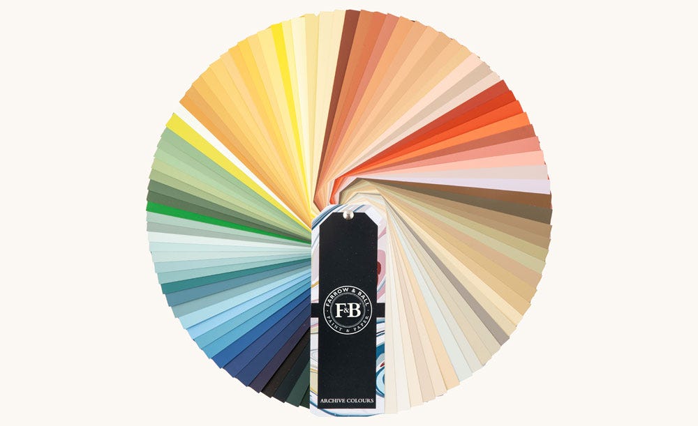
Sample Our Archive Collection
The only way to sample all 142 colours in our archive collection, our Archive Colour Fan is the perfect design resource for those looking to sample beyond our Signature Palette.
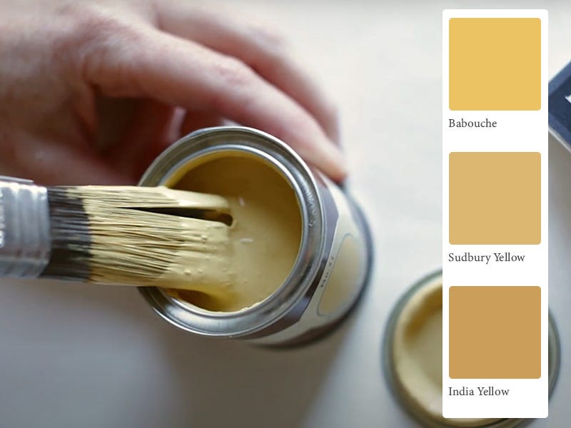
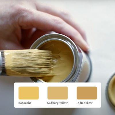
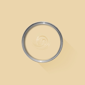
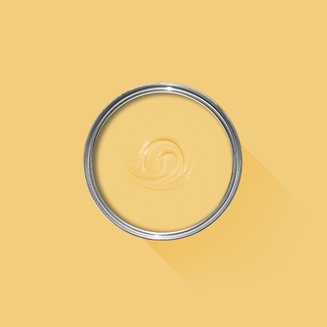
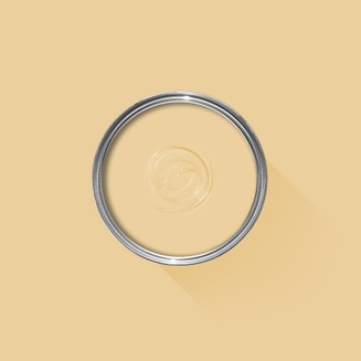
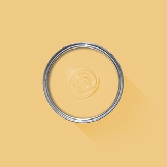
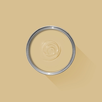
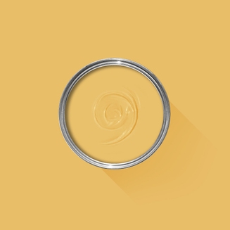
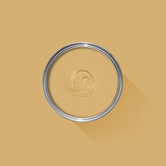
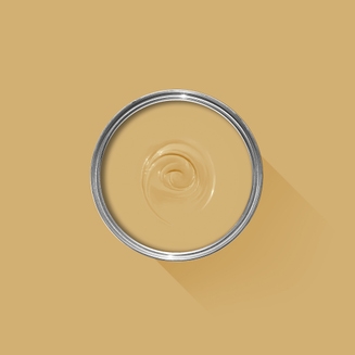
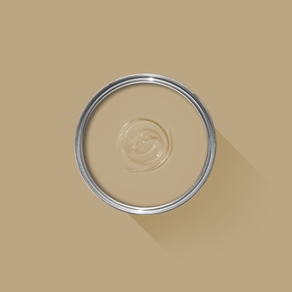
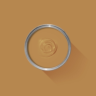
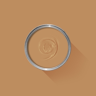
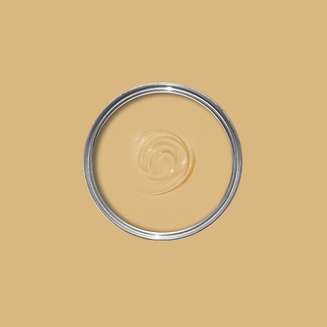
Sample Our Favourite Yellows
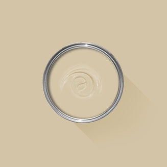
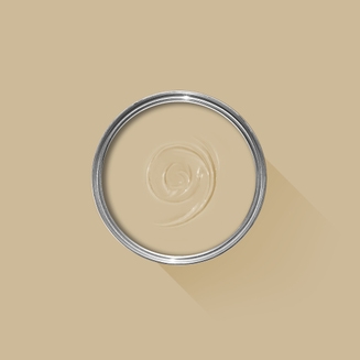
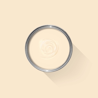
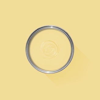
The best way to experience our colours before taking the plunge is with a true-to-colour paint sample. To help you narrow down your shortlist of shades, we've curated three of our most popular yellow shades to help you find your perfect match.
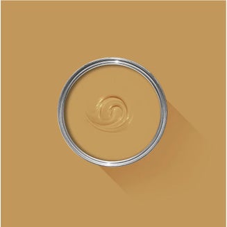
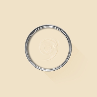
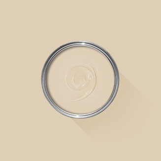
Sample selection contains 3 x 100ml Sample Pots of our beautiful Babouche, Sudbury Yellow and India Yellow.
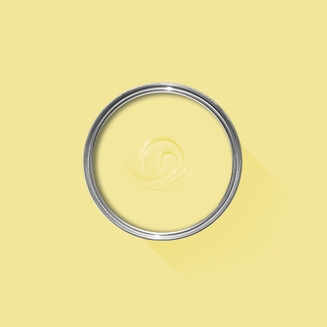
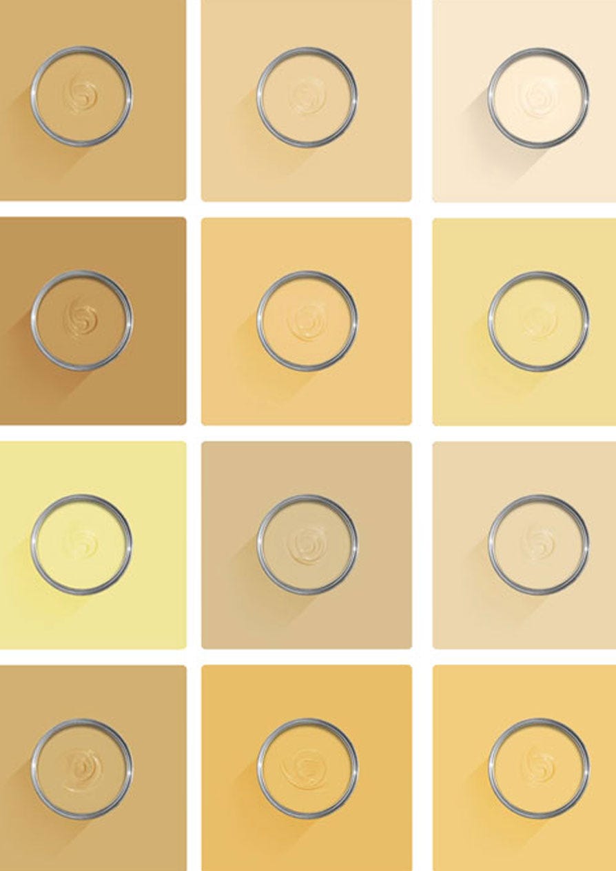
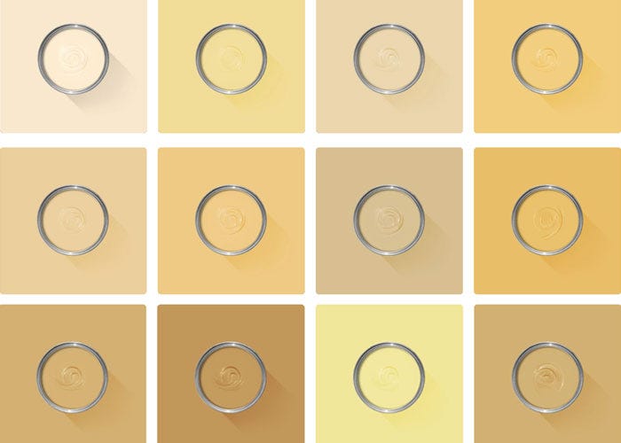
View All Yellow Paint Colours
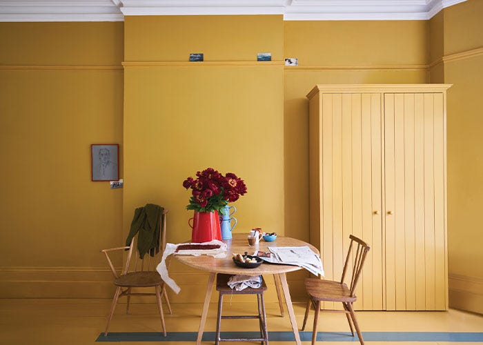
Sunny, cheerful and warm, yellow paint has all the ingredients for a space that makes you smile. From delicate cream to zesty lemon, whatever mood you’re looking to create, we’ve got shades of yellow paint to suit each and every one.
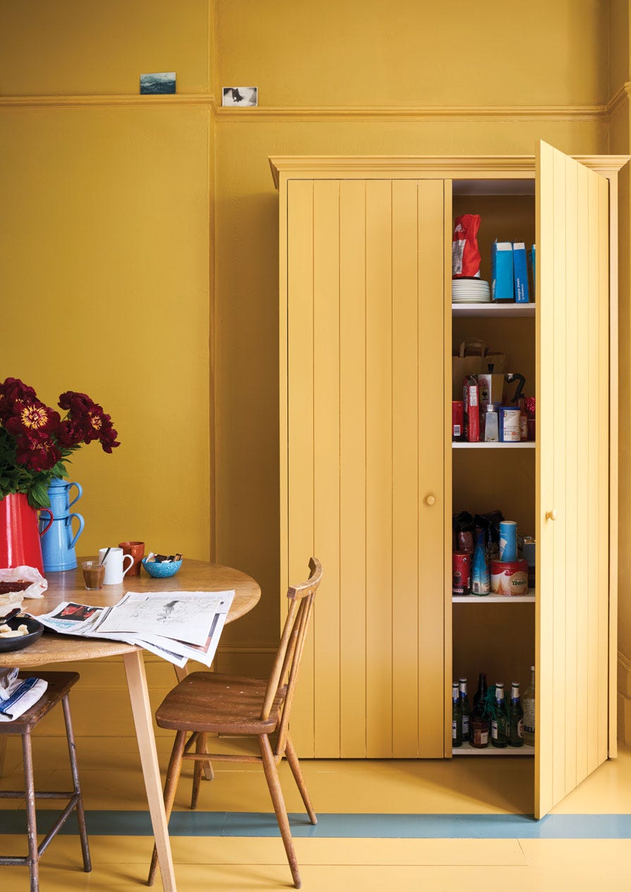
Discover Yellow Paint Schemes
Find inspiration for your project and view beautiful images of yellow paint schemes in real homes.