We’re dedicated to perfecting the art of paint. At our home in Dorset, we combine the finest ingredients, 75 years of experience and technical precision to help you create beautiful spaces that stay beautiful. Even in our colour rich paints, less than 8% of the tin is the colour. The other 92% is what creates the quality, depth and extraordinary response to light that transforms your home.
Paint is like coffee. The colour is the froth on the top, but it’s the quality of the rest of the cup that makes it taste good. – Richard Ball, Farrow & Ball Co-founder
We use twelve exclusive pigments, all specifically selected for their colour intensity. We take colour seriously, so naturally, we only accept the very best. By using these same pigments to make every colour in our palette, all our shades combine effortlessly, making it easy for you to put together a cohesive colour scheme.
Deeper, richer colours
Deeper, richer colours
Packed with pigment for an extraordinary response to every kind of light.
We add generous helpings of rich pigment to create our signature look – deep colours with complex undertones. The same space that feels bright and airy in morning sun, can feel cosy and intimate by evening. Our teams design each shade under every kind of light, so it will be perfectly balanced in every setting.
Extraordinary response to light
Extraordinary response to light
We spend months carefully crafting and testing each of our paint colours to make sure they share our signature extraordinary response to light. This beautiful reaction to changing light, like bringing out different undertones or shifting intensity, is what makes our paint so special.
Interior and exterior finishes
Interior and exterior finishes
From walls, floors and furniture to radiators, skirtings and sheds, our range of paint finishes can help you transform almost any surface in your home (and outside it, too).
We even have multi-surface finishes like Dead Flat® and Full Gloss, so you can tackle walls, woodwork and metal at the same time.
Our comprehensive range is comprised of paint finishes that not only look beautiful, but offer different practical benefits. Designed for a variety of different surfaces, each finish is compatible with our high-performance Primers & Undercoats to ensure exceptional coverage, adhesion and depth of colour.
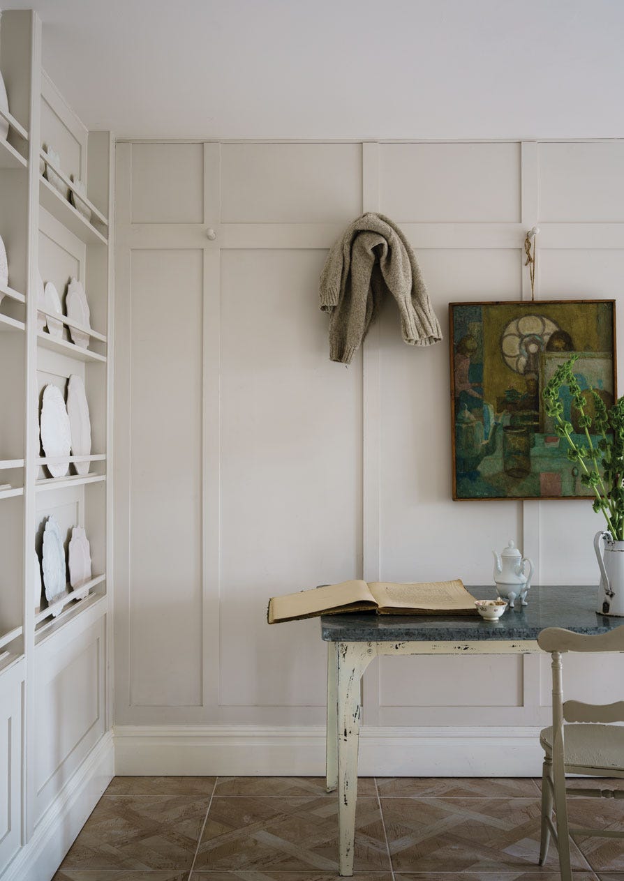
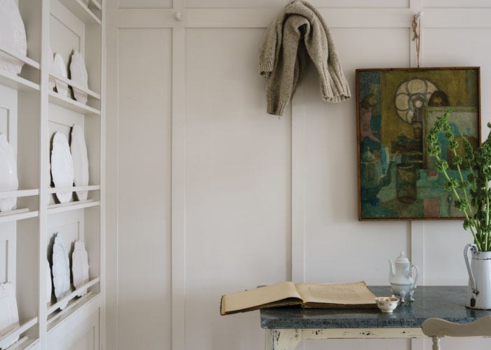
Complementary White
Salt
This soft white is inspired by the chicory coffee popular in New Orleans, often served with steamed milk. Find out more about Salt No.CC5
Every colour in the Farrow & Ball palette is paired with a specific shade of white, these are selected to celebrate a shared undertone and create harmonious spaces alongside your chosen colour.
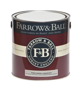
Our White & Light Tones Primer & Undercoat creates a wonderful base for our softest shades. Covering imperfections on your surface and adding extra depth of colour, this primer is based on our simplest colour, All White.
Made with the same natural ingredients and pigments as our topcoats, our Primer & Undercoat is the crucial foundation for creating a rich, even and longer lasting finish.
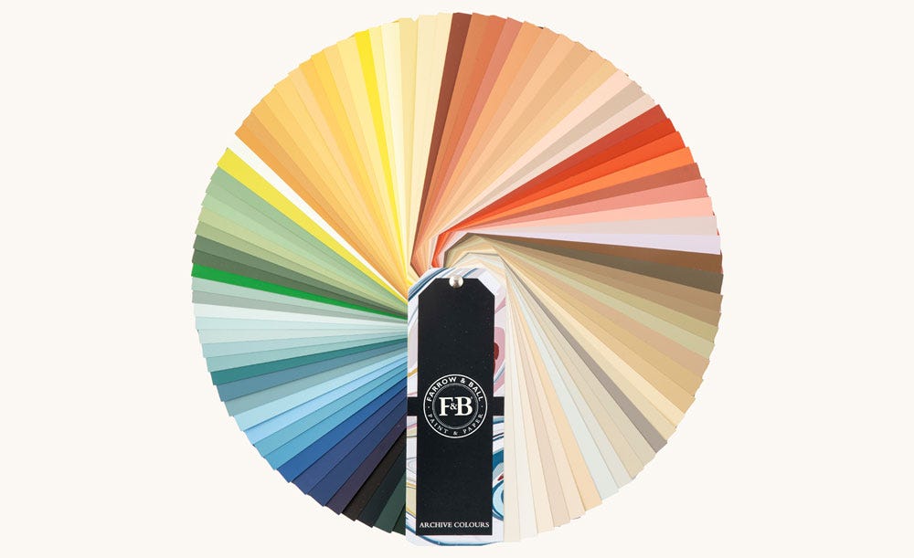
The only way to sample all 142 colours in our archive collection, our Archive Colour Fan is the perfect design resource for those looking to sample beyond our Signature Palette.
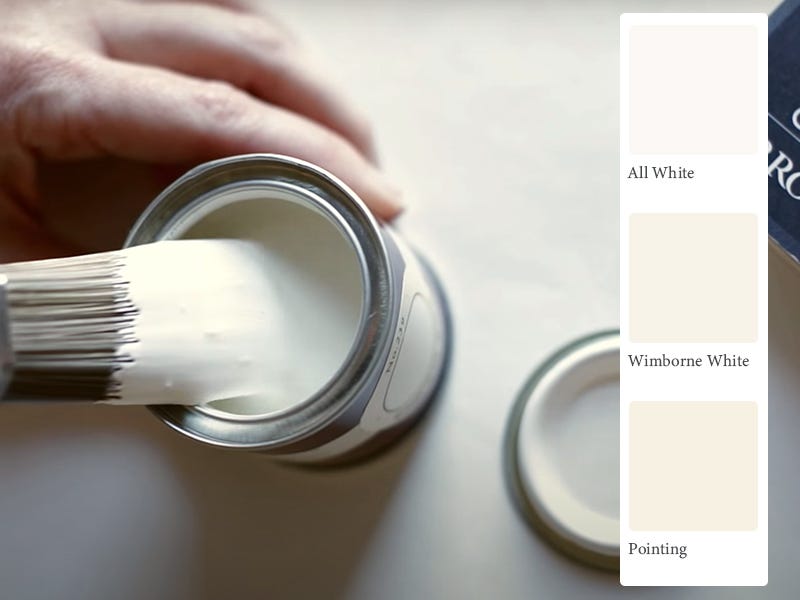
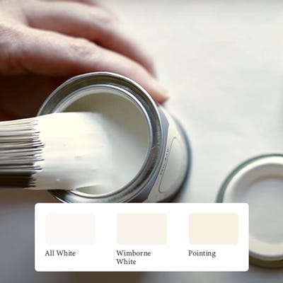
The best way to experience our colours before taking the plunge is with a true-to-colour paint sample. To help you narrow down your shortlist of shades, we've curated three of our most popular shades to help you find your perfect match.
Sample selection contains 3 x 100ml Sample Pots of our beautiful All White, Wimborne White and Pointing.
View All White Paint Colours
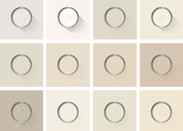
Here at Farrow & Ball, white is never just white. We have over twenty shades to choose from, all with different undertones to create different moods.
Rated 5 out of
5 by
Anonymous from
Amazing as usualThis colour is amazing I have it in the bathroom and toilet
Date published: 2024-04-19
Rated 5 out of
5 by
Mihaela R from
Paint for Bathroom - SaltHighly recommend. Great product, but the cost also reflects it, it's not cheap. I have used F&B throughout my house, with the exception of few places where I found other company's colours more appropriate. You know what to expect with F&B and you won't be disappointed.
Date published: 2024-04-18
Rated 5 out of
5 by
Erica G. from
So lovely!I painted over choosing a living room wall color and did not want to color drench this space. I paired salt with a creamy crisp off white called Greek villa from Sherwin-Williams and it looks divine together. Salt is not a sad gray but it’s cheerful calming clean version. I love the California collection!
Date published: 2024-03-08
Rated 5 out of
5 by
ChrisM from
Great colourGreat paint, such a soft luminous grey. It’s the base colour now for the main living rooms in my home.
Date published: 2023-11-19
Rated 5 out of
5 by
mdscherer from
Cali collection SaltI love this white. Beautiful combination of warm, natural and cool all at the same time. This goes with everything I already have in my home. I used this throughout the house with light and dark coming from every direction. Compliments all directions. Reflects light perfectly.
Date published: 2023-06-26
Rated 5 out of
5 by
Lucy76 from
Looks amazing in my KitchenThis is a really nice white that is not too cold. It’s transformed my kitchen I love it!
Date published: 2023-03-15
Rated 5 out of
5 by
Raychill from
Love Salt!My daughter wanted a white bedroom with fairy lights and vines! (Thanks Instagram!). I wasn’t so keen on white but Salt was perfect. It’s a very light grey and changes with the light. I didn’t want a cream or cold white - this worked beautifully
Date published: 2023-01-03
Rated 5 out of
5 by
Beezlebee from
Loved this paint colour to add some contrastSo happy to have chosen this colour and paint for my renovated Bathroom. Looks absolutely great. Might be my favourite thing in the whole bathroom.
Date published: 2022-11-11
Rated 4 out of
5 by
DesignXWorkshop from
Dove's Tears?Just put this on the walls of my kitchen. Goes on very white and darkens as it dries. I'm detecting a bit of periwinkle? This white looks amazing with recessed LED's in the 4K and up lumens range. If your lighting is soft and yellowish, then this probably isn't the color for you. With the lights off...during the daytime...it does NOT look white..more of a soft grey with some blue tones. The doves are cooing in the backyard. That bluish purple on the backs of mourning doves or periwinkle....that's the color. Periwinkle Juice? or Dove's Tears.
Date published: 2024-03-04
Rated 1 out of
5 by
CA RENEE from
I don’t know —not helpfulI didn’t expect a card. As with other samples I ordered, I thought I’d receive a mini can paint sample. The card was not useful