
It’s safe to say when Cat and Ant Earp left their London lives to take on Ant’s family farm in Dorset, they weren’t quite expecting what would come next. In love with the new spectacular scenery around them, they were inspired to share it with others.
Since opening the Aller Dorset shepherd huts, they’ve been fully booked – and we can certainly see why. Loved by designers, influencers and interior enthusiasts, these countryside hideaways are truly charming: cosy, characterful and inviting, with a generous dose of Farrow & Ball paint of course. So, when the pair added two new huts to the farm, we couldn’t wait to find out all about it from Cat.
Firstly, tell us a little bit about the design process. what look did you want to achieve, how did you go about doing so, and, most importantly, what led you to choose these colours?
I’m the world’s most indecisive person, so for me the design process is always a long one! It was also a little difficult because the huts weren’t built yet and so I had to imagine what everything was going to look like without being in the space. I knew I wanted to create something beautiful, chic and fun. We had two huts at Aller Dorset already and the centre point of those huts was the kitchen cabinet colours, so I started by finding a colour for the kitchen cabinets in the new huts. A good friend of mine Lucy Barlow – half of interior design studio Barlow and Barlow – told me you’ll never be disappointed by going for the bolder option and that’s always stuck with me.
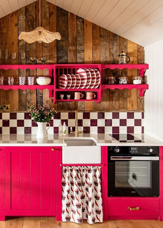
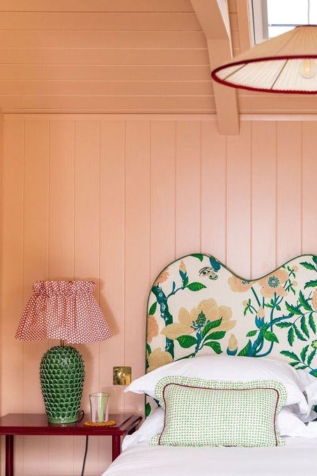
For our hut Kittylands, I knew I wanted a red/burgundy tone, after seeing interior designer Angelica Squire’s kitchen. I picked up samples of practically every Farrow & Ball red and pink and painted little squares of cardboard with them, then pinned them up on my kitchen cabinets at home. I also started collating samples of fabrics I loved with those tones in and then it was really a trial-and-error process seeing what worked. It was between Radicchio and Lake Red but in the end, I chose Lake Red because I just adore the colour. Some people see it as bright pink but I definitely see some red in there. I’m thrilled with it! For the walls, I went for Skimming Stone; it’s a neutral but has a slightly warmer tone than a white. I’d used it before and I love it. For the bedroom, I went for Setting Plaster, which is the world’s best shade of pink.


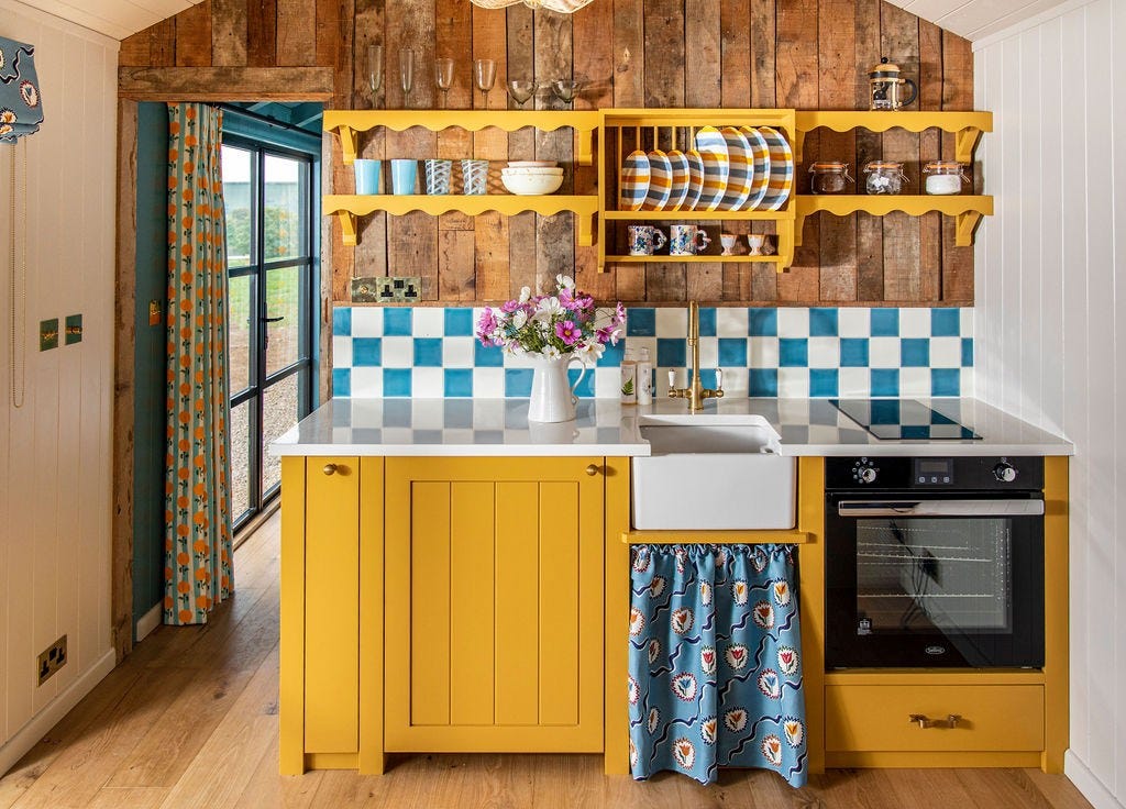
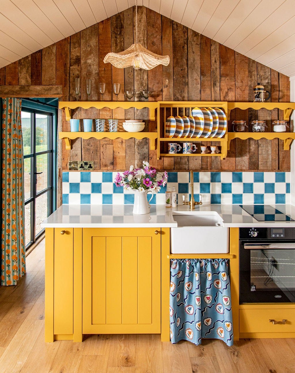
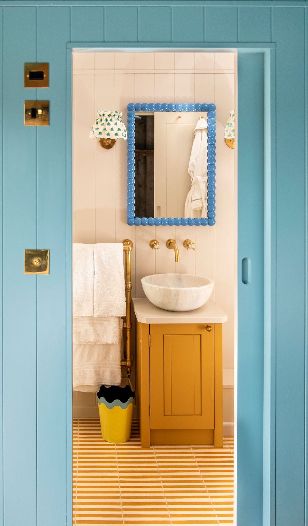
For our second hut Zoulands, it was always going to be a mustard tone. I’ve got a new-found love for yellow, so I really wanted to use it. I have to say, it was a hard decision between India Yellow and Cane Yellow but I went for the slightly stronger India Yellow in the kitchen and then used Cane Yellow for the bathroom cabinet. I chose Stone Blue for the bedroom colour because in my opinion, mustard and blue go amazingly together. And I honestly think Stone Blue is the perfect blue.


How did you go about creating such a luxury feel in the huts?
I’d say it’s all in the detail. I used gorgeous fabrics from some fabulous brands, such as Ottoline, Soane Britain and Molly Mahon, to bring out the colours of the paint. I had cushions made by the brilliant Maddie Dunning too. I’ve also got some amazing final touches in the huts, such as Matilda Goad cutlery, wavy pendent lights and her fabulous heart bistro chair.
How important is choosing the right suppliers to you?
It’s extremely important. I love using sustainable, local suppliers. For example, the reclaimed timber in the huts came from an old pub down the road in Portland. Plankbridge, which is a local company 10 minutes up the road renowned for using sustainable materials and creating huts for The Pig hotels, made ours too. A lot of the brands and products I’ve used, including Farrow & Ball of course, are made in England by amazing artisans.
