

Our Carte Blanche collection is all about creating a look you love — whatever your style or taste. This palette of bold colours and graphic prints may seem to lean towards contemporary homes but it’s so much more versatile than that.
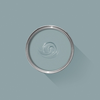
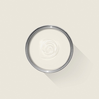
Created by Victoria Alderson (best known as @worn_down_elegance on Instagram), this beautiful, Victorian living room is the perfect example of how Carte Blanche works wonderfully in traditional spaces. You might not expect vivid Hog Plum, soft Sardine, gentle Au Lait and fiery Romesco to complement one another in this 19th century home, but Victoria has masterfully combined them into a harmonious scheme we adore. We spoke to Victoria to hear all about how she created this surprising, sophisticated space.

Can you tell us a little about yourself, your home and your style?
I’m Victoria, a freelance artist, tutor and (once-upon-a-time) interior designer. We live in a Victorian home from 1886, which we've been slowly renovating for nine years. I’m passionate about design and using colours that make my heart sing. I’d say my style is a mix of old and new, and don't follow trends but try to stick with what "feels right". I particularly love oriental objects, joyful colours and meaningful things.
Where did you find your passion for interior design?
My mum was an interior designer and my father had a fabric business, so I guess it's in the blood! I worked as a freelance interior designer for 10 years. My husband is a carpenter and we’ve renovated 10 homes together — so I’ve had lots of practice.

Tell us about your journey with Farrow & Ball?
It was love at first sight from the moment I saw a Farrow & Ball paint chart over 20 years ago. I’m an avid fan of the colours — I love the heritage style, with their muted tones and how they change depending on the light. There are lots of shades to choose from but not so many that it becomes overwhelming. I also especially love the amusing names.
What intrigued you about the Carte Blanche collection and why did you choose Hog Plum for your living room?
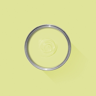
Carte Blanche is an extremely exciting palette because it's so fresh. There are some strong colours that work wonderfully together, along with some more muted, recognisably Farrow & Ball shades. Hog Plum is the brightest, almost-neon shade in the collection and l love its freshness. We have three big windows in our sitting room with views of the surrounding Yorkshire Dales, so I wanted a shade to complement the colours outside. Hog Plum's yellow and green tones really enhance the view, bringing the outside in.

What are your top tips for creating interesting colour schemes and a timeless home?
I tend to start my projects from one object and then build the colour scheme from there, like a rug or vase. I love worn objects with patinas and imperfections because they tell a story. They’ve been loved, used and repurposed. If a room already has a strong architectural feature (like windows), I’d build the scheme from there. Another top tip would be to use lots of lamps, a mix of patterns and following what you love (rather than what's in fashion).
Anything else you’d like to add?
It's been an honour and pleasure to be involved in F&Bs exciting collaboration with Christopher John Rogers.
