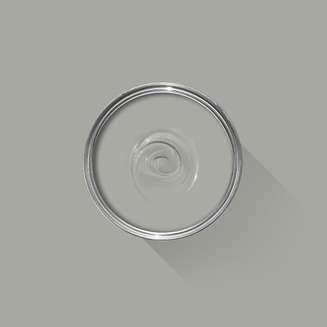
You can use Apple Pay when shopping on Apple devices and on a Safari browser.
Klarna
Paint now, pay later with Klarna.
We’ve partnered with Klarna to offer you multiple ways to pay for your handcrafted paint and paper.
Available in United Kingdom, Austria, Spain, Finland, Ireland, Italy and The Netherlands only.
PayPal
With PayPal you can pay for your paint and paper in just a few easy steps.
Card Payments
We also accept card payments from Visa, Mastercard, Maestro and Amex
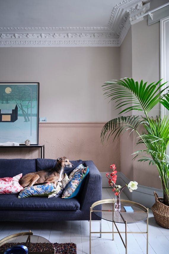
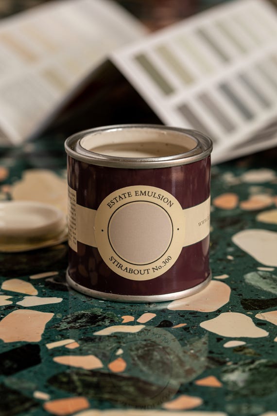
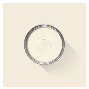
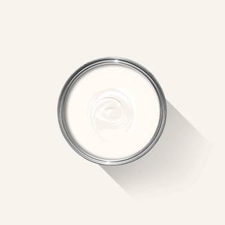
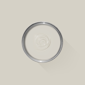
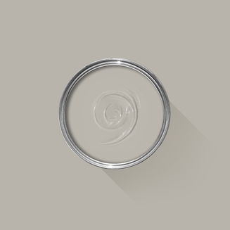
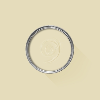
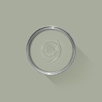
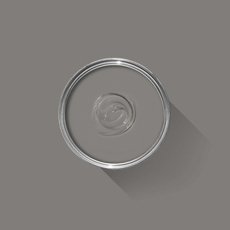
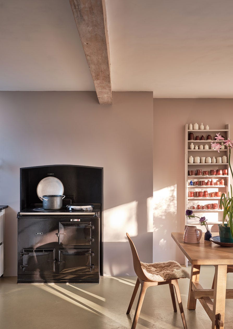
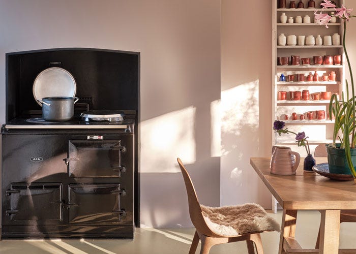
An earthy neutral
Stirabout is inspired by the nurturing porridge favoured over many centuries in Ireland. An earthy tone with just a hint of underlying grey, it’s perfect for creating a relaxed feel, which will never be too cold. Try pairing it with Jitney and natural fabrics for a laidback look.
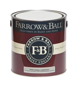
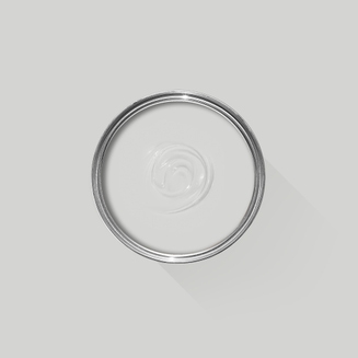
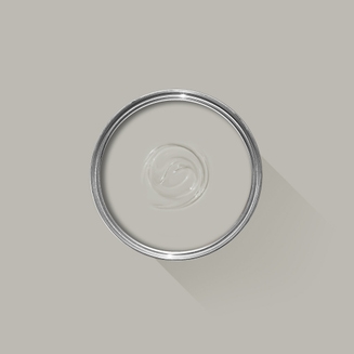
Recommended Primer & Undercoat:White and Light Tones
We’re dedicated to perfecting the art of paint. At our home in Dorset, we combine the finest ingredients, 75 years of experience and technical precision to help you create beautiful spaces that stay beautiful. Even in our colour rich paints, less than 8% of the tin is the colour. The other 92% is what creates the quality, depth and extraordinary response to light that transforms your home.
Paint is like coffee. The colour is the froth on the top, but it’s the quality of the rest of the cup that makes it taste good. – Richard Ball, Farrow & Ball Co-founder
We use twelve exclusive pigments, all specifically selected for their colour intensity. We take colour seriously, so naturally, we only accept the very best. By using these same pigments to make every colour in our palette, all our shades combine effortlessly, making it easy for you to put together a cohesive colour scheme.
Deeper, richer colours
Deeper, richer colours
Packed with pigment for an extraordinary response to every kind of light.
We add generous helpings of rich pigment to create our signature look – deep colours with complex undertones. The same space that feels bright and airy in morning sun, can feel cosy and intimate by evening. Our teams design each shade under every kind of light, so it will be perfectly balanced in every setting.
Extraordinary response to light
Extraordinary response to light
We spend months carefully crafting and testing each of our paint colours to make sure they share our signature extraordinary response to light. This beautiful reaction to changing light, like bringing out different undertones or shifting intensity, is what makes our paint so special.
Interior and exterior finishes
Interior and exterior finishes
From walls, floors and furniture to radiators, skirtings and sheds, our range of paint finishes can help you transform almost any surface in your home (and outside it, too).
We even have multi-surface finishes like Dead Flat® and Full Gloss, so you can tackle walls, woodwork and metal at the same time.
Our comprehensive range is comprised of paint finishes that not only look beautiful, but offer different practical benefits. Designed for a variety of different surfaces, each finish is compatible with our high-performance Primers & Undercoats to ensure exceptional coverage, adhesion and depth of colour.
Colour Story
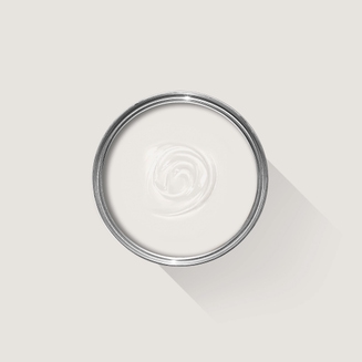
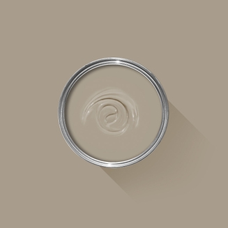
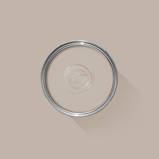
Complementary White
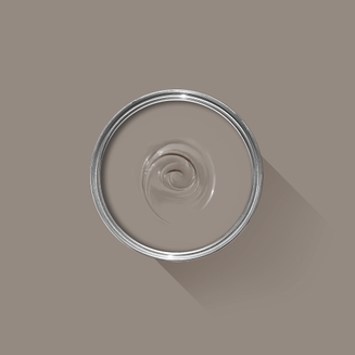
Pointing
One of our Red Based Neutrals, Pointing has a warm undertone to it which creates the prettiest of spaces and always softens the feel of a room. Find out more about Pointing No.2003
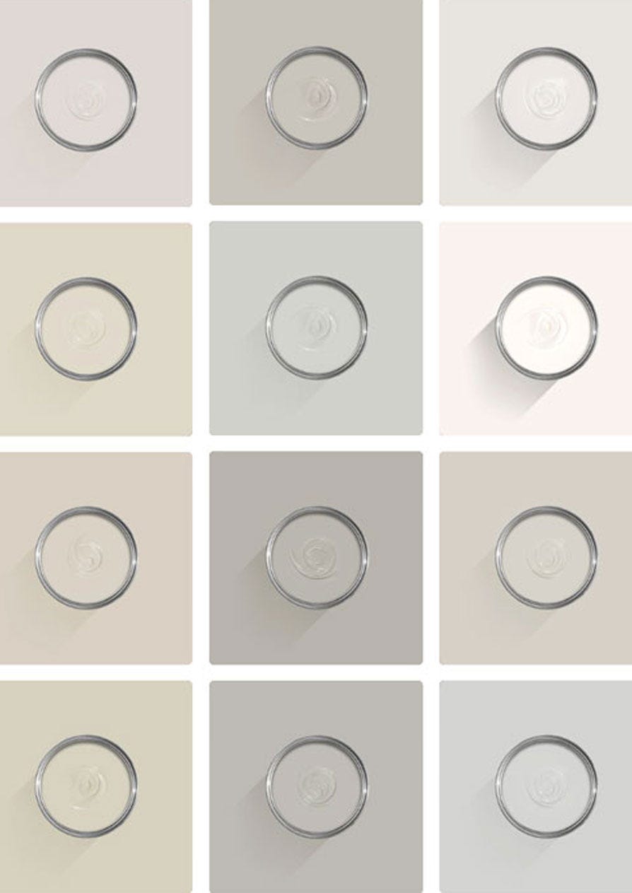
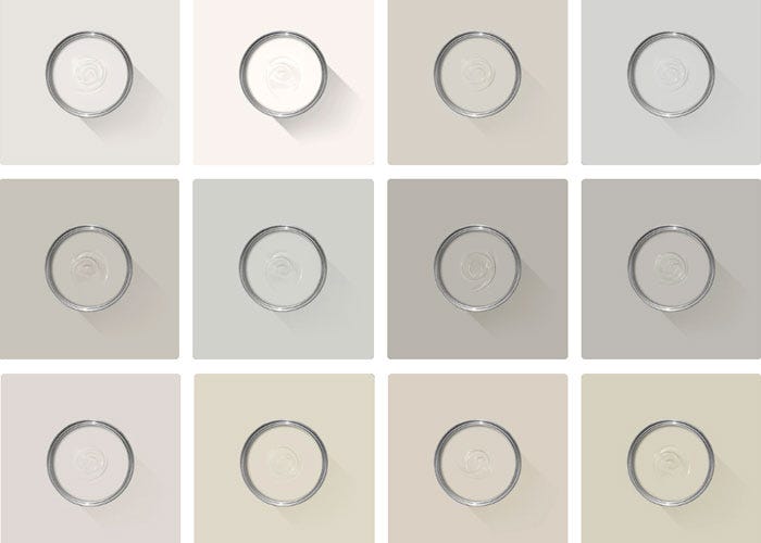
Every colour in the Farrow & Ball palette is paired with a specific shade of white, these are selected to celebrate a shared undertone and create harmonious spaces alongside your chosen colour.
Our White & Light Tones Primer & Undercoat creates a wonderful base for our softest shades. Covering imperfections on your surface and adding extra depth of colour, this primer is based on our simplest colour, All White.
Made with the same natural ingredients and pigments as our topcoats, our Primer & Undercoat is the crucial foundation for creating a rich, even and longer lasting finish.
Our expert Colour Consultants are ready and waiting to help bring your style to life. If you’d like personalised advice on how to use our paint and papers in your home, book an in-home or virtual appointment today.
When it comes to versatility, nothing can match the enduring charm of neutrals. With blue, yellow, red and even lilac undertones, we have a neutral to suit every style.
Rated 5 out of
5 by
Colton from
Yummy Oatmeal Color"Stirabout" is a stunning warm neutral that's akin to the comforting hue of a creamy, wholesome oatmeal. Its rich, inviting tones create a cozy ambiance that's absolutely perfect! I'm painting my whole main level in this color, intending to pair it with Dimity for the trim and Jitney for the fireplace paneling. I've chosen Farrow and Ball's latest finish, "Dead Flat," and it's applying incredibly smoothly. Check out the picture of my ongoing painting progress. I'll provide an update once it's all finished!
Date published: 2023-12-14
Rated 5 out of
5 by
MoosevegStrass! from
Lovely warm colour.I love the colour of this emulsion. I have teamed it with Setting Plaster, which is the feature wall and have used Stirabout for the rest of the room. It’s warm for my East facing room. It looks greyish in some light, but in general it’s a lovely warm nutural colour. It replaced the Magnolia that was on the walls when we moved in. Its perfect.
Date published: 2023-12-05
Rated 5 out of
5 by
Jeomum from
Great addition to the strong neutral rangeAt last!! A shade bordering on taupe. Subtly warm.
Date published: 2023-11-29
Rated 5 out of
5 by
Anonymous from
Lovely colour in all light variation.This dead flat paint is amazing - very flat finish and a wonderful colour for the whole of my hallway.
Date published: 2023-11-15
Rated 5 out of
5 by
Deedle from
Love StiraboutWarms up my North facing living room beautifully. Colour changes throughout the day. It's my perfect neutral!
Date published: 2023-07-20
Rated 5 out of
5 by
pbs253 from
A soft green kitchenSo happy that Stirabout arrived just in time! for our kitchen reno. The palette is warm, harmonious, and easy to live with. It involves 3 (and possibly 4) F&B colors, and I could not be happier with my choices.
Lower cabinets Treron
Upper cabinets: French Gray
Upper walls, trim, and ceiling, Stirabout
Accent color for one cabinet away from the rest Yellow Ground
Date published: 2023-06-12
Rated 5 out of
5 by
Anonymous from
Just love ❤️Stirabout was just the perfect colour that I was looking for.
Date published: 2023-06-11
Rated 5 out of
5 by
Crosby Designs LLC from
Cannot stop specifying this color!We have 2 different projects nearing the final phases of construction right now and we are using Stirabout in both. It’s making me want to repaint everything in my house! For one project we’re using for the back staircase and lower level on millwork, trim and some walls. The client has always loved Dimity but it didn’t look as good with our white cement tile floors . Stirabout is perfection and adds the right amount of warmth without diminishing the light. We’re using Entrance Hall Pink for the backs of the bookcases and Brinjal on the window sashes
Date published: 2023-03-19
Rated 5 out of
5 by
Ines from
Great choice for a warm but modern living roomAbsolutely love the colour. I was trying to decide between Oxford Stone and Stirabout and chose stirabout, hoping that it would be less „cappuccino“ but a bit more modern. It looks absolutely fantastic and it was super easy to apply and looks 100% even in my Estate Emulsion finish that I chose.
Date published: 2023-02-23
Rated 5 out of
5 by
HC989 from
The perfect colourThis colour looks gorgeous on our fitted wardrobes, also contrasting perfectly with Wimborne White on the walls.
Date published: 2023-02-12
Rated 4 out of
5 by
Anna H from
Lovely sophisticated neutralI used Stirabout in a bright north facing bedroom with jitney on the trim and it’s the perfect neutral and has come up trumps where other colours failed.
I found this a really difficult room to choose a colour for as the cool bright light just bleached everything out and lost the sophisticated warmth…Joa’s white turned into a very bright (almost radioactive) peach, schoolhouse white came out highlighter yellow, Wimborne white looked like trade white… you get the idea!
Lost a star as I really did not enjoy working with the new dead flat, whilst it looks amazing it was a very tricky paint to work with. It went on a dream over primed new plaster but struggled to adhere to the walls of a previously painted room despite using the primer and did take 3-4 coats to fully cover and has flashed terribly on the ceiling.
Date published: 2023-08-05
Rated 4 out of
5 by
Marchhare from
Slightly pink????Only bought a sample pot but a bit disappointed as it looks quite pink in daylight in my north facing hallway. ...using it on two different walls. I’ll try it in another’s room with a different aspect and hope that the ‘pinkness’ isn’t there. Anyone else noticed a pink hue? I do love Farrow n Ball paint tho.
Date published: 2023-05-12
Rated 2 out of
5 by
LouJane from
Blistering and bubbling estate emulsionWe are decorating our living room with Stirabout Estate Emulsion and are having a lot of problems with it The first coats went on ok, but when we applied a final coat by roller, the paint underneath began to bubble up. The coverage is patchy and not at all what we are used to with F&B (we have always used F&B in our home and been very happy with it).
We allowed plenty of drying time between coats, and are now in a position where we can’t finish the room as we can’t apply a final coat. Cutting in is still visible and there are spots that require re coating but the paint just bubbles if you try.
Please can you advise what might be causing this problem with the paint, and if there is anything that can be done to rectify the situation as we are now onto our fifth tin on a job that was a maximum of three tins of paint.
Date published: 2024-03-30
Rated 2 out of
5 by
Glowworm from
Stirabout is just pinkPainted my west facing extension and adjacent middle room walls in Stirabout. One wall looks a nice neutral and all the rest is just pink. Nothing wrong with quality but it’s a very unpredictable and risky colour. I’ve always used F&B and I’m familiar with the changing hues etc but this colour is something else. Everywhere else in the house is shadow white and shaded white and I should have stuck with them.
Date published: 2024-03-16
Rated 2 out of
5 by
LuluBr from
PatchyI am quite disappointed with Stirabout. The colour is a lovely oat that goes really well with Templeton Pink. I used the F&B primer, but it still came out patchy after two coats of painit. I had to use a third coat and it is still not completely even.
Some of the F&B colours are very pigmented and go on like a dream (eg pelt), whilst others are quite thin in pigment. Stirabout does not have a lot of coverage. Disappointed.