


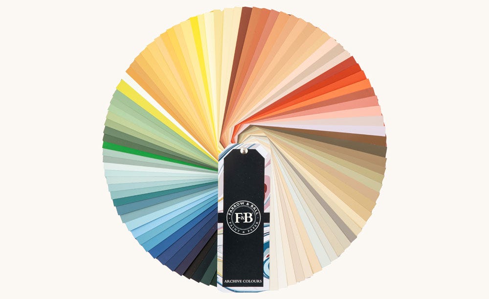
Sample Our Archive Collection
The only way to sample all 142 colours in our archive collection, our Archive Colour Fan is the perfect design resource for those looking to sample beyond our Signature Palette.
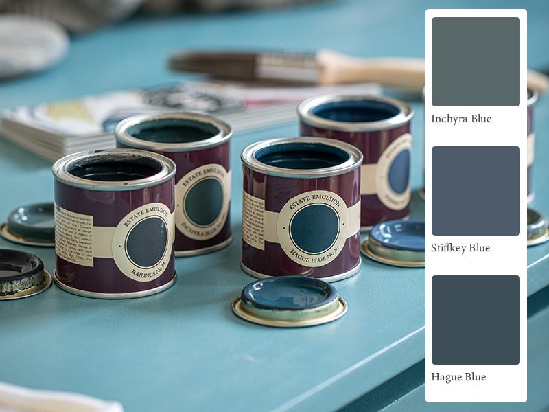
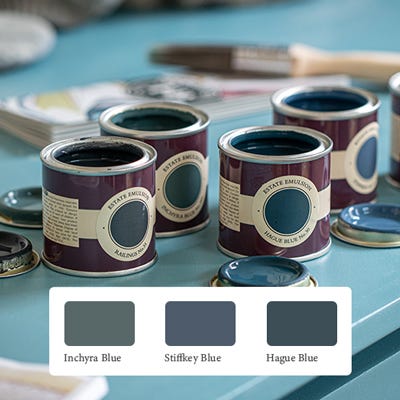
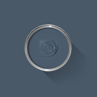
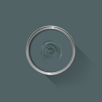
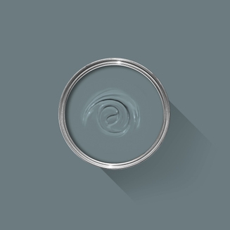
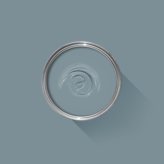
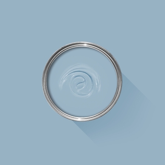
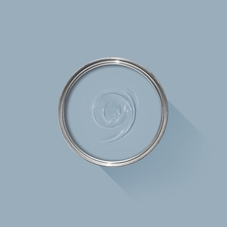
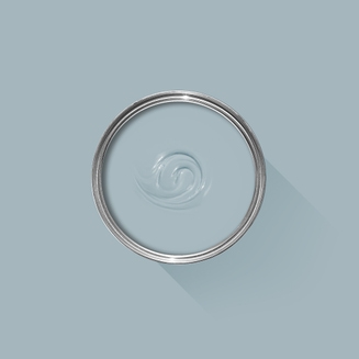
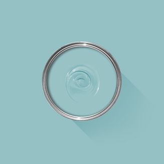
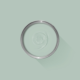
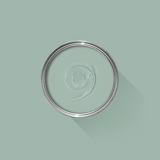
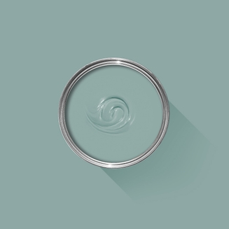
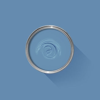
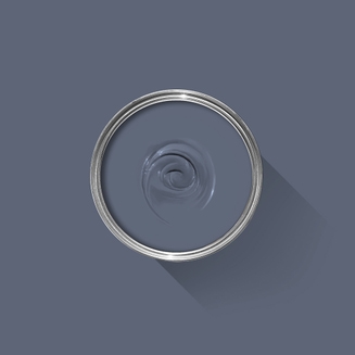
Sample Our Favourite Blues
The best way to experience our colours before taking the plunge is with a true-to-colour paint sample. To help you narrow down your shortlist of shades, we've curated three of our most popular blue shades to help you find your perfect match.
Sample selection contains 3 x 100ml Sample Pots of our beautiful Inchyra Blue, Stiffkey Blue and Hague Blue.

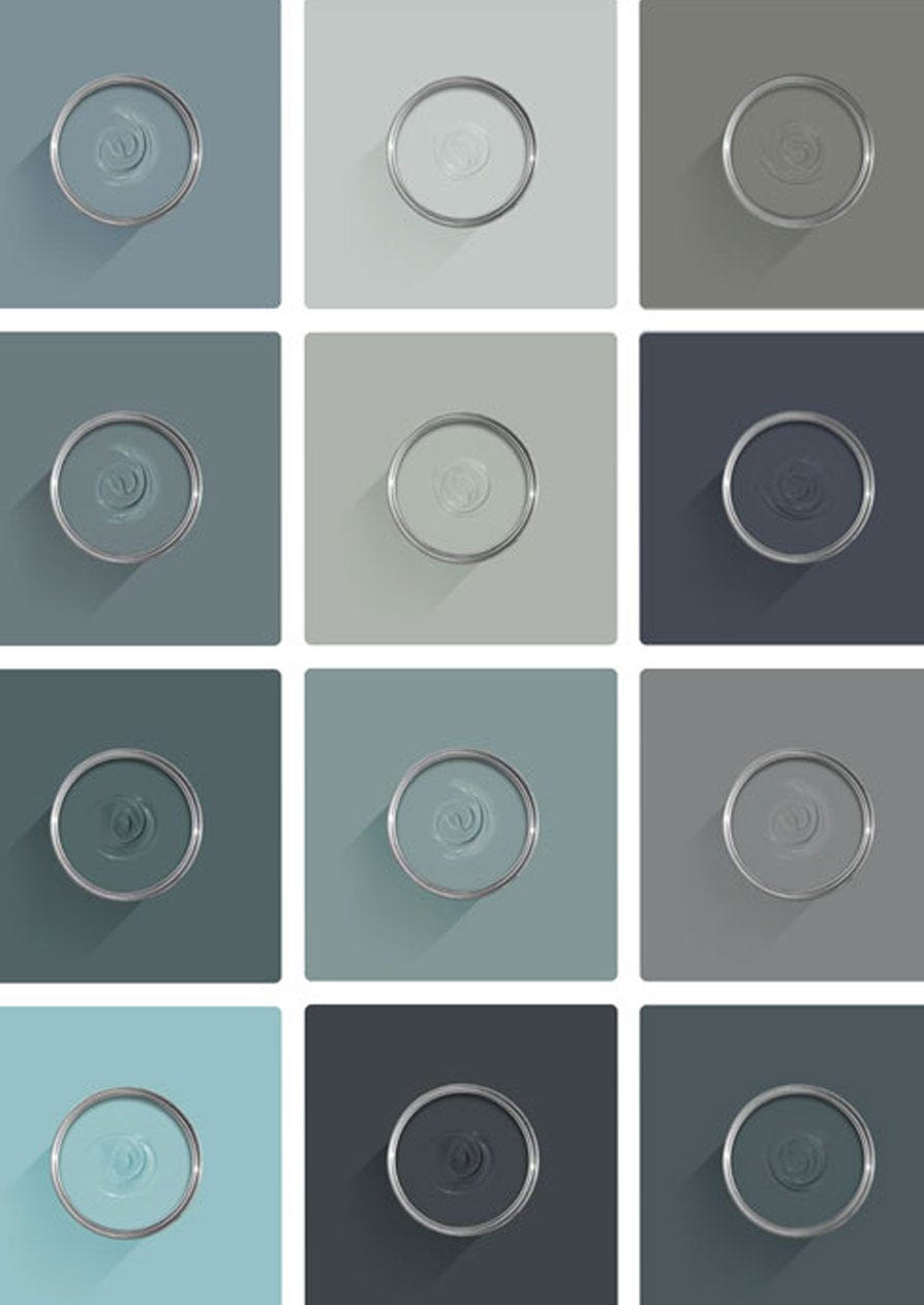
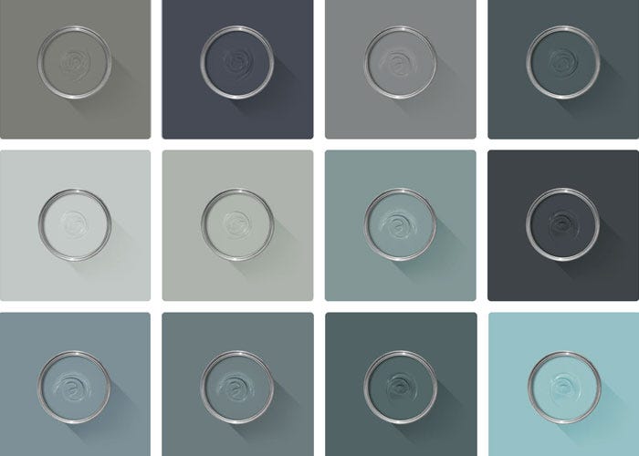
View All Blue Paint Colours
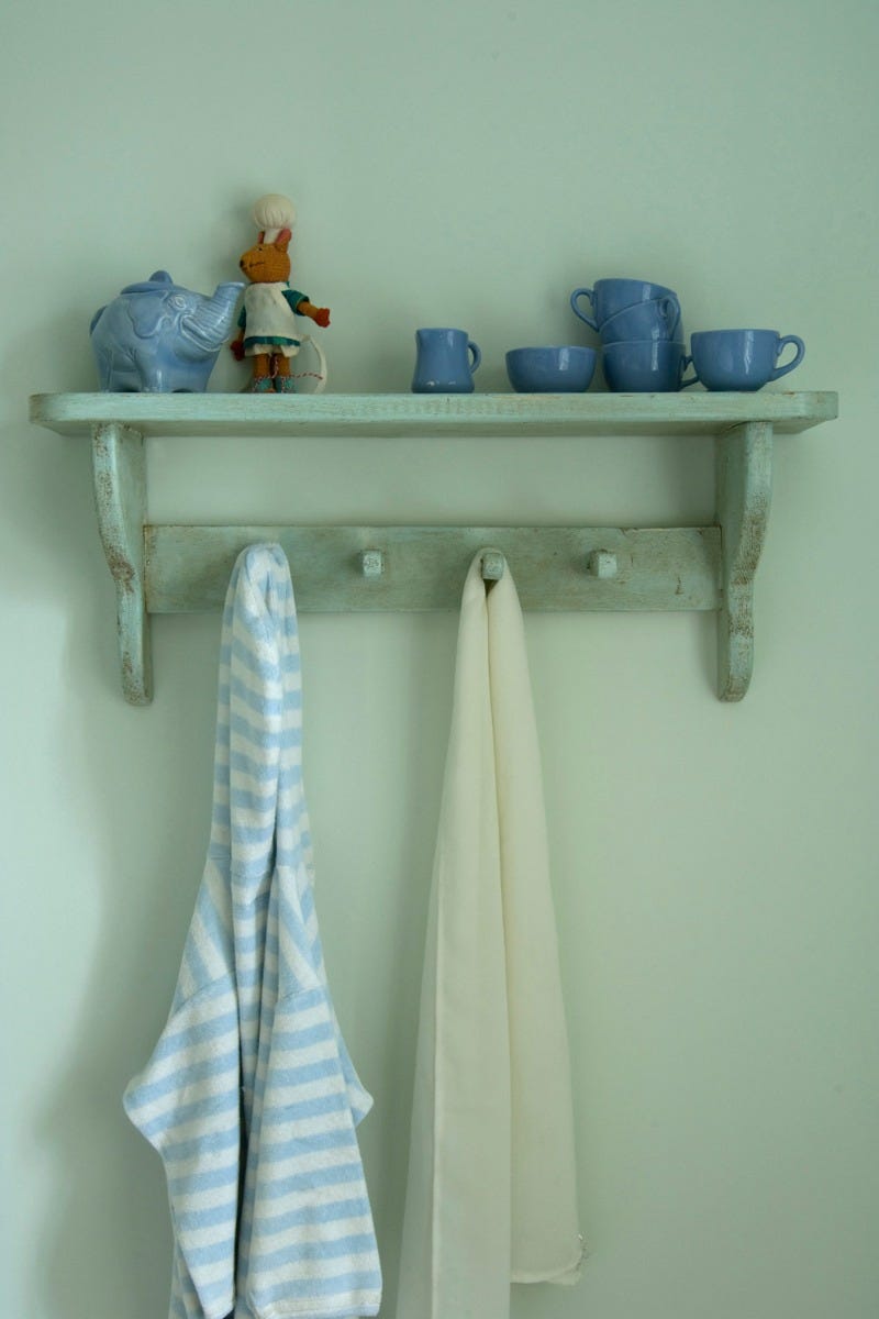
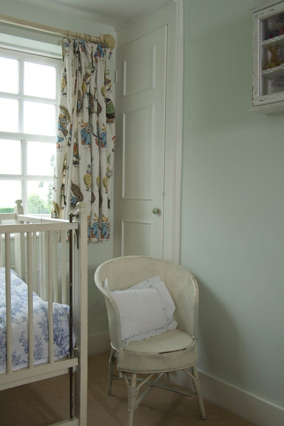
When it comes to creating colour schemes, blue paint is one of the most versatile options around. In some spaces it evokes calm and serenity, while in others it’s cosy and dramatic.
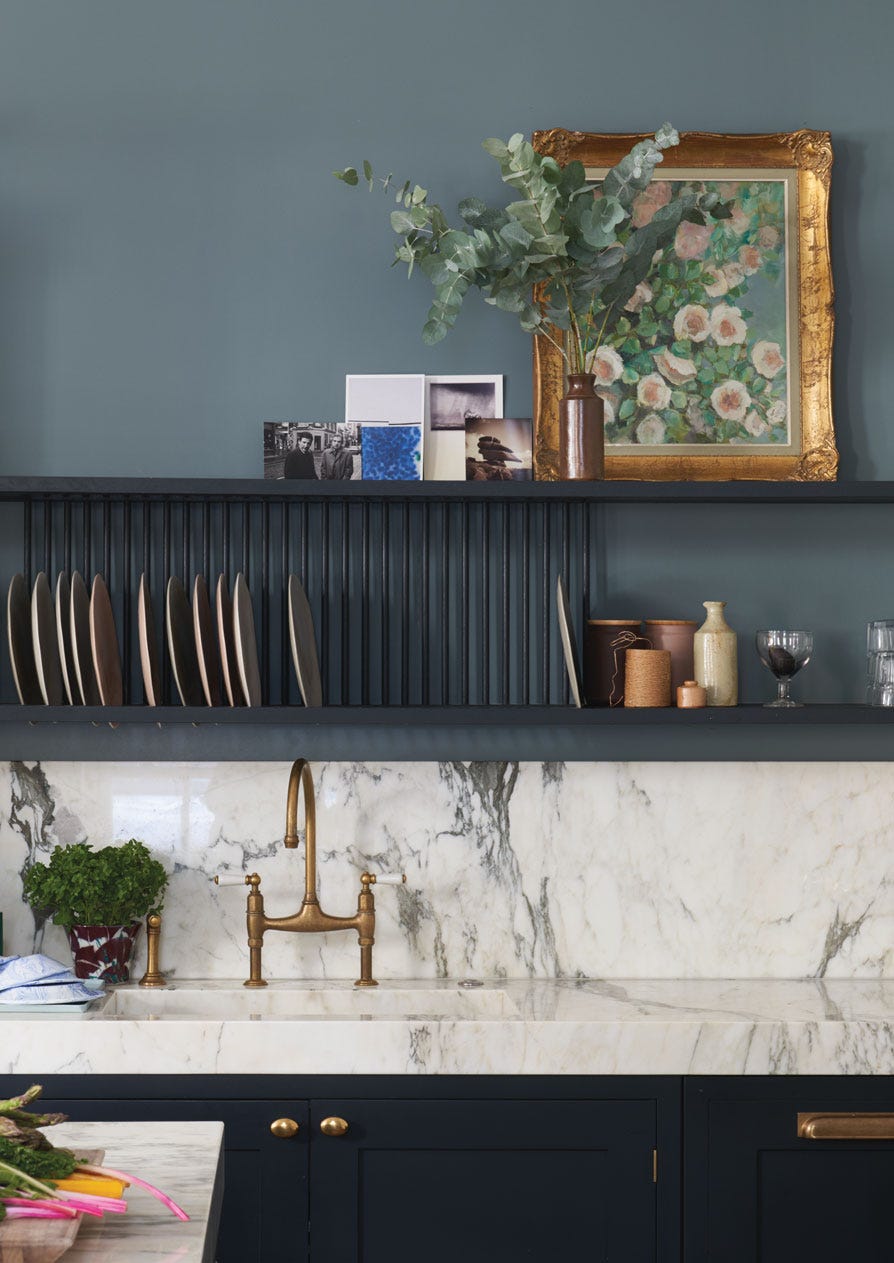
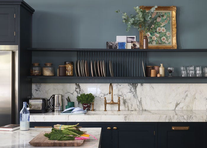
Discover Blue Paint Schemes
Find inspiration for your project and view beautiful images of blue paint schemes in real homes.