


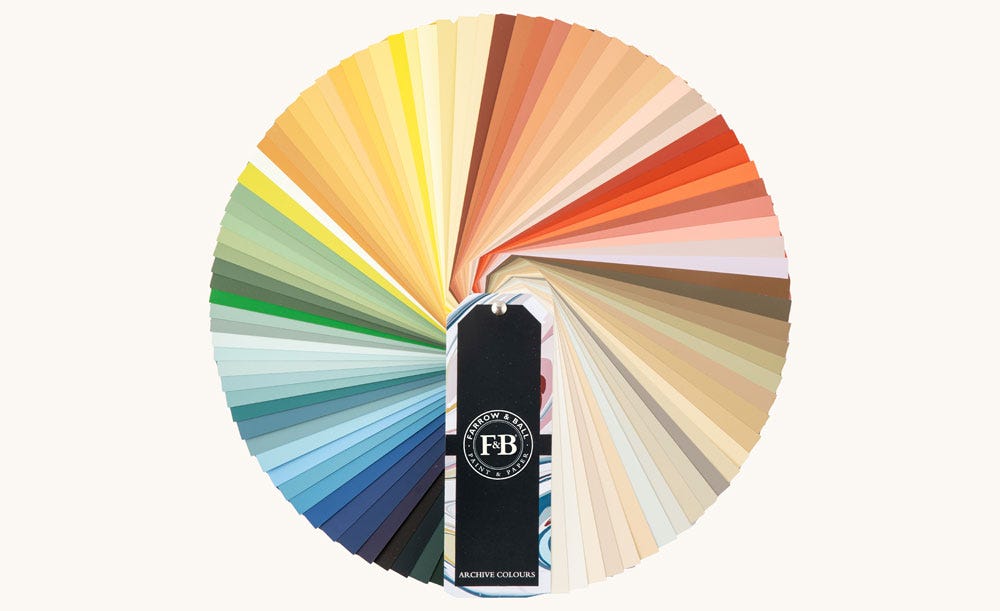
Sample Our Archive Collection
The only way to sample all 142 colours in our archive collection, our Archive Colour Fan is the perfect design resource for those looking to sample beyond our Signature Palette.
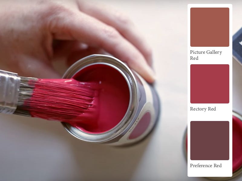
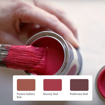
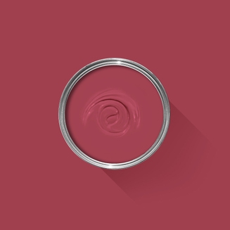
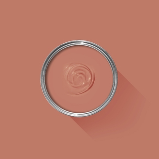
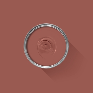
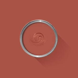
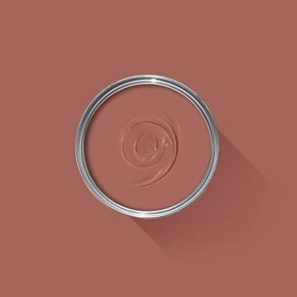
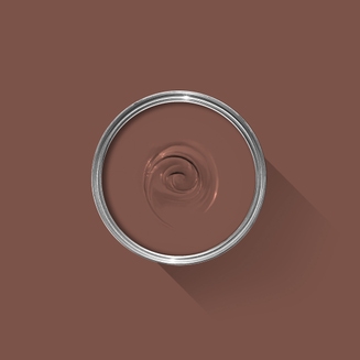
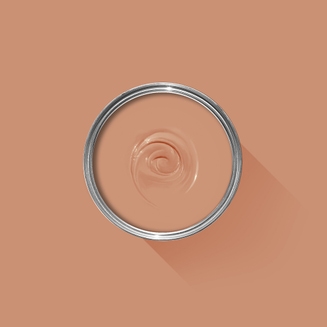
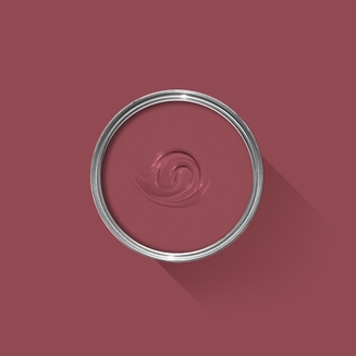
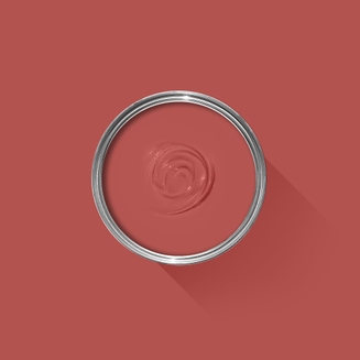
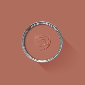
Sample Our Favourite Reds
The best way to experience our colours before taking the plunge is with a true-to-colour paint sample. To help you narrow down your shortlist of shades, we've curated three of our most popular red shades to help you find your perfect match.
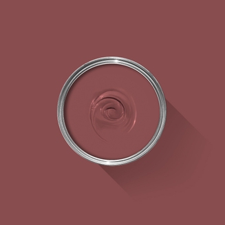
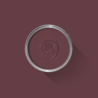
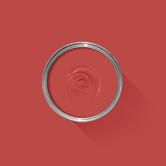
Sample selection contains 3 x 100ml Sample Pots of our beautiful Picture Gallery Red, Rectory Red and Preference Red.

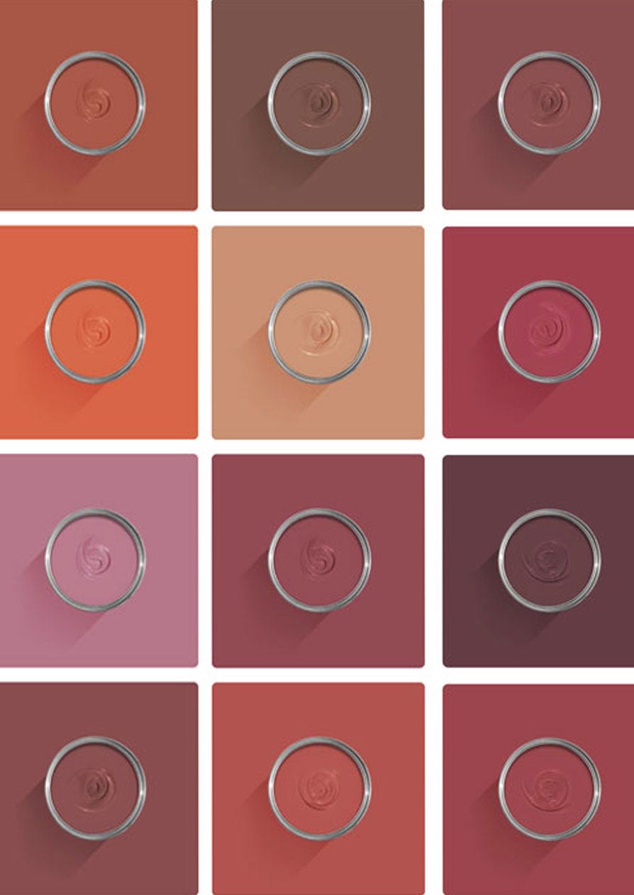
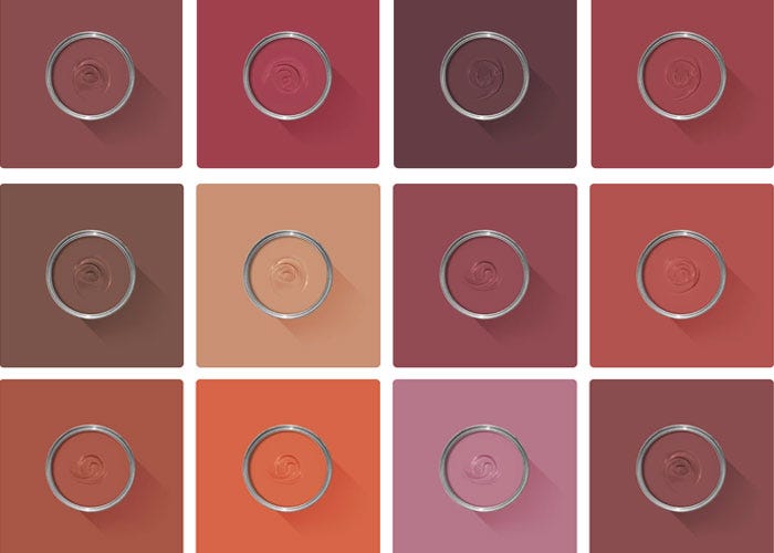
View All Red Paint Colours
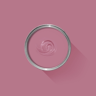
Ranging from understated near-grey to deep plum, our purple palette offers an array of styles and moods.
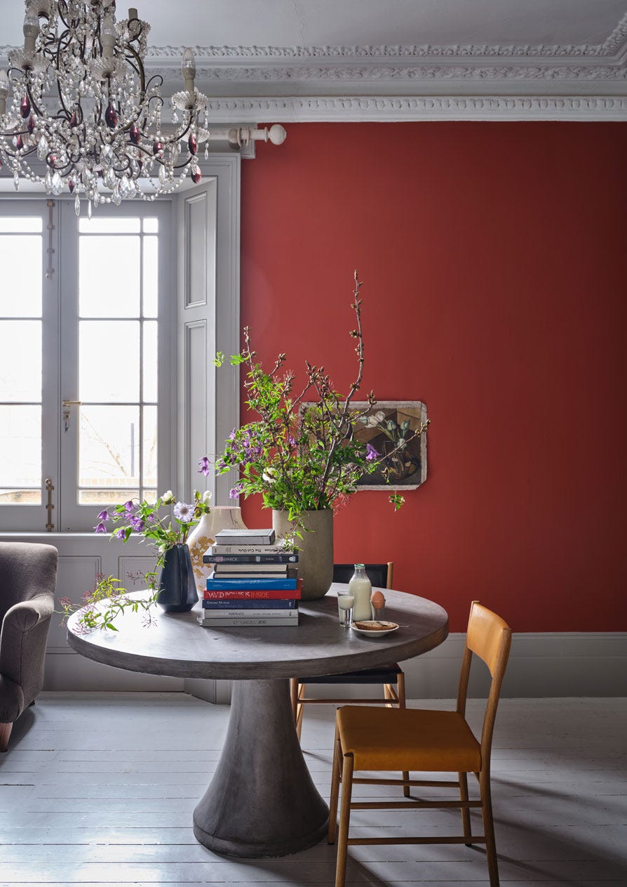
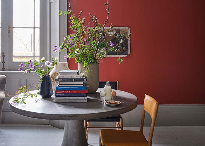
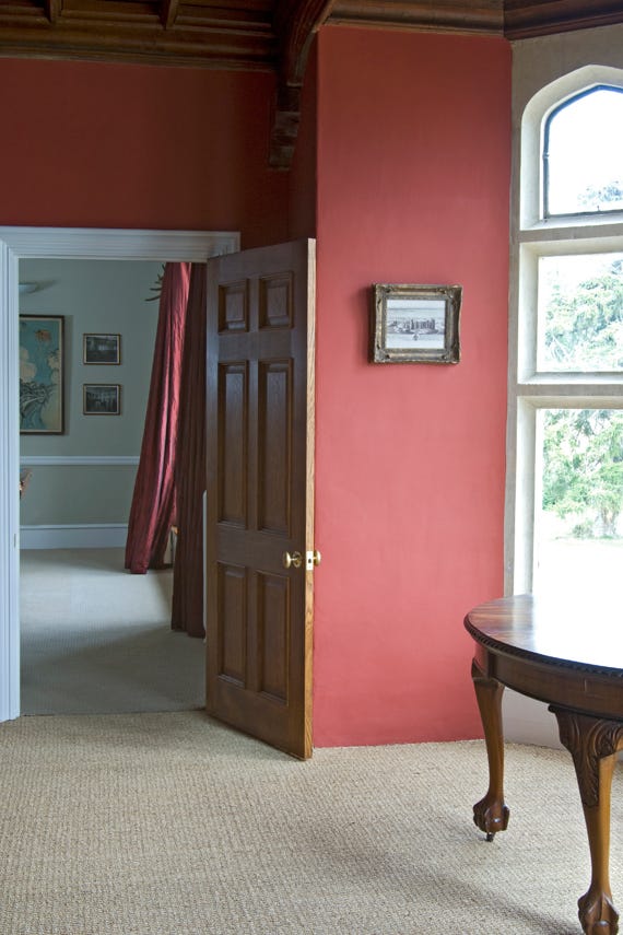
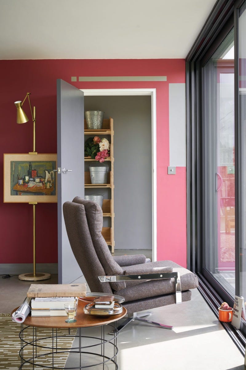
Discover Red Paint Schemes
Find inspiration for your project and view beautiful images of red paint schemes in real homes.