You can use Apple Pay when shopping on Apple devices and on a Safari browser.
Klarna
Paint now, pay later with Klarna.
We’ve partnered with Klarna to offer you multiple ways to pay for your handcrafted paint and paper.
Available in United Kingdom, Austria, Spain, Finland, Ireland, Italy and The Netherlands only.
PayPal
With PayPal you can pay for your paint and paper in just a few easy steps.
Card Payments
We also accept card payments from Visa, Mastercard, Maestro and Amex
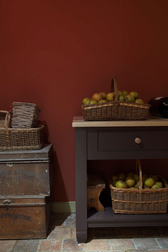
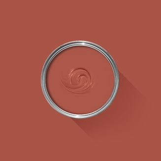
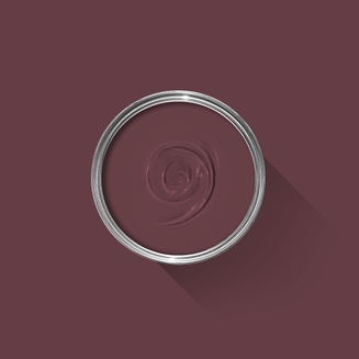
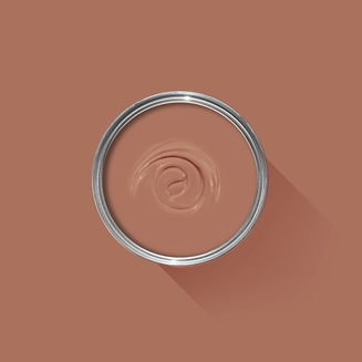
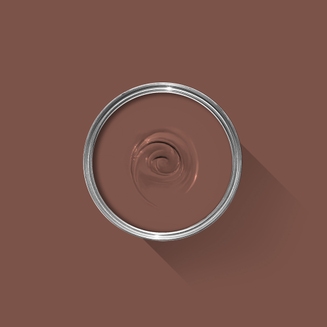
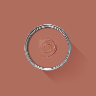
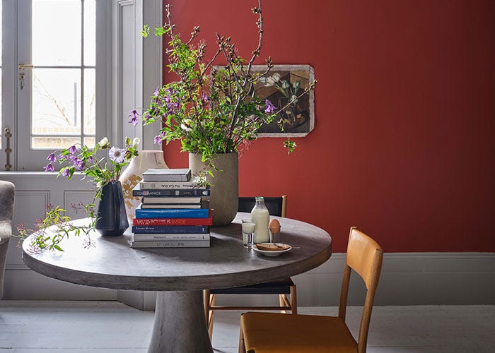
A rich brown based red
This timeless red is based on the rich colour of the magnificent gallery at Attingham Park. A generous helping of brown pigment deepens Picture Gallery Red, bringing a unique warmth and character. As its name suggests, this ruddy hue creates a striking backdrop for works of art, be they hand drawn in crayon or expertly painted in oil.
We’re dedicated to perfecting the art of paint. At our home in Dorset, we combine the finest ingredients, 75 years of experience and technical precision to help you create beautiful spaces that stay beautiful. Even in our colour rich paints, less than 8% of the tin is the colour. The other 92% is what creates the quality, depth and extraordinary response to light that transforms your home.
Paint is like coffee. The colour is the froth on the top, but it’s the quality of the rest of the cup that makes it taste good. – Richard Ball, Farrow & Ball Co-founder
We use twelve exclusive pigments, all specifically selected for their colour intensity. We take colour seriously, so naturally, we only accept the very best. By using these same pigments to make every colour in our palette, all our shades combine effortlessly, making it easy for you to put together a cohesive colour scheme.
Deeper, richer colours
Deeper, richer colours
Packed with pigment for an extraordinary response to every kind of light.
We add generous helpings of rich pigment to create our signature look – deep colours with complex undertones. The same space that feels bright and airy in morning sun, can feel cosy and intimate by evening. Our teams design each shade under every kind of light, so it will be perfectly balanced in every setting.
Extraordinary response to light
Extraordinary response to light
We spend months carefully crafting and testing each of our paint colours to make sure they share our signature extraordinary response to light. This beautiful reaction to changing light, like bringing out different undertones or shifting intensity, is what makes our paint so special.
Interior and exterior finishes
Interior and exterior finishes
From walls, floors and furniture to radiators, skirtings and sheds, our range of paint finishes can help you transform almost any surface in your home (and outside it, too).
We even have multi-surface finishes like Dead Flat® and Full Gloss, so you can tackle walls, woodwork and metal at the same time.
Our comprehensive range is comprised of paint finishes that not only look beautiful, but offer different practical benefits. Designed for a variety of different surfaces, each finish is compatible with our high-performance Primers & Undercoats to ensure exceptional coverage, adhesion and depth of colour.
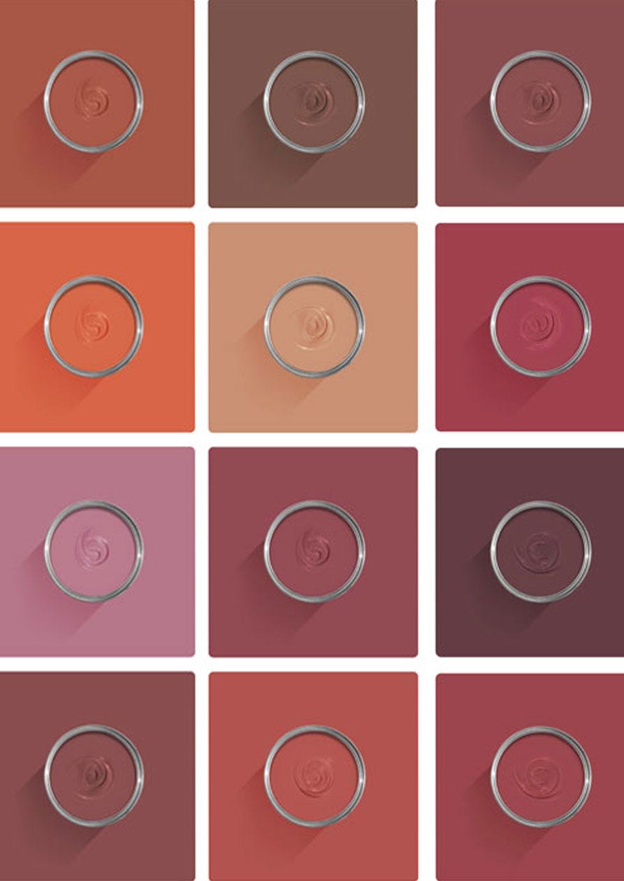
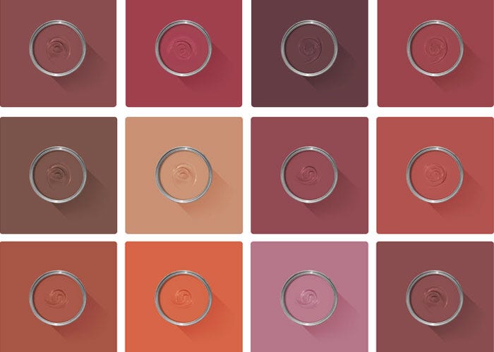
Colour Story
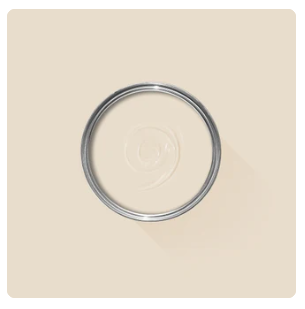
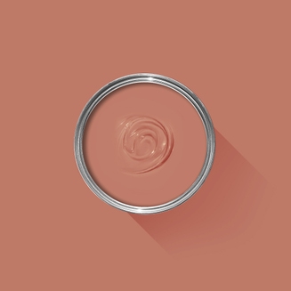
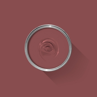
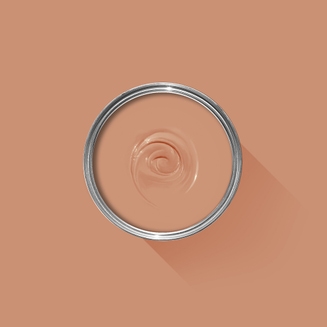
Complementary White
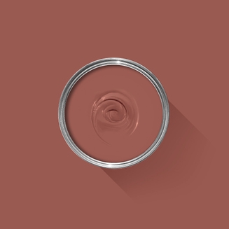
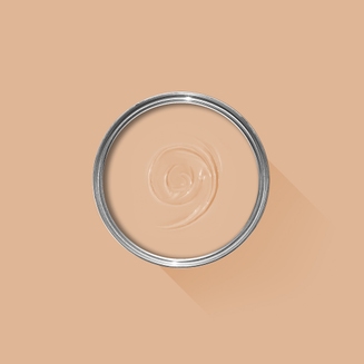
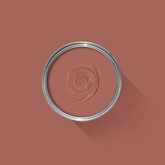
Dimity
This pale and subdued taupe is brimming with warmth and an unmatchable depth Find out more about Dimity No.2008
Every colour in the Farrow & Ball palette is paired with a specific shade of white, these are selected to celebrate a shared undertone and create harmonious spaces alongside your chosen colour.
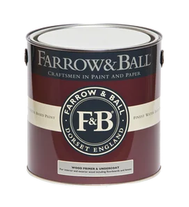
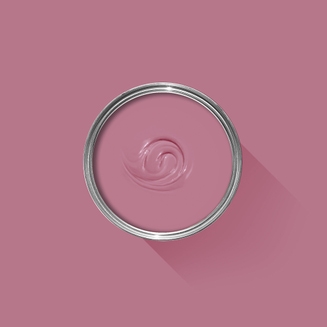
Our Red & Warm Tones Primer & Undercoat is the perfect first step towards truly cosy colour schemes. Based on the shade Porphyry Pink, it makes topcoats look even richer, so you can enjoy the fullest expression of your chosen hue.
Made with the same natural ingredients and pigments as our topcoats, our Primer & Undercoat is the crucial foundation for creating a rich, even and longer lasting finish.
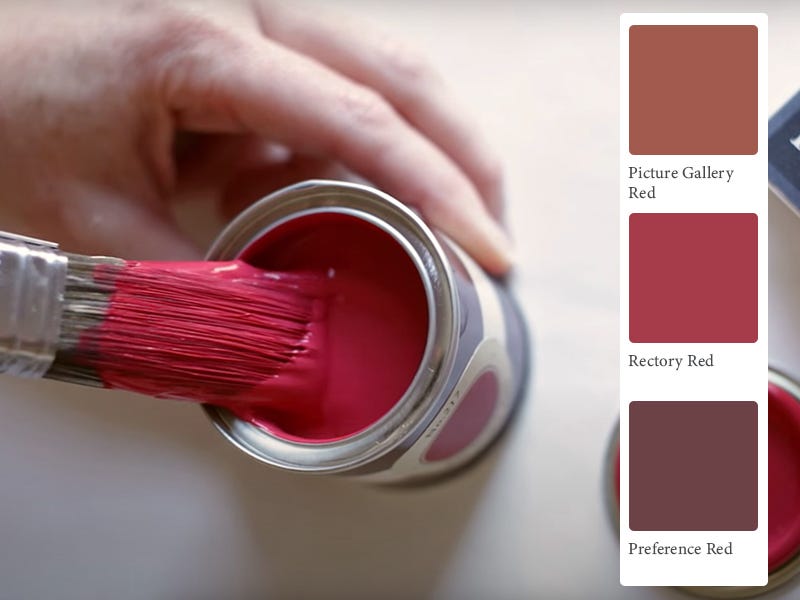
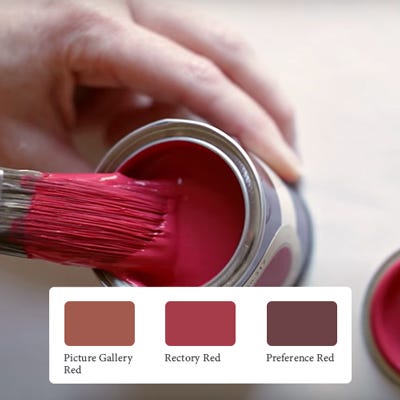
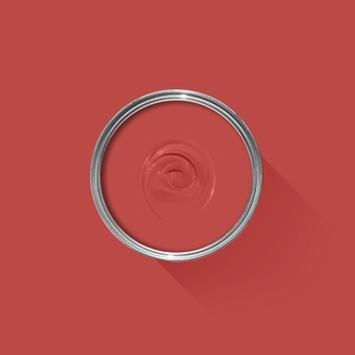
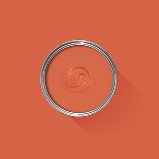
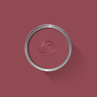
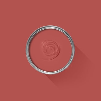
The best way to experience our colours before taking the plunge is with a true-to-colour paint sample. To help you narrow down your shortlist of shades, we've curated three of our most popular red shades to help you find your perfect match.
Sample selection contains 3 x 100ml Sample Pots of our beautiful Picture Gallery Red, Rectory Red and Preference Red.
Our expert Colour Consultants are ready and waiting to help bring your style to life. If you’d like personalised advice on how to use our paint and papers in your home, book an in-home or virtual appointment today.
Rated 5 out of
5 by
PGRLover from
PGRWonderfully strong colour aided and abetted by the quality of the paint
Date published: 2023-11-20
Rated 5 out of
5 by
Hann_J from
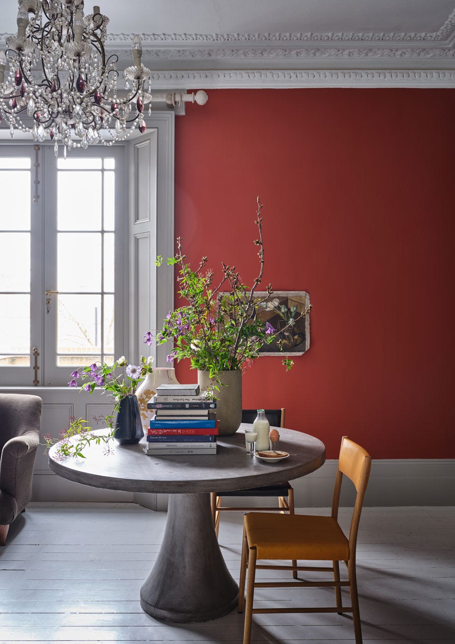
The perfect pop of warmthDuring our recent kitchen/diner renovation I wanted a pop of colour to lift the scheme and became increasingly drawn to picture gallery red due to its earthy hue. It works beautifully with drop cloth walls and appears in our north facing room as a rich, rusty tone that adds a layer of warmth. The finish of the estate eggshell and depth of colour is exceptional.
Back in 2010, we moved to an entirely water based range of finishes, becoming the first in the industry to do so. These low-odour, low-VOC finishes are easy to clean without harmful solvents. They are also certified child- and baby-safe in accordance with Safety of Toys Part 3: Migration of certain elements (EN 71-3:2019+A1:2021).
Exclusions: Casein Distemper, Wood Primer & Undercoat and Metal Primer & Undercoat.
Quality Finishes
Every one of our paint colours is available in a range of durable interior and exterior paint finishes, each rigorously tested to ensure an exceptional depth of colour and long-lasting finish. For the very best results, we always recommend using a Farrow & Ball Primer & Undercoat - see above for the correct tone for this colour.
Safety Information
Always read and follow the information on the product label.
All Farrow & Ball finishes except Limewash contain isothiazolinones, which may produce an allergic reaction. Farrow & Ball Limewash contains calcium hydroxide which can cause severe damage in contact with skin or eyes. For further information about our products, including guidance on safe use and application, click here to view our advice pages.
Limewash: Danger. Causes skin irritation. Causes serious eye damage. May cause respiratory irritation.
Exterior Eggshell and Exterior Masonry: Harmful to aquatic life with long lasting effects. Contains isothiazolinones. May produce an allergic reaction.
All other finishes: Contains isothiazolinones. May produce an allergic reaction.