UK Category
-
-
-
-
-
-
-
-
-
-
-
-
-
-
-
-
-
-
-
-
-
-
-
-
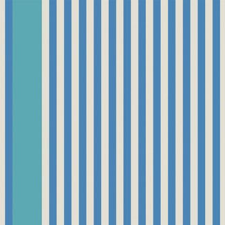 StripeStripe 6101Stripe 6101
$335.00- BP Paper 61-01 Stripe
- BP Paper 61-02 Stripe
- BP Paper 61-03 Stripe
- BP Paper 61-04 Stripe
-
 CheckCheck 6001Check 6001
$345.00- BP Paper 60-01 Check
- BP Paper 60-02 Check
- BP Paper 60-03 Check
- BP Paper 60-04 Check
-
 DotDot 5901Dot 5901
$345.00- BP Paper 59-01 Dot
- BP Paper 59-02 Dot
- BP Paper 59-03 Dot
- BP Paper 59-04 Dot
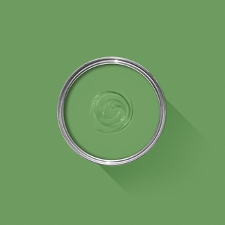
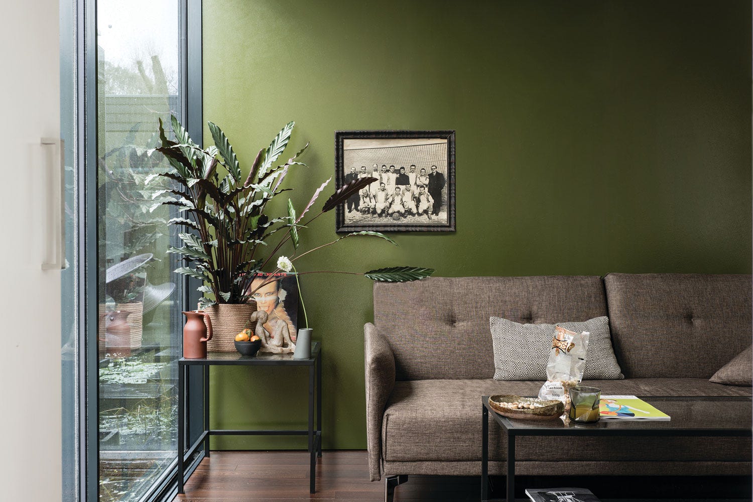
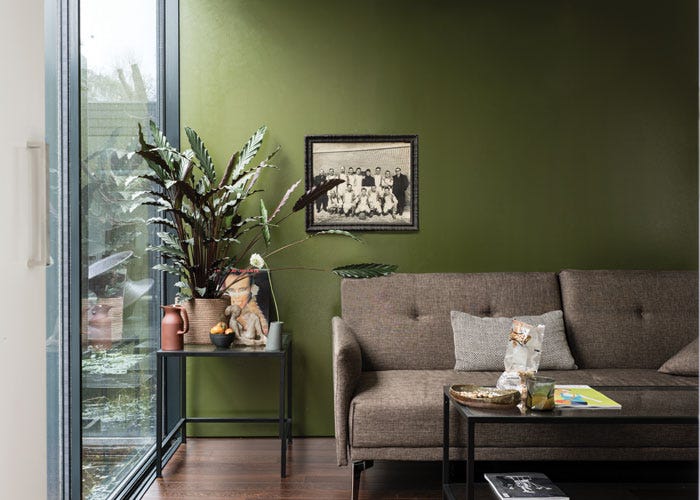
Green Paint Schemes
Find inspiration for your project and view beautiful images of green paint schemes in real homes.
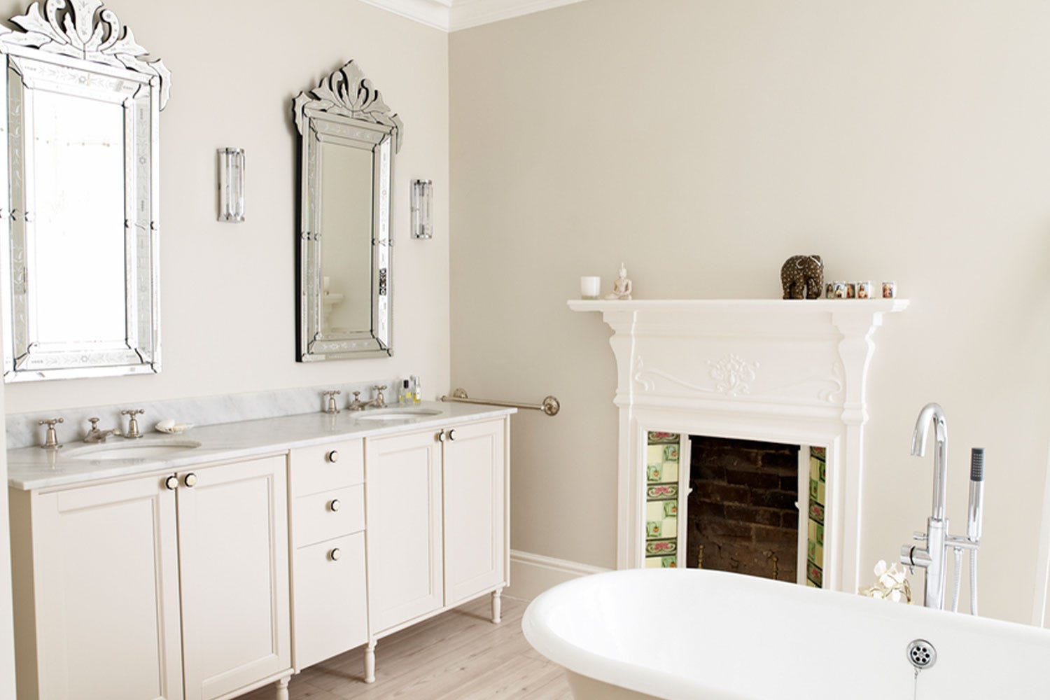
White Paint Schemes
Find inspiration for your project and view beautiful images of white paint schemes in real homes.