We accept card payments from Visa, Mastercard, Maestro and Amex.
Simply choose card payment and fill in your details at checkout to choose this option. In some cases, you’ll be asked to authorise the payment through your bank for additional security.
PayPal
With PayPal you can pay for your paint and paper in just a few easy steps.
Simply choose PayPal at checkout, confirm the payment on their website (you’ll need to log in or create an account if you don’t have one already), and then you’ll be redirected back to farrow-ball.com with your order complete.
Apple Pay
You can use Apple Pay when shopping on Apple devices and on a Safari browser. But you need to activate it in your Apple account and device first.
Choose Apple Pay at checkout, confirm the payment on your Apple device and you’ll be redirected back to farrow-ball.com with your order complete.
Klarna
Paint now, pay later with Klarna.
We’ve partnered with Klarna to offer you multiple ways to pay for your handcrafted paint and paper. Just look for the Klarna logo at checkout or visit our FAQ page to find out more.
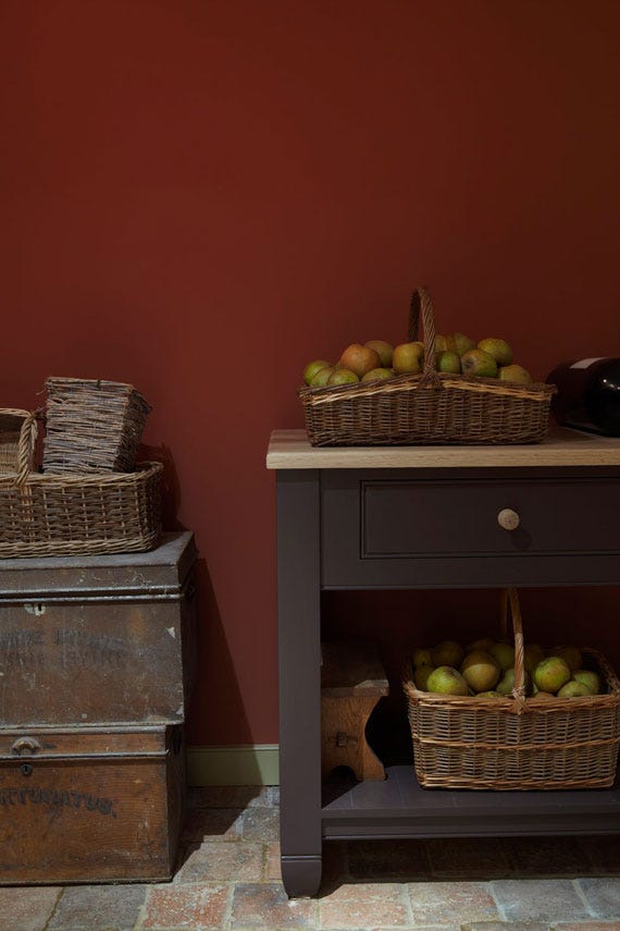
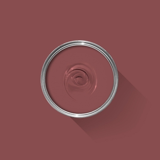
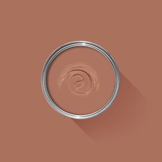
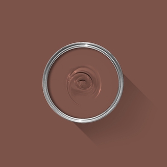
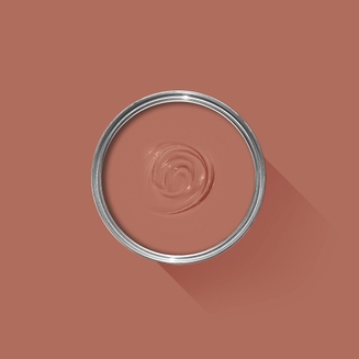
Estate Emulsion
This timeless red is based on the rich tone of the magnificent gallery at Attingham Park.
Estate Emulsion is a classic choice for low-traffic interior walls and ceilings. Very matt with a distinctive, chalky finish, it minimises imperfections and creates a beautiful depth of colour.
Estate Emulsion is a very matte finish with a chalky 2% sheen.
Our deeper, richer colours are available in a range of finishes with different sheen levels. Sheen always affects how colour appears: the same shade in gloss can look very different in matte. That’s why we specifically adjust the formula for every finish to make sure the balance is exactly right and you get the colour you were expecting. Our colours and finishes are formulated together, so you simply can’t have one without the other.
Classic, chalky look
Classic, chalky look
A true classic, Estate Emulsion is a distinctive, chalky finish that minimises imperfections and creates beautiful depth of colour. Due to this unique texture, it’s best suited to less-busy areas without a lot of traffic.
For walls and ceilings in low-traffic areas
For walls and ceilings in low-traffic areas
Estate Emulsion is our classic finish for interior walls and ceilings in low-traffic areas. Gently wipeable but not washable.
From walls, floors and furniture to radiators, skirtings and sheds, our range of paint finishes can help you transform almost any surface in your home (and outside it, too). Browse our full selection of finishes to find the perfect paint for your project.
100% water based
100% water based
We’re proud to have been the first in the industry to transition to a completely water based range back in 2010. As a result, all of our finishes, including our tough trim and floor paints, are made with a low-odour, low-VOC water base that scores A+ for indoor air quality.
Plus, our water based paint doesn’t discolour over time like solvent based paints can. So your spaces stay beautiful for longer.
Toy safe
Toy safe
This finish is independently tested and certified toy-safe in accordance with Safety of Toys Part 3: Migration of certain elements (EN 71-3:2019+A1:2021). That means you can and a splash of colour to toys, cribs and other surfaces little ones come into contact with. Our paints also have hardly any odour and don’t need any solvents to clean up, so you can breathe easy during application and beyond.
75 Years of Perfecting Paint
If you've ever wondered what it is that makes Farrow & Ball so special, you'll find the answers here.
From our high-quality ingredients to our artisanal methods, our 100% water based range of finishes and responsible practices, it's about so much more than just paint and paper.
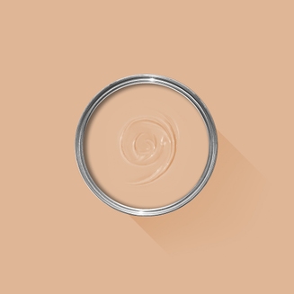
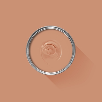
Complementary White
Dimity
This pale and subdued taupe is brimming with warmth and an unmatchable depth Find out more about Dimity No.2008
Every colour in the Farrow & Ball palette is paired with a specific shade of white, these are selected to celebrate a shared undertone and create harmonious spaces alongside your chosen colour.
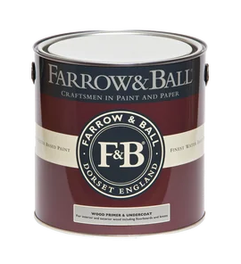
Recommended Primer & Undercoat
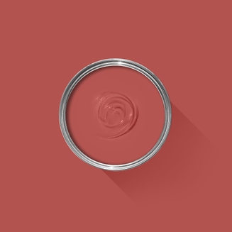
Red & Warm Tones
Our Red & Warm Tones Primer & Undercoat is the perfect first step towards truly cosy colour schemes. Based on the shade Porphyry Pink, it makes topcoats look even richer, so you can enjoy the fullest expression of your chosen hue.
Made with the same natural ingredients and pigments as our topcoats, our Primer & Undercoat is the crucial foundation for creating a rich, even and longer lasting finish.
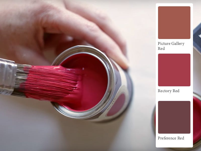
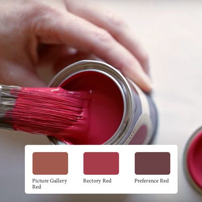
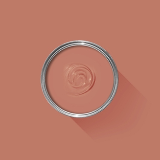
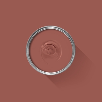
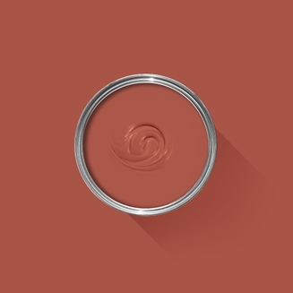
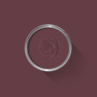
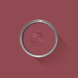
The best way to experience our colours before taking the plunge is with a true-to-colour paint sample. To help you narrow down your shortlist of shades, we've curated three of our most popular red shades to help you find your perfect match.
Sample selection contains 3 x 100ml Sample Pots of our beautiful Picture Gallery Red, Rectory Red and Preference Red.
Rated 5 out of
5 by
Edenrose from
Creates a cosy impactWhen we bought our current house, knowing it required full modernisation throughout, we decided from the off that we didn't want it to look like another archetypal renovation property: grey, bland and unimaginative. We wanted it to be vibrant and full of character. The resultant waves of colour throughout this house you could also call an overcorrection. Our previous house was a new build - a haze of magnolia and neutrals. Decorating that house was never particularly inspiring as it was always done with a view to selling it in the near future - it was never going to be a forever home - so it was kept perpetually neutral.
We knew we'd be in this house a lot longer so we promised ourselves we would decorate it exactly how we wanted it - not worrying about reselling. We wanted the decor to suit the age of the house and we chose colours simply because we loved them.
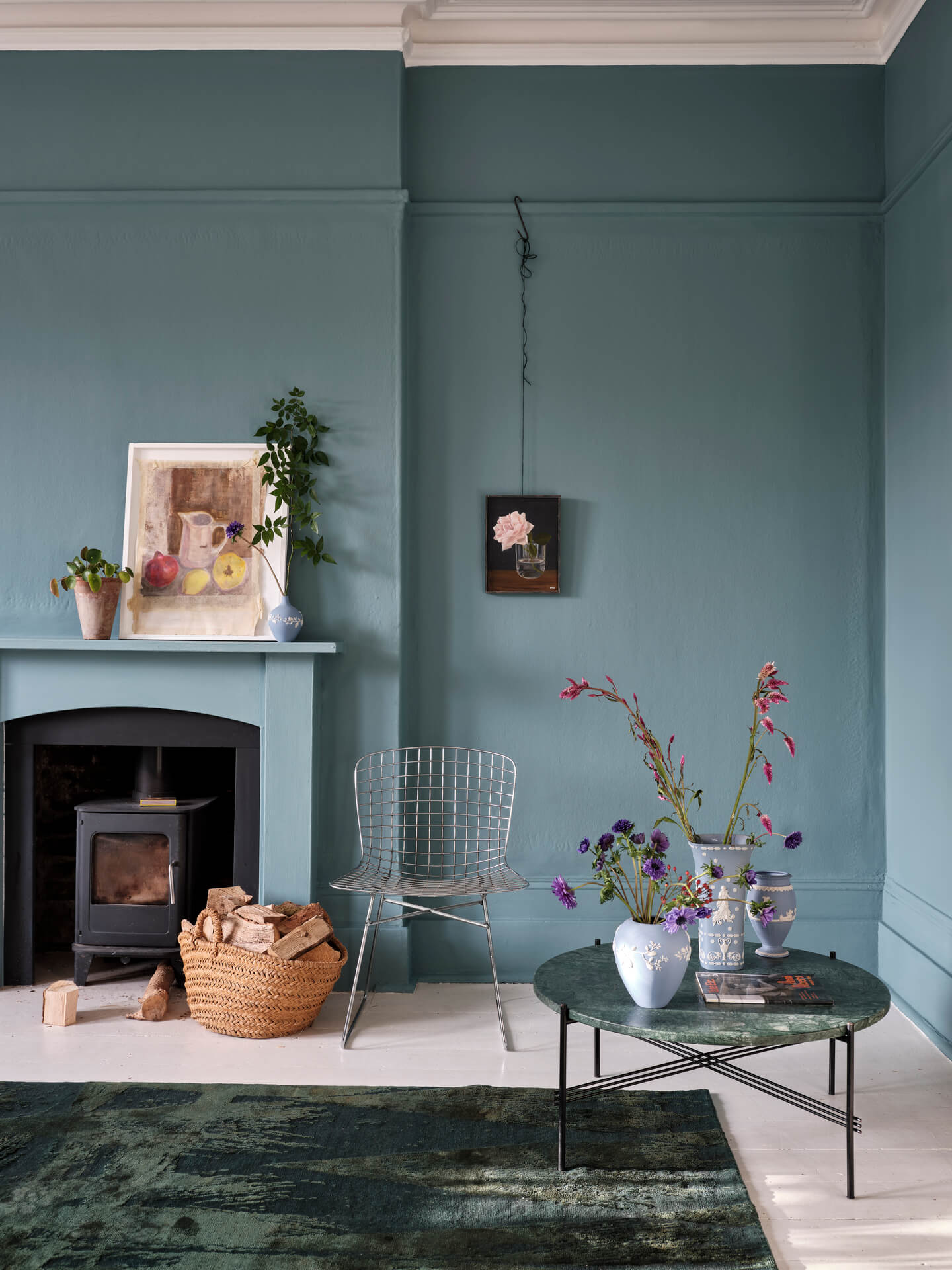
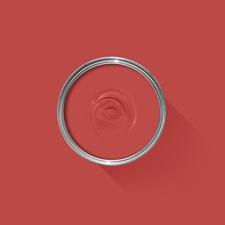
Picture Gallery Red was one of the first colours we decided on. The living room is north facing and gets very little natural light. Rather than trying to fight that, we decided to steer into the skid. This is a dark and moody red. There's a bit of drama in it but I find it also quite calming. We wanted to create a warm, cosy room that we could relax in during the evenings in front of our newly-installed log burner. We got exactly that! It's not garish like some reds can be. It has an earthy brown undertone and is very warm.
I used Joa's White on the ceiling (painting the ceiling something other than stark white is my new favourite thing!) and it pairs brilliantly. On the trims I used All White in Modern Eggshell. This was the perfect choice as it goes with anything having no undertones: pure white but not stark and bluish like you get with some whites. This was also important as I wanted to use All White on all the trims throughout the downstairs as well as the same flooring, as each room is a different colour and I wanted some coherency.
Now the finish. I read review after review while trying to chose between the infamous Estate Emulsion and the newer Modern Emulsion. There is no doubt the Estate finish is beautiful and unique - I've seen it in other houses - but I could not have walls that you couldn't touch or wipe. So, I plumped for the Modern finish and I've used that in every room. It was the right decision. I don't have to worry about marks or fingerprints. You still get a richly pigmented colour and it goes on like a dream. Yes there's a slight sheen to it that you don't get with the ultra matt Estate but the pros far outweigh this. The undercoat is a different story and was infinitely harder to apply, but it was worth it. Make sure you match the correct undercoat - I used the one for reds.
I highly recommend this colour. It's warm, full of character and beautifully rich. Though be warned, there are many who will turn their nose up at a 'red living room'. When we were in the messy stages of the renovation, many of the contractors baulked at the thought of painting it red. And there are a few family members who I know don't really like it. But I couldn't care less. Me and my husband love it and that was the aim: to create a space that we loved - I could stare at my beautiful walls all day! I've also read a number of articles stating that you should never paint a room red - as it invokes feelings of agitation and anger - I have honestly only ever found this room to be relaxing and I often fall asleep in it!
Happy painting and I hope my review has helped with your colour decisions!
Back in 2010, we moved to an entirely water based range of finishes, becoming the first in the industry to do so. These low-odor, low-VOC finishes are easy to clean without harmful solvents. They also meet child- and baby-safe requirements in accordance with The Canada Cribs, Cradles and Bassinets Regulations, Canada Toy Regulations (SOR/2011-17) – Section 23 and ASTM F963 – 17 - Standard Consumer Safety Specification for Toy Safety.
Quality Finishes
Every one of our paint colours is available in a range of durable interior and exterior paint finishes, each rigorously tested to ensure an exceptional depth of colour and long-lasting finish. For the very best results, we always recommend using a Farrow & Ball Primer & Undercoat - see above for the correct tone for this colour.
Safety Information
Always read and follow the information on the product label.
All Farrow & Ball finishes except Limewash contain isothiazolinones, which may produce an allergic reaction. Farrow & Ball Limewash contains calcium hydroxide which can cause severe damage in contact with skin or eyes. For further information about our products, including guidance on safe use and application, click here to view our advice pages.
WARNING: This product can expose you to chemicals including acetaldehyde, which is known to the State of California to cause cancer. For more information, go to www.P65Warnings.ca.gov.