We accept card payments from Visa, Mastercard, Maestro and Amex.
Simply choose card payment and fill in your details at checkout to choose this option. In some cases, you’ll be asked to authorise the payment through your bank for additional security.
PayPal
With PayPal you can pay for your paint and paper in just a few easy steps.
Simply choose PayPal at checkout, confirm the payment on their website (you’ll need to log in or create an account if you don’t have one already), and then you’ll be redirected back to farrow-ball.com with your order complete.
Apple Pay
You can use Apple Pay when shopping on Apple devices and on a Safari browser. But you need to activate it in your Apple account and device first.
Choose Apple Pay at checkout, confirm the payment on your Apple device and you’ll be redirected back to farrow-ball.com with your order complete.
Klarna
Paint now, pay later with Klarna.
We’ve partnered with Klarna to offer you multiple ways to pay for your handcrafted paint and paper. Just look for the Klarna logo at checkout or visit our FAQ page to find out more.
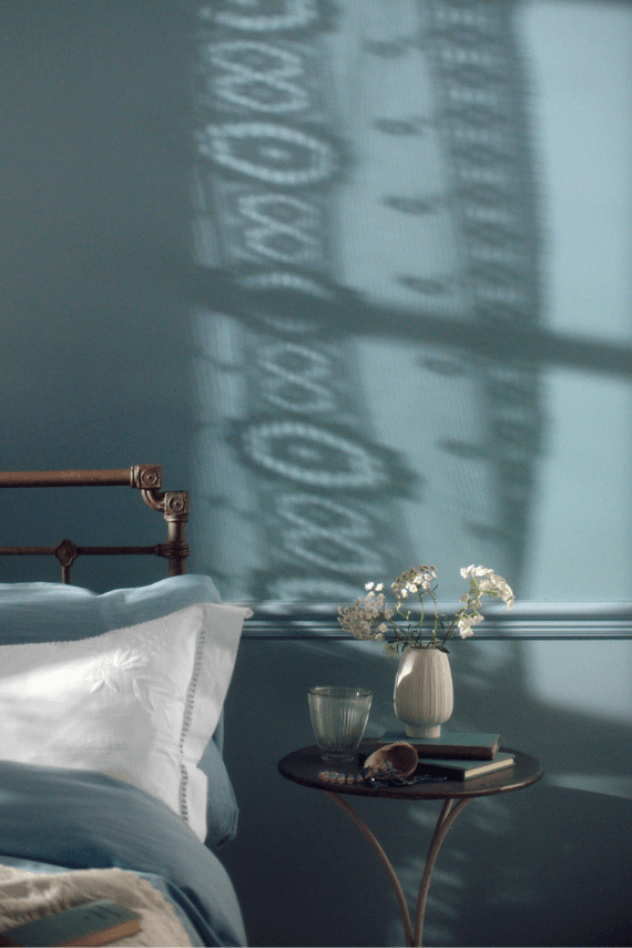
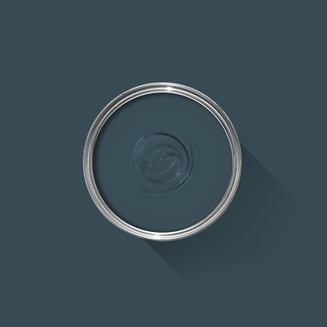
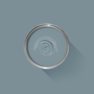
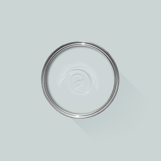
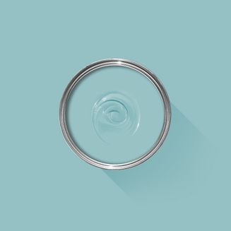
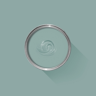
A clean, cool blue
This clean cool blue is inspired by the wings of seabirds when seen in bright sunlight. Sitting between Parma Gray and Lulworth Blue, Kittiwake has a touch more black pigment creating a warmer, more relaxed feel. This shade is perfect for living spaces, staying truly blue in all lights. It also complements stainless steel especially well, so is ideal for contemporary kitchens. A sophisticated blue, it looks fantastic with Wine Dark and Borrowed Light.
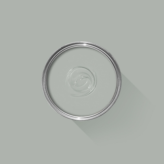
Recommended Primer & Undercoat:White and Light Tones
We’re dedicated to perfecting the art of paint. At our home in Dorset, we combine the finest ingredients, 75 years of experience and technical precision to help you create beautiful spaces that stay beautiful. Even in our colour rich paints, less than 8% of the tin is the colour. The other 92% is what creates the quality, depth and extraordinary response to light that transforms your home.
Paint is like coffee. The colour is the froth on the top, but it’s the quality of the rest of the cup that makes it taste good. – Richard Ball, Farrow & Ball Co-founder
We use twelve exclusive pigments, all specifically selected for their colour intensity. We take colour seriously, so naturally, we only accept the very best. By using these same pigments to make every colour in our palette, all our shades combine effortlessly, making it easy for you to put together a cohesive colour scheme.
Deeper, richer colours
Deeper, richer colours
Packed with pigment for an extraordinary response to every kind of light.
We add generous helpings of rich pigment to create our signature look – deep colours with complex undertones. The same space that feels bright and airy in morning sun, can feel cosy and intimate by evening. Our teams design each shade under every kind of light, so it will be perfectly balanced in every setting.
Extraordinary response to light
Extraordinary response to light
We spend months carefully crafting and testing each of our paint colours to make sure they share our signature extraordinary response to light. This beautiful reaction to changing light, like bringing out different undertones or shifting intensity, is what makes our paint so special.
Interior and exterior finishes
Interior and exterior finishes
From walls, floors and furniture to radiators, skirtings and sheds, our range of paint finishes can help you transform almost any surface in your home (and outside it, too).
We even have multi-surface finishes like Dead Flat and Full Gloss, so you can tackle walls, woodwork and metal at the same time.
Our comprehensive range is comprised of paint finishes that not only look beautiful, but offer different practical benefits. Designed for a variety of different surfaces, each finish is compatible with our high-performance Primers & Undercoats to ensure exceptional coverage, adhesion and depth of colour.
Colour Story
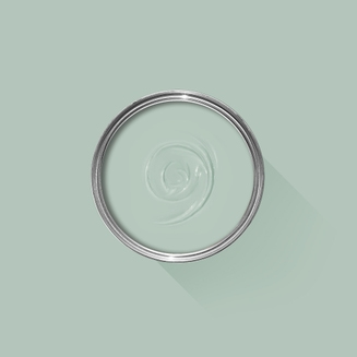
Complementary White
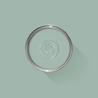
Strong White
One of our Contemporary Neutrals, the subtle urban feel of its light grey undertones add a contemporary twist to period homes, while staying in keeping with modern properties. Find out more about Strong White No.2001
Every colour in the Farrow & Ball palette is paired with a specific shade of white, these are selected to celebrate a shared undertone and create harmonious spaces alongside your chosen colour.
Our White & Light Tones Primer & Undercoat creates a wonderful base for our softest shades. Covering imperfections on your surface and adding extra depth of colour, this primer is based on our simplest colour, All White.
Made with the same natural ingredients and pigments as our topcoats, our Primer & Undercoat is the crucial foundation for creating a rich, even and longer lasting finish.
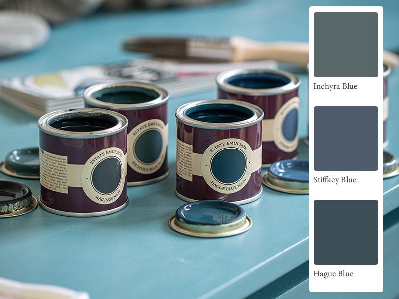
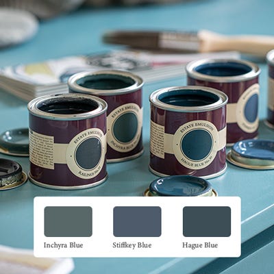
The best way to experience our colours before taking the plunge is with a true-to-colour paint sample. To help you narrow down your shortlist of shades, we've curated three of our most popular blue shades to help you find your perfect match.
Sample selection contains 3 x 100ml Sample Pots of our beautiful Inchyra Blue, Stiffkey Blue and Hague Blue.
Rated 5 out of
5 by
Laura H from
Blue/Grey Perfection!Beautiful shade that changes in different lights - a lovely grey/blue that paints on really well and has completely changed the feel of our living room.
Date published: 2024-03-31
Rated 5 out of
5 by
Mr.& Mrs D from
Porch projectWe have been planning quite a dramatic transformation of our porch and front door. The entrance to our house had an uneven brick paver floor, brick walls which had faded to a harsh orange, and a really unpleasant modern front door with Victorian style fancy mouldings around a panel of toilet glass.
We had the floor levelled and tiled with beautiful encaustic tiles in soft black with cream dots. We ordered six sample pots from Farrow and Ball, and chose Wimborne White for the brick walls, Pigeon for the wooden screens were having made to disguise the utility boxes, and after some deliberation, Vardo for the front door. The glass panel will be replaced as will the moulding around it and a new letterbox will complete the job without us having to buy an entirely new door.
It was a real help to be able to try out the colours first, particularly as our first choices for the door; Dix Blue or Kittiwake seemed too subtle. Vardo will be perfect!
Date published: 2024-03-26
Rated 5 out of
5 by
Taylor33 from
Fantastic colour for little boys nurseryFantastic colour and perfect finish for child’s room
Date published: 2024-03-17
Rated 5 out of
5 by
Irena from
Satisfied customerWe're very happy with the quality of the paint and the service we have received.
Date published: 2023-10-13
Rated 5 out of
5 by
DIY man carlisle from
Harry Potter!Used kittiwake alongside incarnadine and Dayroom yellow with wind dark in woodwork for a Harry Potter themed bedroom.also used duck green in en suite shower room.
Kittiwake has a relaxed feel about it and I have enough left to cover a small area.Wine dark on the woodwork is particularly nice with this colour
Date published: 2023-09-15
Rated 5 out of
5 by
Interiors Katie from
Great colourI didn’t like this colour at first after painting the whole dining room it felt too muted, however after using bamboozle and pink ground alongside it looks absolutely beautiful. I tried the new dead flat finish which is great as you can use it on multiple surfaces.
Date published: 2023-08-27
Rated 5 out of
5 by
mumofbikingboys from
Lovely paint.Beautiful colour and coverage. For Victorian-style bathroom
Date published: 2023-08-16
Rated 5 out of
5 by
Knaven Schoolhouse from
Gorgeous BlueBeautiful colour used in a bedroom we are currently turning into a dressing room. It’s not a cold blue. It’s perfect
Date published: 2023-05-10
Rated 5 out of
5 by
Jstokes from
Perfect for our Provence style kitchenI purchased the Farrow and Ball fan deck, and that really helped in providing the perfect accent color for the back door in our kitchen. We have classic terra cotta floors, and so changing the kitchen from all white paint to setting plaster walls with skimming stone trim, and the accent on the door in Kittiwake is just inspired. This blue is exactly like the color palette in the South of France on doors and shutters. Its not too bright -its a bit shaded, but a clear, soft blue. Like all Farrow and Ball paints it has interesting depth and richness to it -its a very happy color.
Date published: 2023-02-18
Rated 2 out of
5 by
WILLIAM 2024 from
Into the Kittiwake BluePainted our newly decorated hallway with Kittiwake (and Blue Maize for the staircase) from floor to ceiling . It was a gamble because there weren't much light coming through to the hallway and we worried painting it blue would make the space very dark but it turned out beautifully! What we loved about Kittiwake was that it made the whole space more airy, bright and calm. We LOVED it 😍
Back in 2010, we moved to an entirely water based range of finishes, becoming the first in the industry to do so. These low-odor, low-VOC finishes are easy to clean without harmful solvents. They also meet child- and baby-safe requirements in accordance with The Canada Cribs, Cradles and Bassinets Regulations, Canada Toy Regulations (SOR/2011-17) – Section 23 and ASTM F963 – 17 - Standard Consumer Safety Specification for Toy Safety.
Quality Finishes
Every one of our paint colours is available in a range of durable interior and exterior paint finishes, each rigorously tested to ensure an exceptional depth of colour and long-lasting finish. For the very best results, we always recommend using a Farrow & Ball Primer & Undercoat - see above for the correct tone for this colour.
Safety Information
Always read and follow the information on the product label.
All Farrow & Ball finishes except Limewash contain isothiazolinones, which may produce an allergic reaction. Farrow & Ball Limewash contains calcium hydroxide which can cause severe damage in contact with skin or eyes. For further information about our products, including guidance on safe use and application, click here to view our advice pages.
WARNING: This product can expose you to chemicals including acetaldehyde, which is known to the State of California to cause cancer. For more information, go to www.P65Warnings.ca.gov.