We accept card payments from Visa, Mastercard, Maestro and Amex.
Simply choose card payment and fill in your details at checkout to choose this option. In some cases, you’ll be asked to authorise the payment through your bank for additional security.
PayPal
With PayPal you can pay for your paint and paper in just a few easy steps.
Simply choose PayPal at checkout, confirm the payment on their website (you’ll need to log in or create an account if you don’t have one already), and then you’ll be redirected back to farrow-ball.com with your order complete.
Apple Pay
You can use Apple Pay when shopping on Apple devices and on a Safari browser. But you need to activate it in your Apple account and device first.
Choose Apple Pay at checkout, confirm the payment on your Apple device and you’ll be redirected back to farrow-ball.com with your order complete.
Klarna
Paint now, pay later with Klarna.
We’ve partnered with Klarna to offer you multiple ways to pay for your handcrafted paint and paper. Just look for the Klarna logo at checkout or visit our FAQ page to find out more.
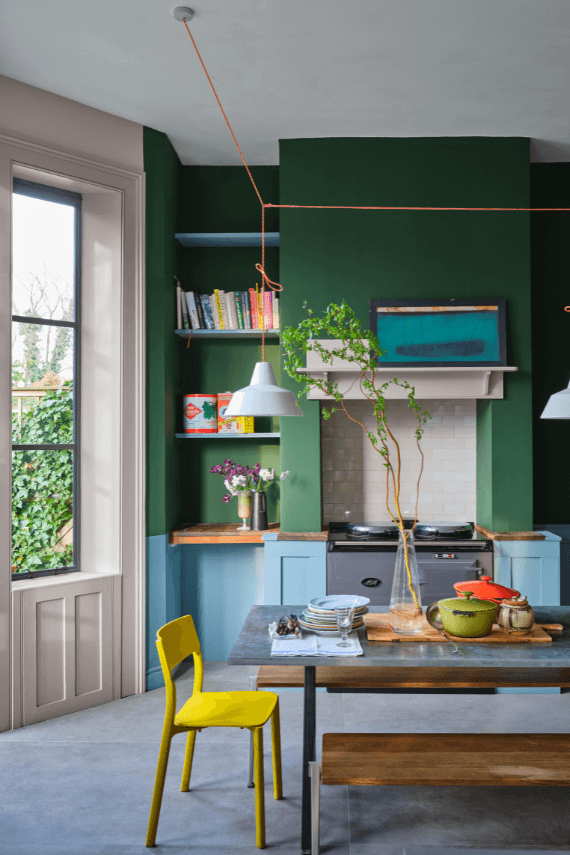
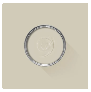
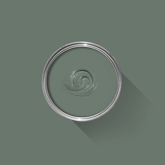
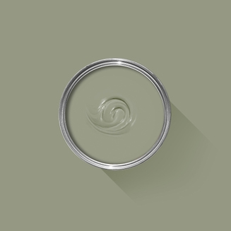
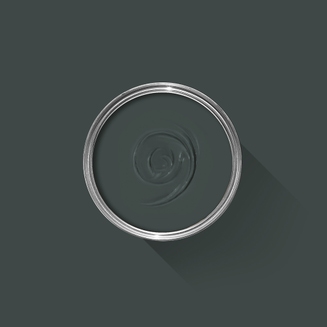
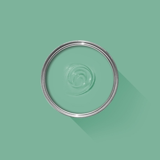
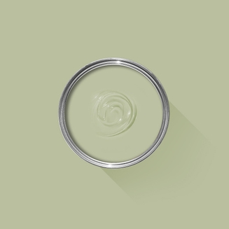
A clean, forest green
This clean mid green is named in honour of a kind and generous member of our Farrow & Ball team who is sadly no longer with us. A dependable, uncomplicated colour, with the ability to feel even greener in bright daylight or more conservative in lower light. This shade is a beautiful addition to any home.
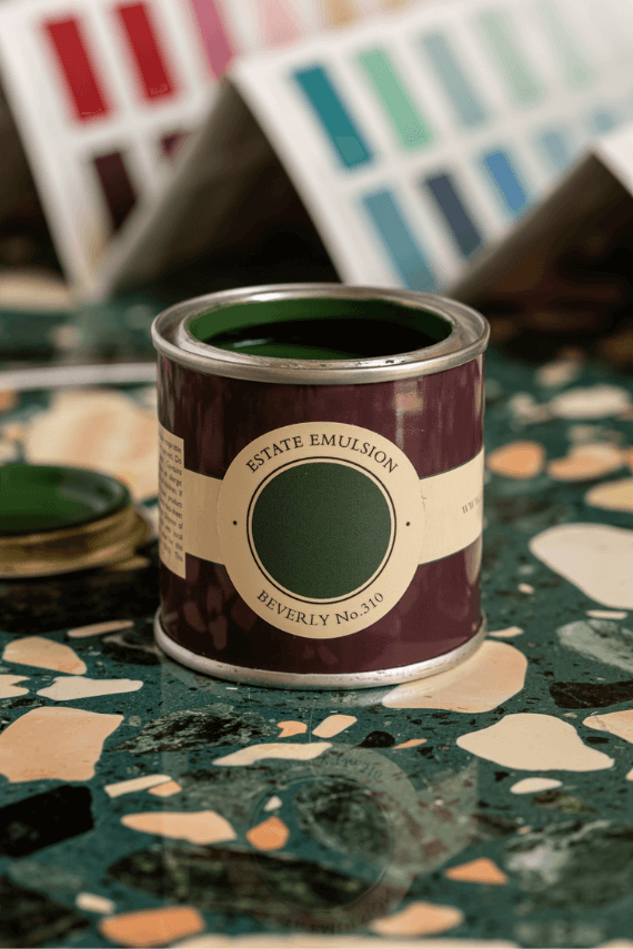
We’re dedicated to perfecting the art of paint. At our home in Dorset, we combine the finest ingredients, 75 years of experience and technical precision to help you create beautiful spaces that stay beautiful. Even in our colour rich paints, less than 8% of the tin is the colour. The other 92% is what creates the quality, depth and extraordinary response to light that transforms your home.
Paint is like coffee. The colour is the froth on the top, but it’s the quality of the rest of the cup that makes it taste good. – Richard Ball, Farrow & Ball Co-founder
We use twelve exclusive pigments, all specifically selected for their colour intensity. We take colour seriously, so naturally, we only accept the very best. By using these same pigments to make every colour in our palette, all our shades combine effortlessly, making it easy for you to put together a cohesive colour scheme.
Deeper, richer colours
Deeper, richer colours
Packed with pigment for an extraordinary response to every kind of light.
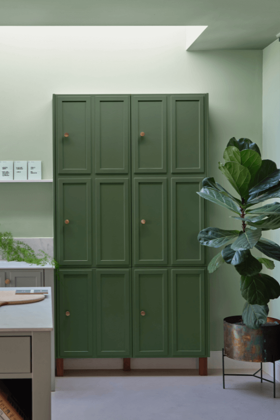
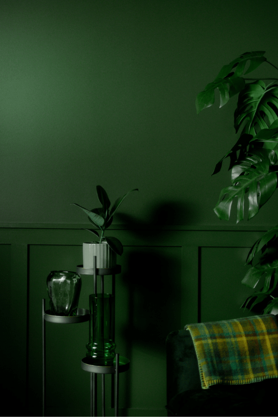
We add generous helpings of rich pigment to create our signature look – deep colours with complex undertones. The same space that feels bright and airy in morning sun, can feel cosy and intimate by evening. Our teams design each shade under every kind of light, so it will be perfectly balanced in every setting.
Extraordinary response to light
Extraordinary response to light
We spend months carefully crafting and testing each of our paint colours to make sure they share our signature extraordinary response to light. This beautiful reaction to changing light, like bringing out different undertones or shifting intensity, is what makes our paint so special.
Interior and exterior finishes
Interior and exterior finishes
From walls, floors and furniture to radiators, skirtings and sheds, our range of paint finishes can help you transform almost any surface in your home (and outside it, too).
We even have multi-surface finishes like Dead Flat and Full Gloss, so you can tackle walls, woodwork and metal at the same time.
Our comprehensive range is comprised of paint finishes that not only look beautiful, but offer different practical benefits. Designed for a variety of different surfaces, each finish is compatible with our high-performance Primers & Undercoats to ensure exceptional coverage, adhesion and depth of colour.
Colour Story
Complementary White
Shaded White
Shaded White has a gentle greyness making it incredibly versatile within homes both old and new. Find out more about Shaded White No.201
Every colour in the Farrow & Ball palette is paired with a specific shade of white, these are selected to celebrate a shared undertone and create harmonious spaces alongside your chosen colour.
When it comes to using dark colours, the deeper the better. So, for an irresistibly inviting finished look, pair darker shades with our Dark Tones Primer & Undercoat. Based on the colour of Down Pipe, combining this primer with your topcoat creates an unrivalled richness and makes quite the statement.
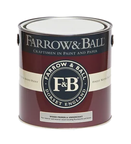
Made with the same natural ingredients and pigments as our topcoats, our Primer & Undercoat is the crucial foundation for creating a rich, even and longer lasting finish.
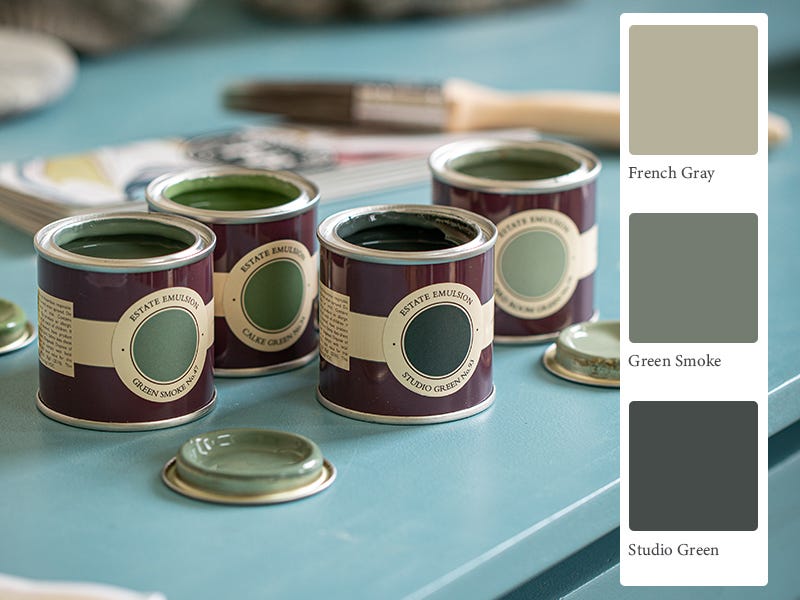
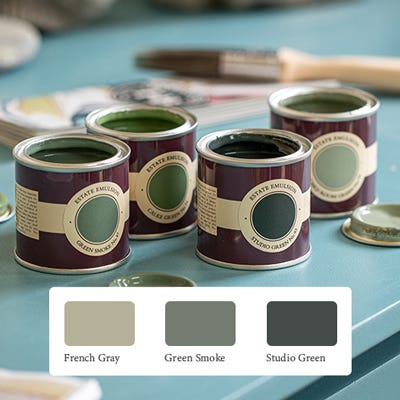
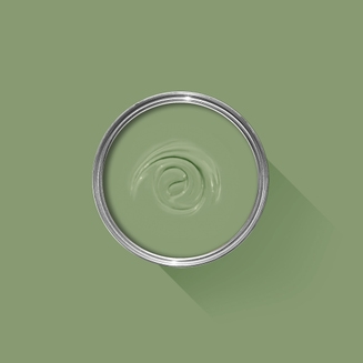
The best way to experience our colours before taking the plunge is with a true-to-colour paint sample. To help you narrow down your shortlist of shades, we've curated three of our most popular green shades to help you find your perfect match.
Sample selection contains 3 x 100ml Sample Pots of our beautiful French Gray, Green Smoke and Studio Green.
Rated 5 out of
5 by
AliH from
Lovely deep warm greenLove this green, very warm and adds a contrast to the breakfast room green
Date published: 2023-11-18
Rated 5 out of
5 by
Hcoombes from
Amazing colour!Lovely green colour. Easy to use, great consistency. Really added a modern warmth to my living room. Very happy
Date published: 2023-10-11
Rated 5 out of
5 by
ashleyb from
best greenLove this color; turned a small back room into a cozy, welcoming den that you never want to leave.
Date published: 2023-09-21
Rated 5 out of
5 by
P William from
Fabulous colour!We painted our snug in Beverly - decided to be bold and went for walls and ceiling! Delighted with the colour, makes the room feel so chic and cosy
Date published: 2023-09-14
Rated 5 out of
5 by
Luuc from
Love this colour so muchBeautiful green with yellow and red undertones. You won’t regret the choice
Date published: 2023-07-23
Rated 5 out of
5 by
Jojofg from
PerfectionDefinitely made the correct decision buying the Dead Flat paint and dark coloured primer. The colour is just exquisite.
Date published: 2023-07-18
Rated 5 out of
5 by
Chatters71 from
5stars for paint not customer serviceBeautiful paint. Dreadful customer service. Ordered online and spent the next week trying to convince customer service team they had taken my money and not delivered any product. Eventually got a refund after many calls and purchased the product from a local shop
Date published: 2023-07-05
Rated 5 out of
5 by
Anonymous from
Public SpaceI took a bit of a risk using Beverly for a small public function room that is rented frequently. The strategy was to increase the usage of the room for small dinner parties by having a more intimate and elegant look. So far, and I expect this will continue, everyone is very taken with the color and finish. I couldn't be more pleased. Now the rest of the room has to be upgraded!
Date published: 2023-06-26
Rated 5 out of
5 by
Aslippert from
We now have a beautiful front doorBeautiful colour, perfect for our front door. It needed three coats for full coverage.
Date published: 2023-06-05
Rated 5 out of
5 by
Anls from
BeverlyDries to a lovely rich full coloured green and the paint quality is fabulous- never used it before but I’m now a convert !
Date published: 2023-05-27
Rated 5 out of
5 by
Lily pond from
New Fabulous colourBe brave and use this new colour it looks fantastic - we have done a landing with lots of pictures and it is a great background for any picture - try it - will use it on another area
Date published: 2023-04-19
Rated 5 out of
5 by
Abfab from
Beautiful Beverly!Beverly was just the right shade of green I was looking for in my north facing garden room. It especially makes the room feel cosy at night. I have had so many positive comments on the choice of colour. It makes me smile every day!
Date published: 2023-04-18
Rated 5 out of
5 by
J Rowling from
The absolute best shade of green.I had my bedroom redecorated with a dark green wallpaper as my starting point and after buying tester pots in various shades I went for Beverly for the walls and woodwork and I’m so glad I did , it is the most stunning shade of green and my favourite as it’s the same shade of green as my favourite house at a very famous magical school. It looks stunning in daylight and at night with candle light or lamps , it’s just so rich and opulent looking. I also love that it’s been named in tribute to a Farrow and Ball staff member so she’ll live on forever.
Date published: 2023-03-02
Rated 5 out of
5 by
Melhmac from
Proper bottle greenBit nervous of this green at first, as swopped to Beverly from Calke Green at last minute, but so glad that I did. Walls in stirabout, not too far off the previous Cornforth White Bit nervous of this green at first, as swopped to Beverly from Calke Green at last minute, but so glad that I did. Walls in your new Stirabout, not too far off the previous Cornforth White finish.
Date published: 2022-11-12
Rated 5 out of
5 by
Grandma Costin from
GranddaughterI've been awaiting for this colour to paint our granddaughters bedroom in honour of her grannie.
Thankyou F&B
Date published: 2022-10-19
Rated 5 out of
5 by
Brain Lane from
Lovely Country GreenWhat a lovely colour , using on the Garden House on the estate.
Date published: 2022-10-01
Rated 4 out of
5 by
DrJDG from
Awesome colourAwesome colour. Tends to mark, chip and scratch. I’ve needed to do several touch ups
Date published: 2023-07-06
Rated 2 out of
5 by
jesssteph from
Extremely hard to get paint to coverLovely colour, very difficult to cover door despite thorough sanding, undercoat etc