We accept card payments from Visa, Mastercard, Maestro and Amex.
Simply choose card payment and fill in your details at checkout to choose this option. In some cases, you’ll be asked to authorise the payment through your bank for additional security.
PayPal
With PayPal you can pay for your paint and paper in just a few easy steps.
Simply choose PayPal at checkout, confirm the payment on their website (you’ll need to log in or create an account if you don’t have one already), and then you’ll be redirected back to farrow-ball.com with your order complete.
Apple Pay
You can use Apple Pay when shopping on Apple devices and on a Safari browser. But you need to activate it in your Apple account and device first.
Choose Apple Pay at checkout, confirm the payment on your Apple device and you’ll be redirected back to farrow-ball.com with your order complete.
Klarna
Paint now, pay later with Klarna.
We’ve partnered with Klarna to offer you multiple ways to pay for your handcrafted paint and paper. Just look for the Klarna logo at checkout or visit our FAQ page to find out more.
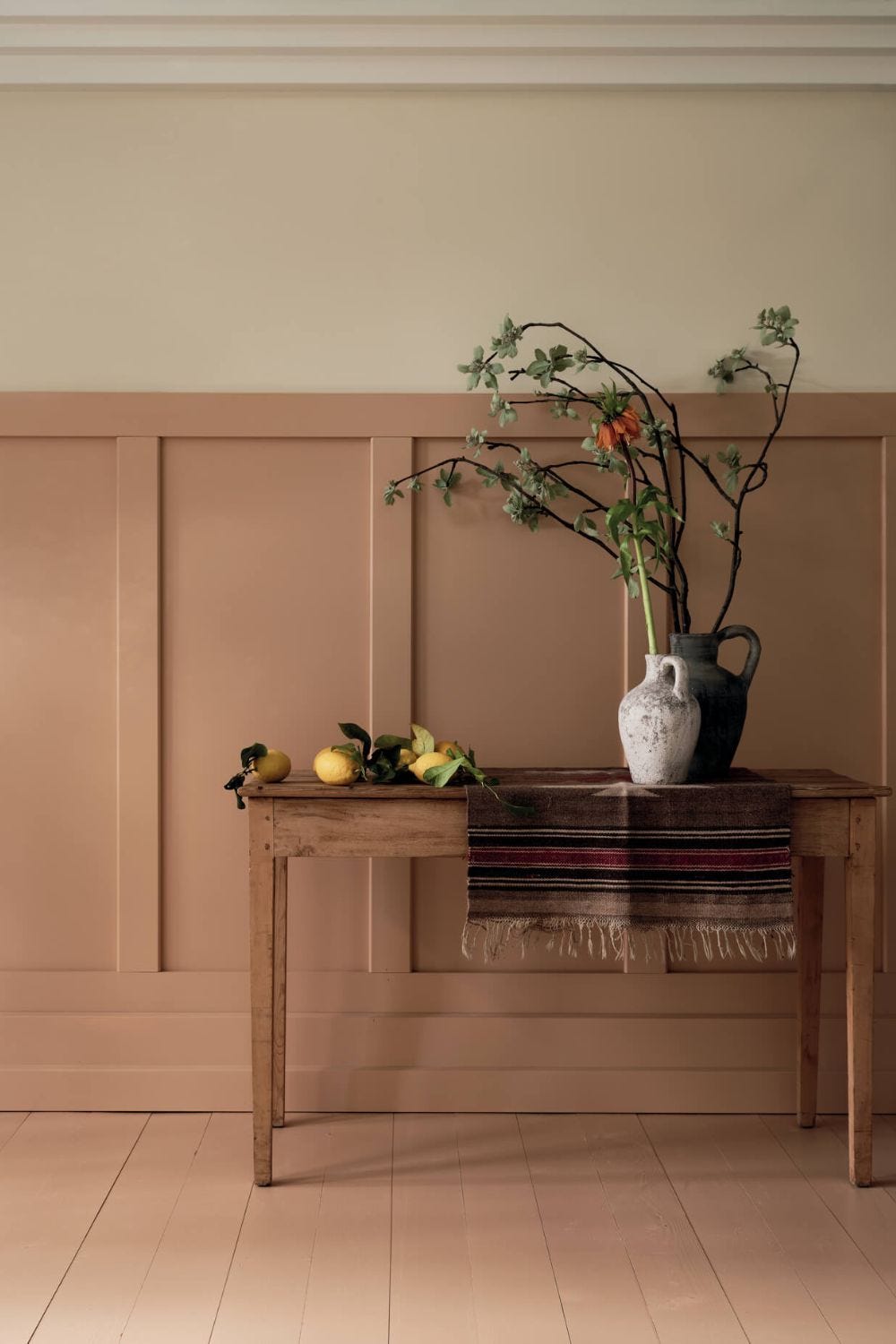
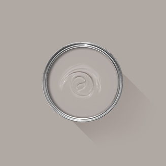
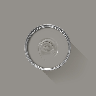
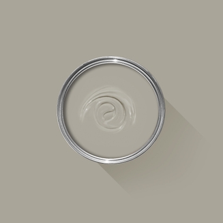
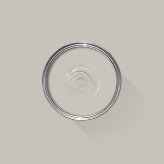
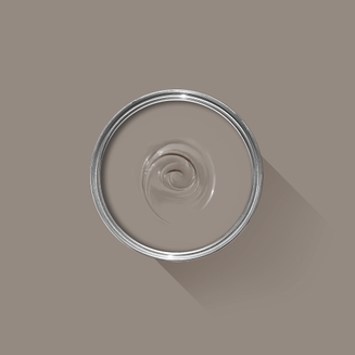
Modern Eggshell
This mid tone neutral is named in memory of John Cornforth, the revered architectural historian and author of English Decoration in the 18th Century.
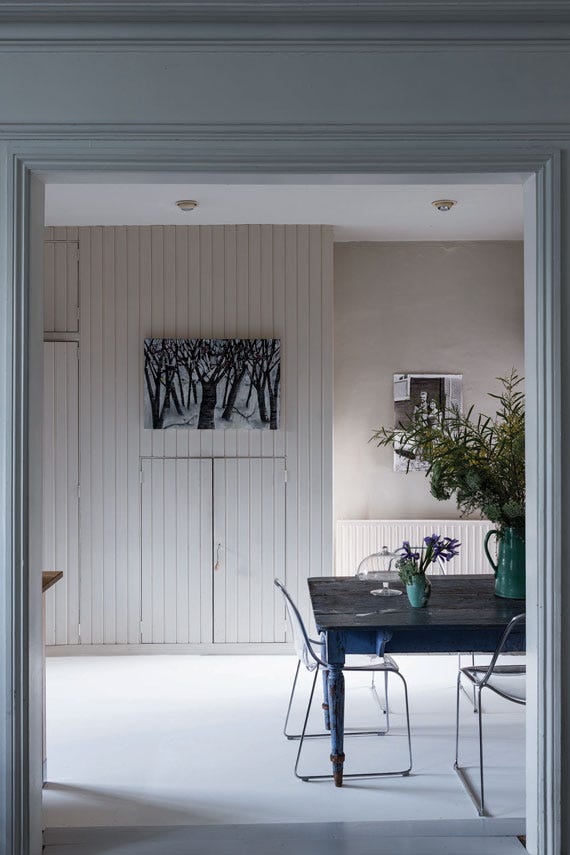
Modern Eggshell is our toughest interior finish, adding lasting colour and protection to interior wood, metal and concrete. It’s even tough enough for floors and kitchen cabinets.
@thewoodworks
Recommended Primer & Undercoat:White and Light Tones
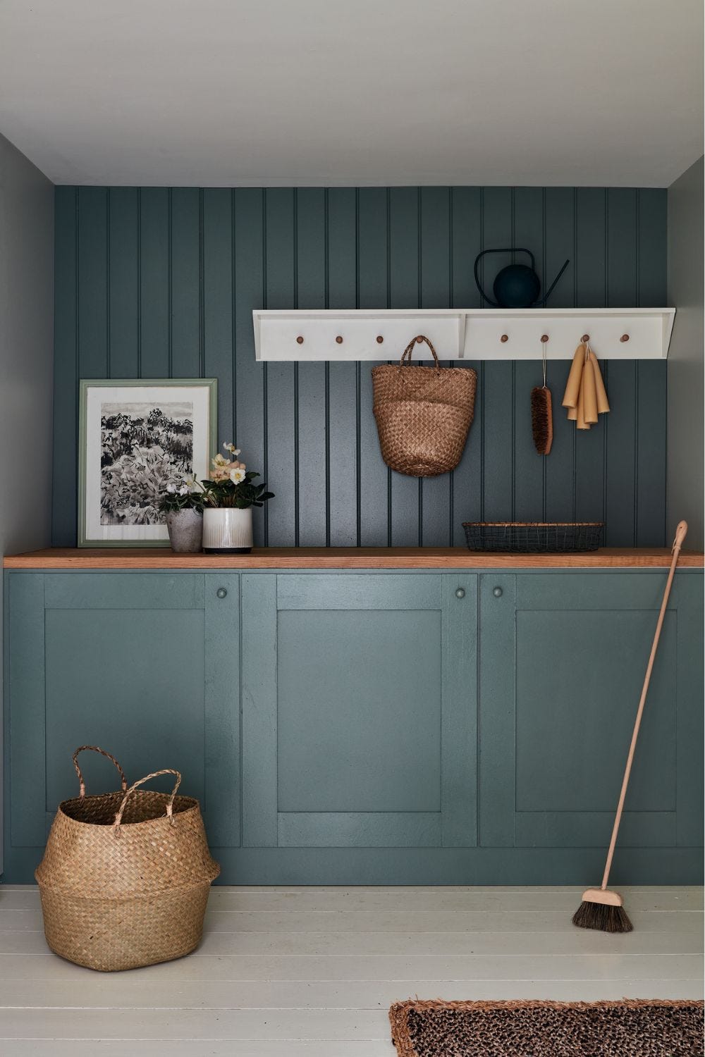
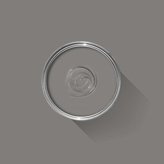
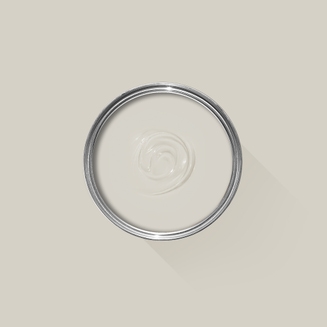
Our super-tough mid shine finish with a 40% sheen.
Our deeper, richer colours are available in a range of finishes with different sheen levels. Sheen always affects how colour appears: the same shade in gloss can look very different in matt. That’s why we specifically adjust the formula for every finish to make sure the balance is exactly right and you get the colour you were expecting. Our colours and finishes are formulated together, so you simply can’t have one without the other.
For interior wood, metal and
concrete
For interior wood, metal and
concrete
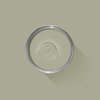
Add colour and protection to interior wood, metal, and concrete surfaces. This ultra-durable eggshell is even tough enough for floors, and can be used throughout the home on skirting, doors, kitchen cabinets, furniture, and radiators.
From walls, floors and furniture to radiators, skirtings and sheds, our range of paint finishes can help you transform almost any surface in your home (and outside it, too). Browse our full selection of finishes to find the perfect paint for your project.
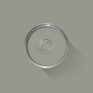
Tough enough for floors
Tough enough for floors
This ultra-durable eggshell is even tough enough for interior wooden and concrete floors.
From walls, floors and furniture to radiators, skirtings and sheds, our range of paint finishes can help you transform almost any surface in your home (and outside it, too). Browse our full selection of finishes to find the perfect paint for your project.
Our most durable finish
Our most durable finish
Modern Eggshell is our toughest finish — it’s even suitable for floors. Formulated by our experts using the finest ingredients, it’s washable, wipeable and stands up to scuffs or scrapes.
100% water based
100% water based
We’re proud to have been the first in the industry to transition to a completely water based range back in 2010. As a result, all of our finishes, including our tough trim and floor paints, are made with a low-odour, low-VOC water base that scores A+ for indoor air quality.
Plus, our water based paint doesn’t discolour over time like solvent based paints can. So your spaces stay beautiful for longer.
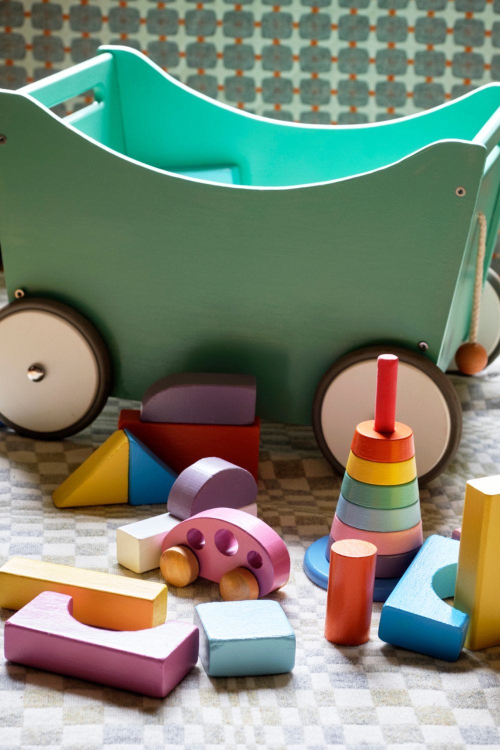
Toy safe
Toy safe
This finish is independently tested and certified toy-safe in accordance with Safety of Toys Part 3: Migration of certain elements (EN 71-3:2019+A1:2021). That means you can and a splash of colour to toys, cribs and other surfaces little ones come into contact with. Our paints also have hardly any odour and don’t need any solvents to clean up, so you can breathe easy during application and beyond.
75 Years of Perfecting Paint
If you've ever wondered what it is that makes Farrow & Ball so special, you'll find the answers here.
From our high-quality ingredients to our artisanal methods, our 100% water based range of finishes and responsible practices, it's about so much more than just paint and paper.
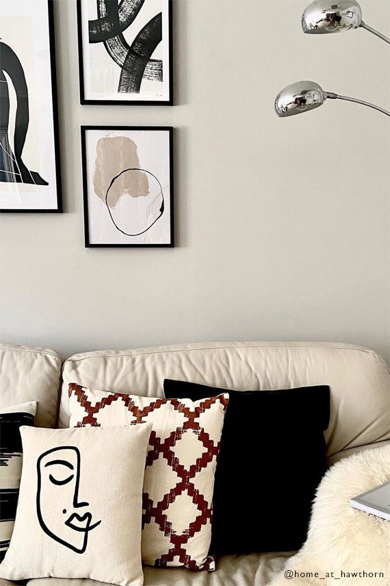
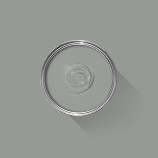
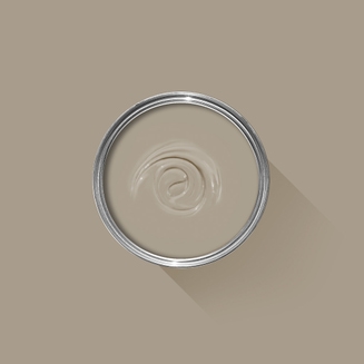
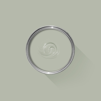
Complementary White
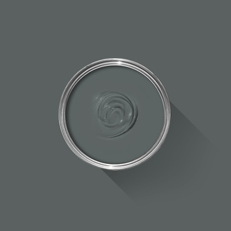
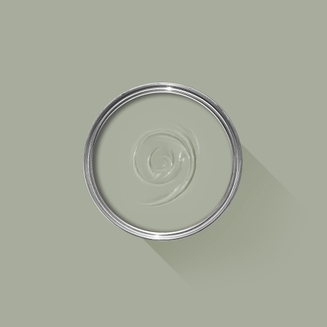
Wevet
One of our Easy Neutrals, Wevet is clean, understated and incredibly easy to live with. Find out more about Wevet No.273
Every colour in the Farrow & Ball palette is paired with a specific shade of white, these are selected to celebrate a shared undertone and create harmonious spaces alongside your chosen colour.
Recommended Primer & Undercoat
White & Light Tones
Our White & Light Tones Primer & Undercoat creates a wonderful base for our softest shades. Covering imperfections on your surface and adding extra depth of colour, this primer is based on our simplest colour, All White.
Made with the same natural ingredients and pigments as our topcoats, our Primer & Undercoat is the crucial foundation for creating a rich, even and longer lasting finish.
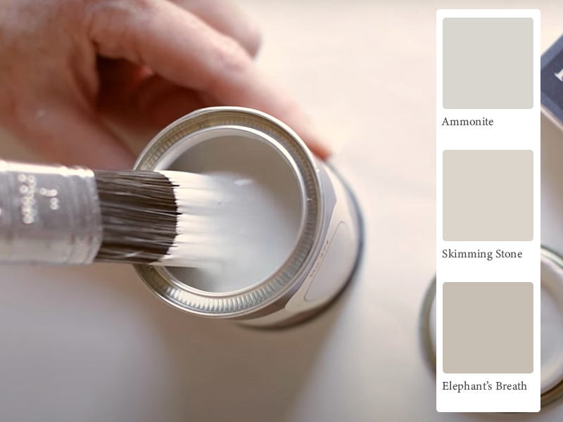
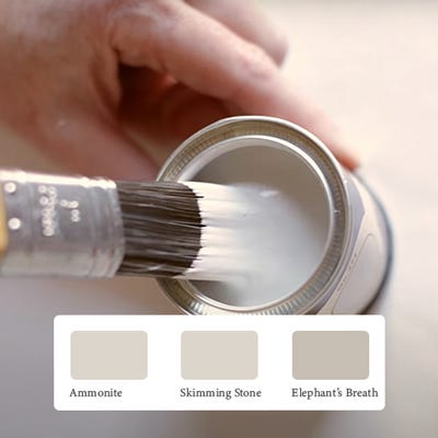
The best way to experience our colours before taking the plunge is with a true-to-colour paint sample. To help you narrow down your shortlist of shades, we've curated three of our most popular grey shades to help you find your perfect match.
Sample selection contains 3 x 100ml Sample Pots of our beautiful Ammonite, Skimming Stone and Elephant's Breath.
Rated 5 out of
5 by
KWConcierge.Vegas from
Worth every pennyOver the last few years this has become our go to paint for all of our remodels. Shows well in browns or grey and the paint itself is amazing.
Date published: 2024-04-17
Rated 5 out of
5 by
DebSlav from
Relaxing colourPaint our en-suite and bedroom in this colour and it’s gorgeous. Very calm and relaxing colour