

Design by Becca Interiors, Photography by Rikki Synder
Dive into the timeless elegance of The Greenwich Edit.
A collection of colours curated by local Farrow & Ball Colour Consultant Kathleen Brennan, this edit pays homage to the rich heritage, prestigious architecture, and idyllic coastal living of this historic town.
Capture the essence of Greenwich, Connecticut in your home.
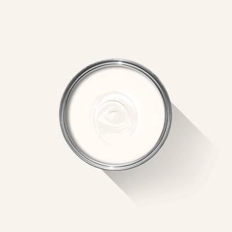
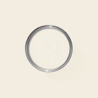
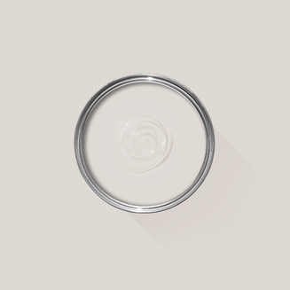
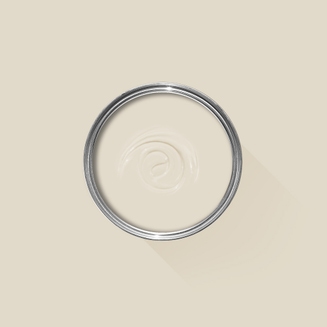
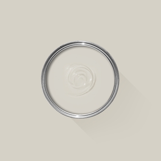
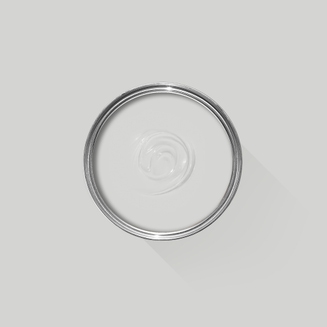
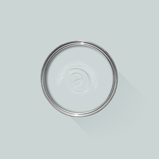
Neutrals
Build spaces that exude refinement and sophistication.
All White – this clean white, neither warm nor cool, is reminiscent of the crisp table linens found in the local fine eateries.
Wimborne White – a classic creamy white, much like beautiful English roses found in the gardens of backcountry estates.
Strong White – a weighted, modern white, conjuring imagery of canvas sails seen tacking back and forth on Long Island Sound.
Slipper Satin – this delicate neutral pays homage to the performing arts, taking its name from the silk used on ballet slippers.


Left: Design by Ariel Okin Interior, Right: Design by Fawn Galli, Photography by Richard Powers
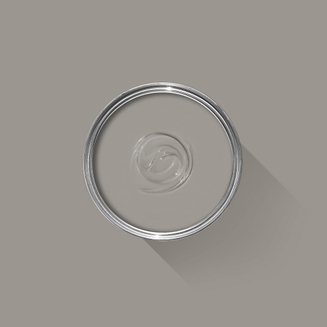
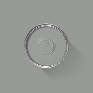
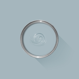
Grays
Let your spaces tell a story with a mix of cool and warm grays to create an atmosphere of opulence or provide a backdrop for elements of accentuating details.
Ammonite – a warm, soft gray, like that of the weathered clapboard or shingles seen on many of the town’s older homes.
Worsted – like the fine wool fabric used for bespoke suits, this warm, deep gray creates a sense of coziness wherever it is used.
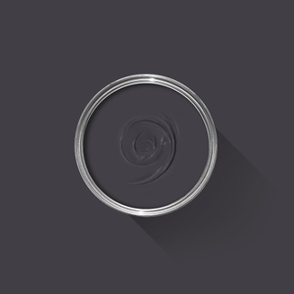
Blackened – a cool, pale gray like a soft early-morning rain.
Manor House Gray – the name says it all. Like the many fine homes found in the town of Greenwich, this strong mid-weight gray makes a statement.


Design by Becca Interiors, Photography by Rikki Synder
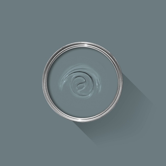
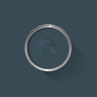
Blues
Our historic blues offer shades to transform your home into a sanctuary of dedicated sophistication.
Borrowed Light – the softest of blues, it whispers of summer garden parties.
Parma Gray – mirrors the color of blue skies on a warm, hazy day.
De Nimes – a denim blue, familiar and comfortable, that works to create a sense of calm.
Hague Blue – a deep marine blue, mysterious in its changeability like the ocean whose luminous waters border the town.


Design by Hendricks Churchill, Photography by Chris Mottalini
Accents
Picture the verdant beauty of the sprawling estates and manicured gardens. These hues reflect the town’s surroundings, with a versatile range of colours that can be mixed and matched, shared and loved.
Paean Black – like the skin of a ripe eggplant found at the town farmer’s market, this luscious deep purple adds stately elegance to the home.
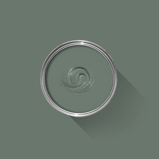
Green Smoke – with green in its name, how can our list not include a green for Greenwich? This deep blue green speaks to the backwoods forests and the curling smoke of a savored cigar.
Railings – as the name implies, this black with a blue undertone is reminiscent of the decorative ironwork gates seen around town.
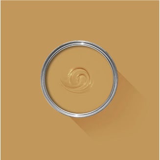
India Yellow – this rich gold harks back to the Greenwich’s early founding in the 17th century, with a unique and versatile application of a timeless hue.


Left: Design by Stephanie Sabbe, Photography by Stephen Karlisc, Right: Photography by Aaron Dougherty

About Kathleen
A member of the Farrow & Ball team for seven years, Kathleen is an expert in colour and light.
From coastal homes to urban showhouses such as the 2023 Elle Décor penthouse, her project list is a masterclass in transforming spaces with colour.
She has an enduring passion for the timeless beauty and character of Greenwich, which is reflected in her work through the blend of tradition and innovation that characterizes her colour stories.
Visit our Greenwich Showroom
Whether you want advice on color schemes, how to redecorate a room or you're overwhelmed by choice, our colour experts are here to help you create a space you love.