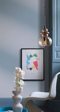
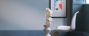
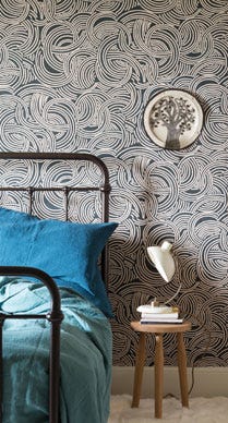
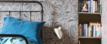
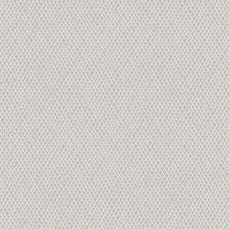
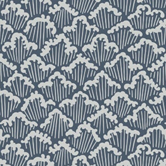
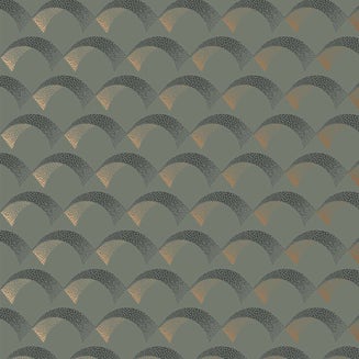
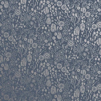
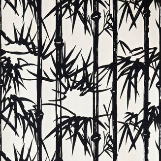
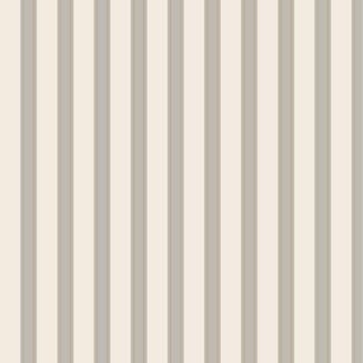
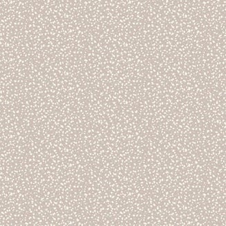
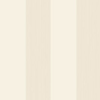
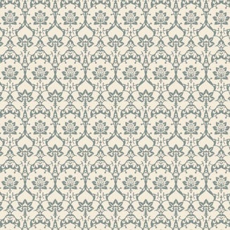
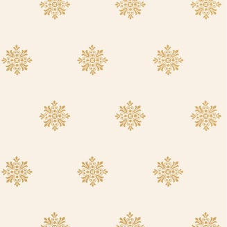
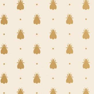
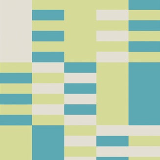
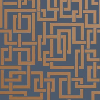
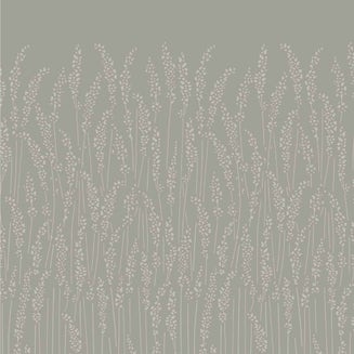
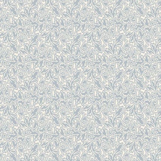
Lotus
This elegant lotus flower design is drawn from 19th century French archives. Its sweeping curves and dramatic motif create a mesmerising pattern across walls, ceilings and even within cupboards.

Lotus BP 2063
REIMAGINED BY MICHAEL DURAND, COLOUR CONSULTANT AT OUR LYON SHOWROOM
Our Lotus wallpaper is incredibly popular, but I wanted to make it even more striking. Setting Plaster creates a warm and timeless backdrop for the Off-Black pattern.
“This soft black is one of the original Farrow & Ball colours. Off-Black is more flattering to adjacent colours than stronger blacks as it feels so much milder in tone. Paint onto the trim, doors and even floors of rooms papered in this pattern to ground your scheme.
Since joining Farrow & Ball in 2014, I’ve been inspired by the similar colour combinations within our Tourbillon and Gable designs.”
Lotus BP 2064
REIMAGINED BY PHILIPPE SZCZUKA, COLOUR CONSULTANT AT OUR PARIS RIVE GAUCHE SHOWROOM
Lotus is a statement in itself, so I’ve tempered this striking pattern with two similar tones. Here Vardo and Breakfast Room Green are both full of life, but equally weighted in their brightness.
Some spaces within our home are often left forgotten, but can be swiftly transformed into a brilliant pocket of pattern and colour. It might be a level between two floors, the inside of a pantry or the back of a bookshelf.


Lotus BP 2065
REIMAGINED BY PATRICK O’DONNELL, INTERNATIONAL COLOUR CONSULTANCY MANAGER
I wanted the combination to be one of drama and richness, giving an almost jacquard weave effect with only a slight contrast between the ground and print colour.
“Red is set to be incredibly popular over the coming months and I wanted to acknowledge this with Brinjal rather than a more traditional red tone.
This colourway would work incredibly well in a dining room - a space used most often at night. Just imagine how dramatic the pattern would feel lit only by candles and table lamps!”