You can use Apple Pay when shopping on Apple devices and on a Safari browser.
Klarna
Paint now, pay later with Klarna.
We’ve partnered with Klarna to offer you multiple ways to pay for your handcrafted paint and paper.
Available in United Kingdom, Austria, Spain, Finland, Ireland, Italy and The Netherlands only.
PayPal
With PayPal you can pay for your paint and paper in just a few easy steps.
Card Payments
We also accept card payments from Visa, Mastercard, Maestro and Amex
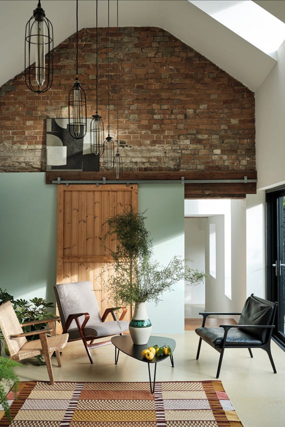
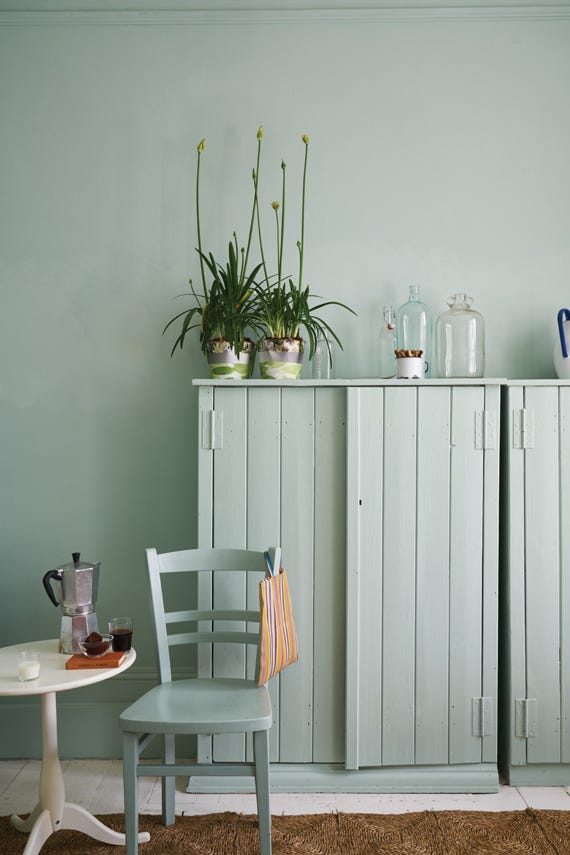
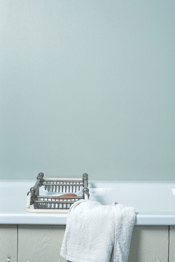
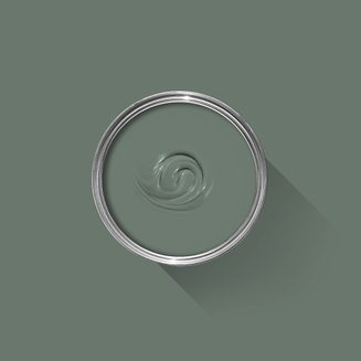
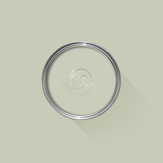
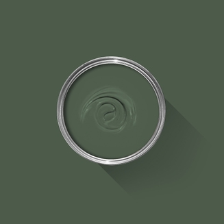
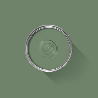
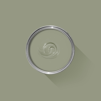
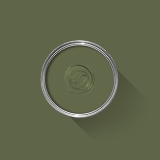
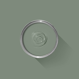
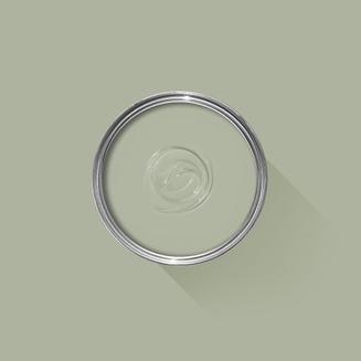
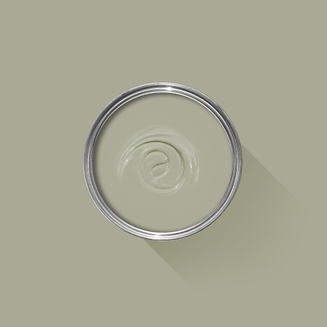
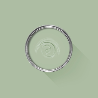
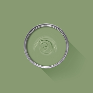
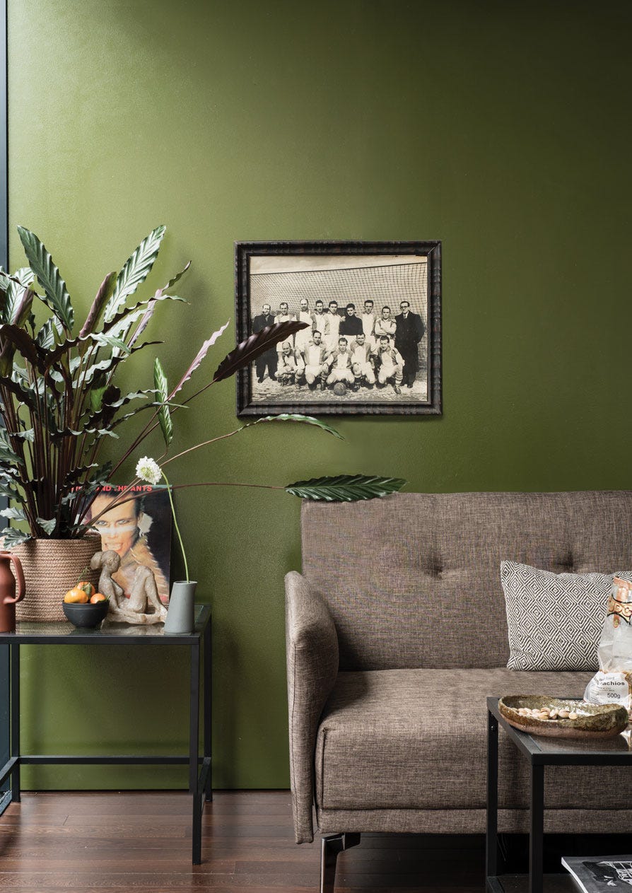
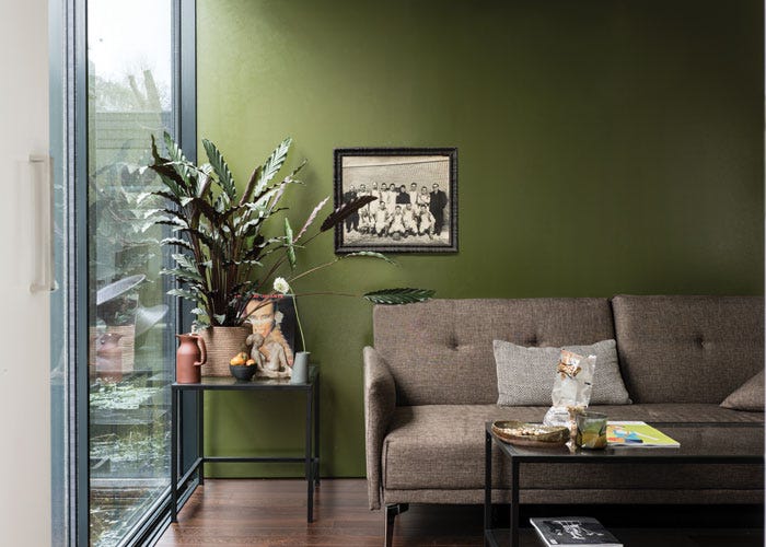
A fresh aqua tone
This mid aqua is named after a much valued, early member of our creative team - and yes, the pun is intended! Teresa's Green owes its freshness to a rich blue base and its warmth to soft green undertones. In the middle of our range of aquas, Teresa’s Green has a calming and therapeutic effect, but still feels cheerful when combined with delicate shades like White Tie.
We’re dedicated to perfecting the art of paint. At our home in Dorset, we combine the finest ingredients, 75 years of experience and technical precision to help you create beautiful spaces that stay beautiful. Even in our colour rich paints, less than 8% of the tin is the colour. The other 92% is what creates the quality, depth and extraordinary response to light that transforms your home.
Paint is like coffee. The colour is the froth on the top, but it’s the quality of the rest of the cup that makes it taste good. – Richard Ball, Farrow & Ball Co-founder
We use twelve exclusive pigments, all specifically selected for their colour intensity. We take colour seriously, so naturally, we only accept the very best. By using these same pigments to make every colour in our palette, all our shades combine effortlessly, making it easy for you to put together a cohesive colour scheme.
Deeper, richer colours
Deeper, richer colours
Packed with pigment for an extraordinary response to every kind of light.
We add generous helpings of rich pigment to create our signature look – deep colours with complex undertones. The same space that feels bright and airy in morning sun, can feel cosy and intimate by evening. Our teams design each shade under every kind of light, so it will be perfectly balanced in every setting.
Extraordinary response to light
Extraordinary response to light
We spend months carefully crafting and testing each of our paint colours to make sure they share our signature extraordinary response to light. This beautiful reaction to changing light, like bringing out different undertones or shifting intensity, is what makes our paint so special.
Interior and exterior finishes
Interior and exterior finishes
From walls, floors and furniture to radiators, skirtings and sheds, our range of paint finishes can help you transform almost any surface in your home (and outside it, too).
We even have multi-surface finishes like Dead Flat® and Full Gloss, so you can tackle walls, woodwork and metal at the same time.
Our comprehensive range is comprised of paint finishes that not only look beautiful, but offer different practical benefits. Designed for a variety of different surfaces, each finish is compatible with our high-performance Primers & Undercoats to ensure exceptional coverage, adhesion and depth of colour.
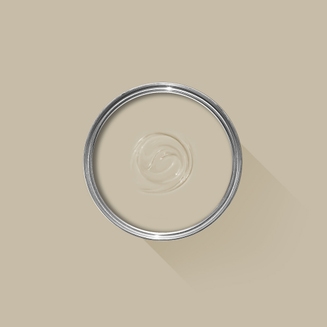
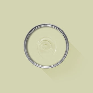
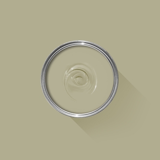
Complementary White
School House White
School House White is pared back, timeless and familiar without the cool undertones of the more contemporary neutral groups. Find out more about School House White No.291
Every colour in the Farrow & Ball palette is paired with a specific shade of white, these are selected to celebrate a shared undertone and create harmonious spaces alongside your chosen colour.
Based on the colour Bone, using our Mid Tones Primer & Undercoat adds the richest depth of colour to some of our best-selling shades.
Made with the same natural ingredients and pigments as our topcoats, our Primer & Undercoat is the crucial foundation for creating a rich, even and longer lasting finish.
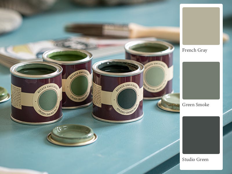
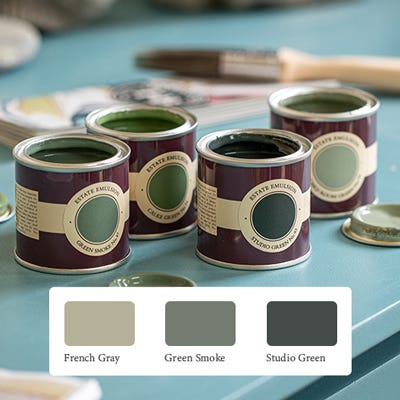
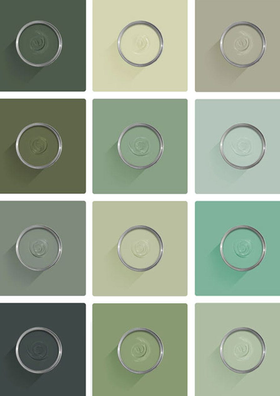
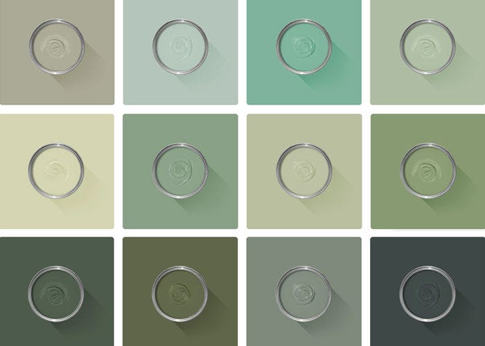
The best way to experience our colours before taking the plunge is with a true-to-colour paint sample. To help you narrow down your shortlist of shades, we've curated three of our most popular green shades to help you find your perfect match.
Sample selection contains 3 x 100ml Sample Pots of our beautiful French Gray, Green Smoke and Studio Green.
Our expert Colour Consultants are ready and waiting to help bring your style to life. If you’d like personalised advice on how to use our paint and papers in your home, book an in-home or virtual appointment today.
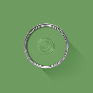
If you’re looking to bring life to your space, there’s one colour that always flourishes. Green paint is a lush and uplifting choice for every room of the house.
Rated 5 out of
5 by
KiwiJeffyC from
Lovely calm colourUsed this for one wall in my office and did other three in White Tie. Just a really lovely warm and calming colour.
Date published: 2024-03-22
Rated 5 out of
5 by
Anonymous from
LovelyLovely lovely lovely nice colour. Easy to apply. Nice
Date published: 2023-11-25
Rated 5 out of
5 by
Paul Gr from
Great paintgreat colour really easy to apply, excellent finish and practically no smell unlike some other brands
Date published: 2023-11-20
Rated 5 out of
5 by
JeanM from
Teresa's GreenJust the shade I had been searching for, as all Farrow & Ball paints I have used before, this was a
delight to use and produces an excellent finish
Date published: 2023-10-14
Rated 5 out of
5 by
Kat60 from
Just the job.Brilliant paint as always. I bought Teresa’s Green to paint in my small hallway which had been painted in a Eau de Nil colour from another supplier. I read on line that this was a similar shade, it is you can’t really tell the difference in the shade just Farrow & Ball is far better quality.
Date published: 2023-08-05
Rated 5 out of
5 by
Anonymous from
Gorgeous colourI bought Teresa’s green for my hall how fab does it look love farrow and ball paint
Date published: 2023-08-05
Rated 5 out of
5 by
Netty63 from
Superb colourLovely colour painted my garden trellis two coats needed but loved the results looks great
Date published: 2023-07-24
Rated 5 out of
5 by
Coachekwe from
Teresa's Green is sublimeThis is one of the most wonderful greens! It does show quite a bit lighter and less saturated in sunlight. I painted my front door which receives direct sunlight for much of the day in two coats. Still too light for my dark siding, so I'll be tinting it slightly with a touch of Green Smoke or maybe Vert de Terre. Thank you for making wonderful paints and for making it so easy to acquire them!
Date published: 2023-06-29
Rated 5 out of
5 by
Lalarose from
chameleon green.This color is so....i don't know. It's a chameleon, in a good way. Sometimes it's green and sometimes it's light aqua (at night, a little grey), and it's fun watching the colors change down my hallway throughout the day. I was looking for something to brighten a dark hallway, and this made it cheery. I used both modern emulsion and dead flat. I must say the dead flat took more coats and the modern emulsion rolled much smoother (but there's a sheen). I'm torn on which I like better.
Date published: 2023-06-07
Rated 5 out of
5 by
YL33 from
Beautiful colour!I recently bought Theresa’s Green and White Tie paint and I Absolutely love the colours! We have an east facing room and the colours look great in all light, but especially first thing in the morning in the sunshine! The quality is great and so easy to put on, I’ll definitely be buying Farrow and Ball again.
Date published: 2023-06-02
Rated 5 out of
5 by
Anonymous from
Great in north facing roomMy north facing living room is painted in Teresa Green and I absolutely love it. Looks fresh during the day - even when cloudy but cosy at night.
Date published: 2023-03-06
Rated 5 out of
5 by
booklover from
FantasticWe just painted my daughter's small east-facing bedroom this color. We used Pavilion Blue for the ceiling but kept the trim and the doors Teresa's Green. It is an absolutely gorgeous color and she was thrilled and surprised that there was no lingering unpleasant paint odor that comes with other brands. It was pricier than other brands but the trade-off is worth it and I have no intentions to repaint for another 10 years or so!
Date published: 2023-02-04
Rated 3 out of
5 by
Anonymous from
Lovely colour, but think twice about Dead FlatLovely colour, but think twice about Dead Flat. We normally use Modern Emulsion and I would say it goes further. We used two 5L tubs for a low-ceiling loft room, which was a lot, and coat considerably more than Modern Emulsion. Yes, it goes on wood/radiators, but due to how flat it is, you may not want to use this on highly used areas like doors, not that we had enough left over to do this anyway. Next time I would spend less and go for the usual emulsion and eggshell combo, which I think would look better too.