You can use Apple Pay when shopping on Apple devices and on a Safari browser.
Klarna
Paint now, pay later with Klarna.
We’ve partnered with Klarna to offer you multiple ways to pay for your handcrafted paint and paper.
Available in United Kingdom, Austria, Spain, Finland, Ireland, Italy and The Netherlands only.
PayPal
With PayPal you can pay for your paint and paper in just a few easy steps.
Card Payments
We also accept card payments from Visa, Mastercard, Maestro and Amex
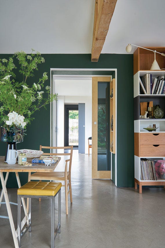
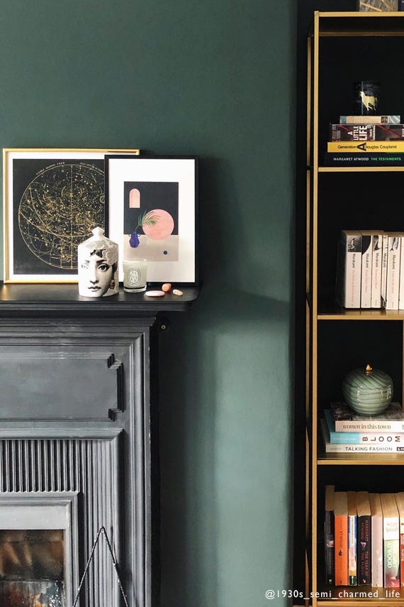
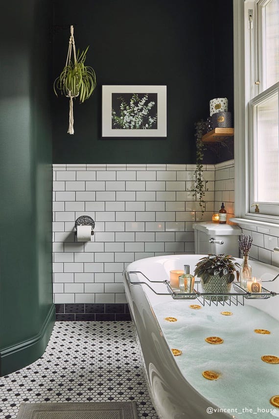
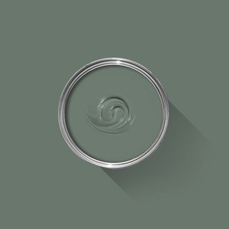
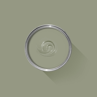
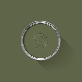
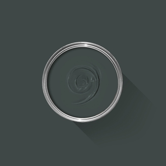
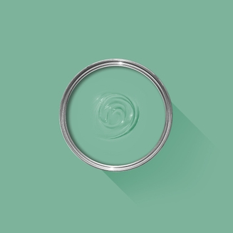
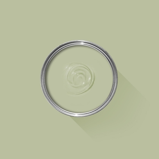
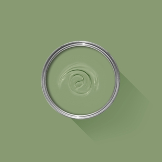
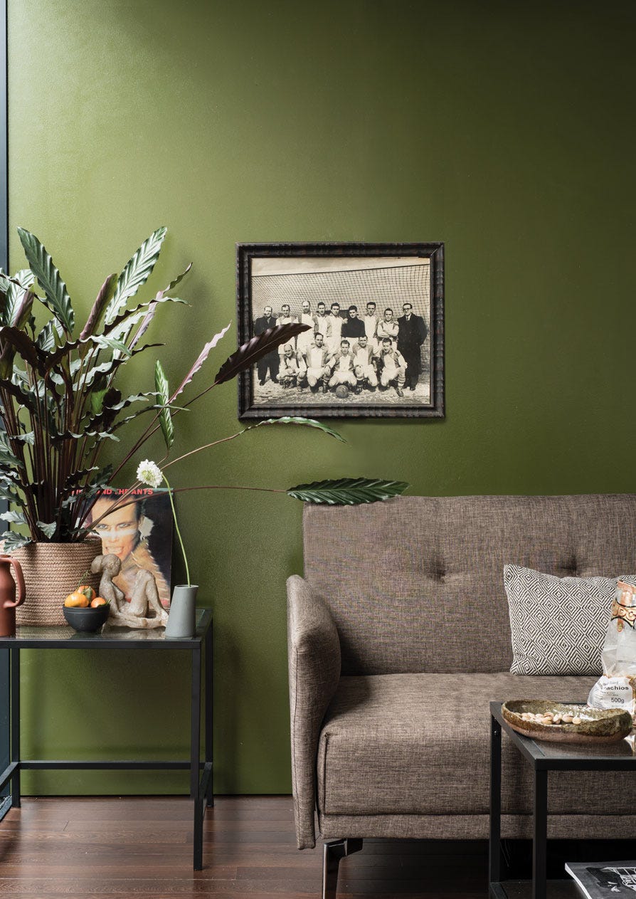
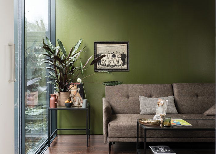
A deep, dark green
Our darkest green is also the colour painted on the original studio at Farrow & Ball, where many of our very first colours were created. When brushed onto exterior surfaces, the rich pigments respond extraordinarily to all types of light and magically appear much greener than on our colour card. Within the home, this deep hue appears almost black unless in very well lit rooms.
We’re dedicated to perfecting the art of paint. At our home in Dorset, we combine the finest ingredients, 75 years of experience and technical precision to help you create beautiful spaces that stay beautiful. Even in our colour rich paints, less than 8% of the tin is the colour. The other 92% is what creates the quality, depth and extraordinary response to light that transforms your home.
Paint is like coffee. The colour is the froth on the top, but it’s the quality of the rest of the cup that makes it taste good. – Richard Ball, Farrow & Ball Co-founder
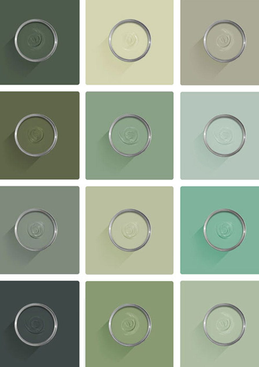
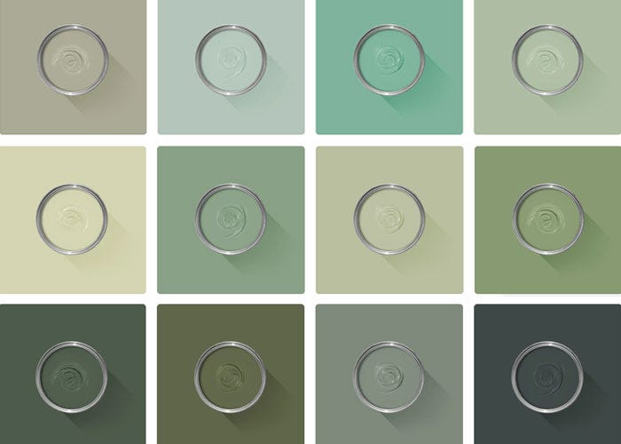
We use twelve exclusive pigments, all specifically selected for their colour intensity. We take colour seriously, so naturally, we only accept the very best. By using these same pigments to make every colour in our palette, all our shades combine effortlessly, making it easy for you to put together a cohesive colour scheme.
Deeper, richer colours
Deeper, richer colours
Packed with pigment for an extraordinary response to every kind of light.
We add generous helpings of rich pigment to create our signature look – deep colours with complex undertones. The same space that feels bright and airy in morning sun, can feel cosy and intimate by evening. Our teams design each shade under every kind of light, so it will be perfectly balanced in every setting.
Extraordinary response to light
Extraordinary response to light
We spend months carefully crafting and testing each of our paint colours to make sure they share our signature extraordinary response to light. This beautiful reaction to changing light, like bringing out different undertones or shifting intensity, is what makes our paint so special.
Interior and exterior finishes
Interior and exterior finishes
From walls, floors and furniture to radiators, skirtings and sheds, our range of paint finishes can help you transform almost any surface in your home (and outside it, too).
We even have multi-surface finishes like Dead Flat® and Full Gloss, so you can tackle walls, woodwork and metal at the same time.
Our comprehensive range is comprised of paint finishes that not only look beautiful, but offer different practical benefits. Designed for a variety of different surfaces, each finish is compatible with our high-performance Primers & Undercoats to ensure exceptional coverage, adhesion and depth of colour.
Colour Story
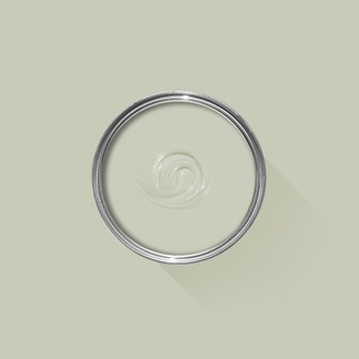
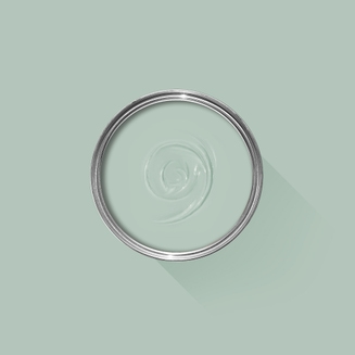
Complementary White
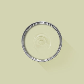
Off White
Off White's underlying green gives it an unsurpassed softness, creating a chalky and traditional wall colour or a sophisticated woodwork tone. Find out more about Off White No.3
Every colour in the Farrow & Ball palette is paired with a specific shade of white, these are selected to celebrate a shared undertone and create harmonious spaces alongside your chosen colour.
When it comes to using dark colours, the deeper the better. So, for an irresistibly inviting finished look, pair darker shades with our Dark Tones Primer & Undercoat. Based on the colour of Down Pipe, combining this primer with your topcoat creates an unrivalled richness and makes quite the statement.
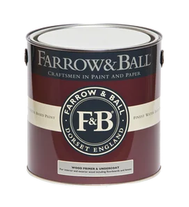
Made with the same natural ingredients and pigments as our topcoats, our Primer & Undercoat is the crucial foundation for creating a rich, even and longer lasting finish.
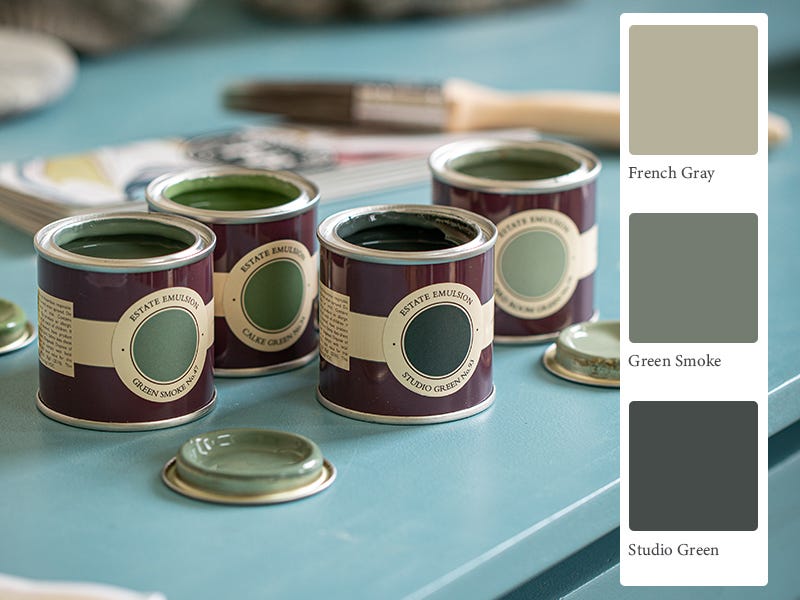
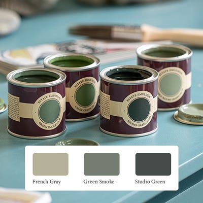
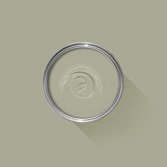
The best way to experience our colours before taking the plunge is with a true-to-colour paint sample. To help you narrow down your shortlist of shades, we've curated three of our most popular green shades to help you find your perfect match.
Sample selection contains 3 x 100ml Sample Pots of our beautiful French Gray, Green Smoke and Studio Green.
Our expert Colour Consultants are ready and waiting to help bring your style to life. If you’d like personalised advice on how to use our paint and papers in your home, book an in-home or virtual appointment today.
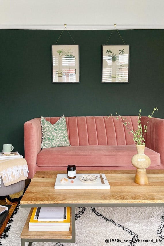
If you’re looking to bring life to your space, there’s one colour that always flourishes. Green paint is a lush and uplifting choice for every room of the house.
Rated 5 out of
5 by
Sainca11 from
A rich deep color that makes a big impact!Got this color for my front door and it made such a difference. We got Studio Green for our front door and the color changes throughout the day and will read as dark green, sometimes green/blue and then green/black. It pairs beautifully with our kitchen colors of Railings and Mouse's Back. Paint was expensive , but a dream to work with.
Date published: 2023-11-09
Rated 5 out of
5 by
Hannah Finnigan from
Beautiful Dark Green - perfect for our staircaseBeautiful very dark green. It can almost look grey in some lights. As with all farrow and ball paints the pigment is incredible, and leaves a solid almost velvet looking finish. We have used school house white on our walls, and wanted a very dark colour for the staircase, and together they look really beautiful. I’d say Studio Green is more of a cold green whereas Bancha which we have in our bathrooms is a warmer green with almost gold/yellow undertones. Also beautiful.
Date published: 2023-11-07
Rated 5 out of
5 by
Alkaseltzer from
A new wonder finishHad this colour before but not in Dead Flat. Result is superb and that is what I wrote last
t time. A real step forward in terms of finish. Well done!
Date published: 2023-11-05
Rated 5 out of
5 by
Big shirl from
Fab paintBeautiful paint .fantastic colour and just glides on the Wall.
Excellent service
Date published: 2023-10-07
Rated 5 out of
5 by
Yasmiininteriorhome from
Darkest green that almost looks blackPhotos will never do this paint colour justice. It is just the most beautiful and deep black/green. Nothing compares to it and photos can’t truly show its colour. Find me on instagram #yasmininteriorhome
Date published: 2023-09-10
Rated 5 out of
5 by
Sharonwendy from
Studio green, in dead flat - fabStudio green is a lovely dark colour with a hint of green which I bought in 'dead flat'. I love this finish. I used it on my bannisters, and it glides on really nicely, with a beautiful finish to it. Improved the look of the wood massively. Will definitely use it again.
Date published: 2023-08-08
Rated 5 out of
5 by
Mulia from
Good productThe dead flat finish worked well on walls, trim and radiators. I was a bit cynical about it working on metalwork, but it delivered!
Date published: 2023-07-10
Rated 5 out of
5 by
Xuxa from
Deep and sophisticatedGorgeous rich colour that changes in different lights. I have used for my base cabinets and paired with Borrowed Light walls and stripped wood counter tops and floor boards in my super sunny kitchen
Date published: 2023-06-29
Rated 5 out of
5 by
Eleanor3162 from
Love the colour, such a good back dropWe done our living room in studio green at first we thought is it going to be to dark , but we went with it and so happy we did . It’s such an elegant colour and so many of our family and friends love it
Date published: 2023-06-17
Rated 5 out of
5 by
Alexandru M from
RecommendThe best colour I have worked with. I have used it on tiles.
Date published: 2023-05-16
Rated 5 out of
5 by
Charlie P from
Studio GreenSuperb paint wouldn't use anything else, excellent quality cant say anymore.
Date published: 2023-04-07
Rated 5 out of
5 by
KJones from
Beautiful, rich colourI repainted the whole kitchen; estate emulsion for the walls, and estate eggshell for the cupboards skirting boards and doors. Such a rich, elegant colour and finish. Highly recommend
Date published: 2022-12-22
Rated 5 out of
5 by
Mk13 from
Exactly what I wanted!I bought my home over the summer and knew I wanted to make a statement with my entrance (and stairway). While the area is still a work in progress, the walls are done and I LOVE them! This color is magical. I actually love it even more at night, due to the blueish hue it seems to develop under artificial light. It's deep, rich, and bold without being in your face.
Date published: 2022-12-18
Rated 4 out of
5 by
Anonymous from
Fantastic! Just dont touch itWe absolutely LOVE the colour of this paint. In different lights it almost looks grey, deep blue and different tones of green. It really is stunning and always gets a lot of attention when guests come round. We paired it with painting some furniture with the Calamine pink which work very well together. Our only gripe is that we ordered the Estate Emulsion and we had to do 5 coats to get a good even coverage that doesn't show where you've cut in round the edges. This obviously cost us quite a lot of money! And worst of all, if you even lightly touch the wall by mistake you'll leave a stain. Which is heart breaking. We've decided next time we repaint the wall, we'll go for the Modern Emulsion. Sadly a higher sheen, but from using Modern Emulsion in the bathroom we've noticed there are no stains in there. But other than that, it's simply a stunning colour of paint and the real matt effect from the Estate Emulsion is incredible.
Date published: 2023-01-05
Rated 1 out of
5 by
JennyO from
Beautiful Color, estate emulsion marks easilyWe love the color and paid to have our stairwell professionally painted. Initially, everything looked amazing, but we were incredibly disappointed to find out how easily the estate emulsion marks up. Our walls were marked up after only a few days and it’s impossible to touch up a single spot without it looking like the third photo attached. We are already going to have to re-roll the wall and will have a really tough time keeping up with marks moving forward. Very disappointed considering how expensive this paint is compared to other brands and how much we spent to have our house professionally painted.