You can use Apple Pay when shopping on Apple devices and on a Safari browser.
Klarna
Paint now, pay later with Klarna.
We’ve partnered with Klarna to offer you multiple ways to pay for your handcrafted paint and paper.
Available in United Kingdom, Austria, Spain, Finland, Ireland, Italy and The Netherlands only.
PayPal
With PayPal you can pay for your paint and paper in just a few easy steps.
Card Payments
We also accept card payments from Visa, Mastercard, Maestro and Amex
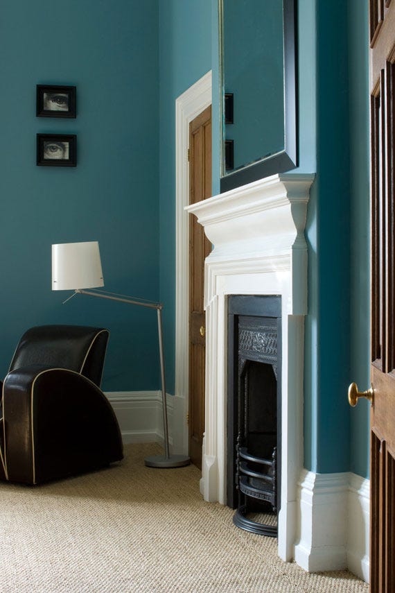
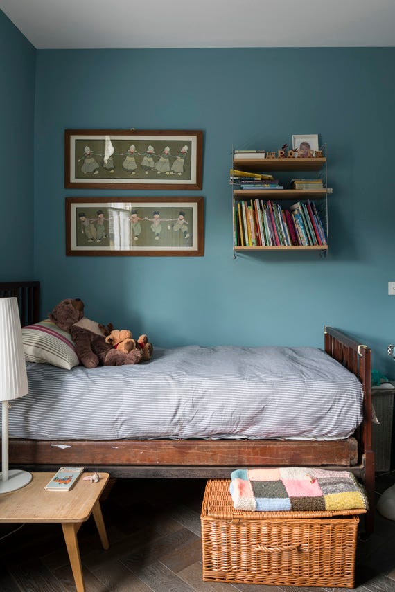
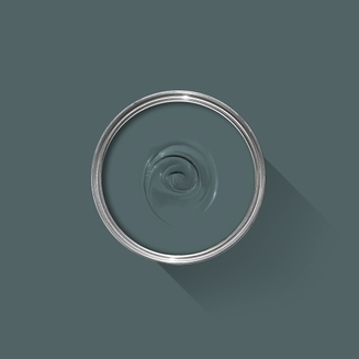
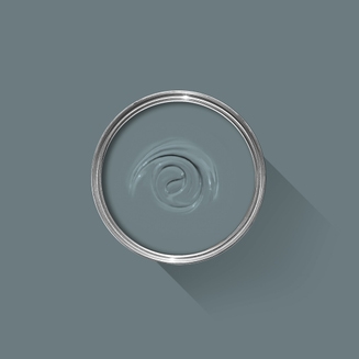
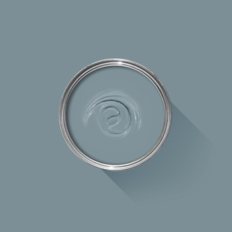
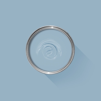
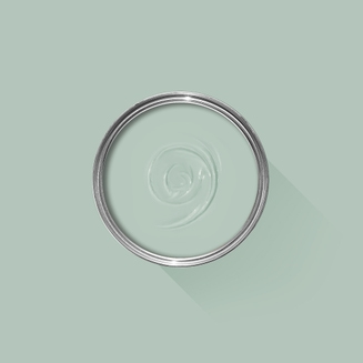
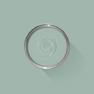
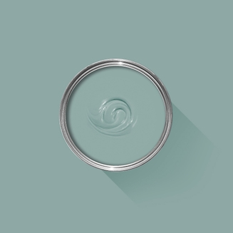
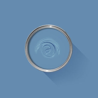
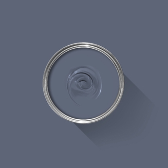
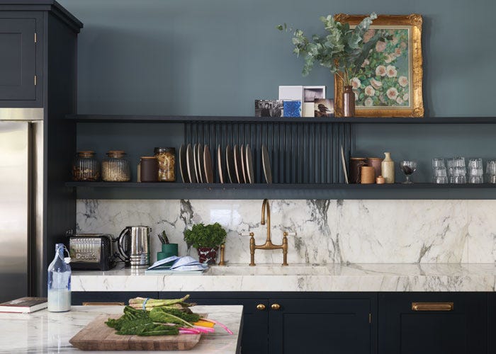
A lively blue
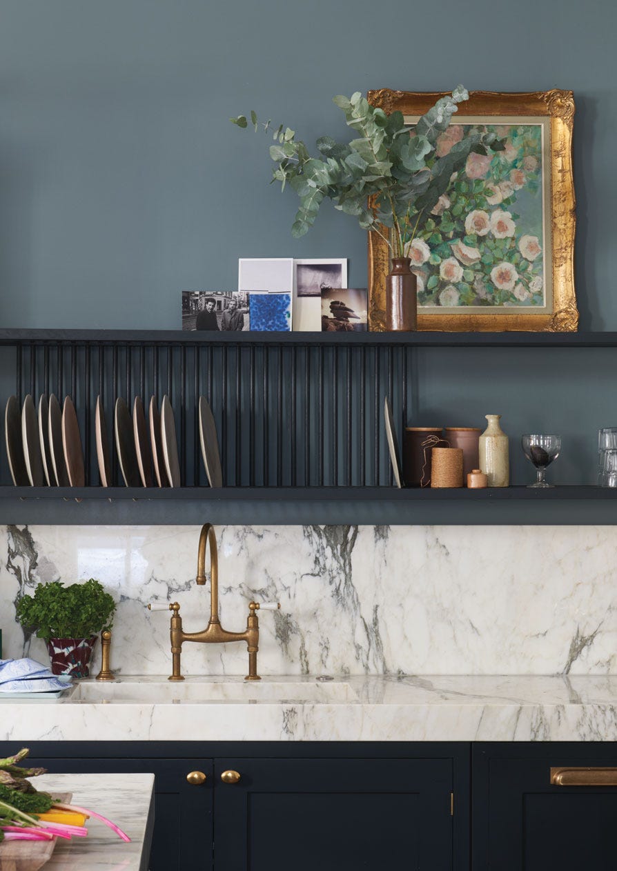
This warm and timeless blue is named after the indigo pigment which was often imported in lumps in the 18th century. Stone Blue’s lively and saturated colour can be used alongside warmer tones such as Pelt to create an inviting vintage look, or the cooler Mole's Breath for a cleaner, more contemporary feel. When contrasted with Dimpse woodwork, however, it feels both distinguished and familiar.
We’re dedicated to perfecting the art of paint. At our home in Dorset, we combine the finest ingredients, 75 years of experience and technical precision to help you create beautiful spaces that stay beautiful. Even in our colour rich paints, less than 8% of the tin is the colour. The other 92% is what creates the quality, depth and extraordinary response to light that transforms your home.
Paint is like coffee. The colour is the froth on the top, but it’s the quality of the rest of the cup that makes it taste good. – Richard Ball, Farrow & Ball Co-founder
We use twelve exclusive pigments, all specifically selected for their colour intensity. We take colour seriously, so naturally, we only accept the very best. By using these same pigments to make every colour in our palette, all our shades combine effortlessly, making it easy for you to put together a cohesive colour scheme.
Deeper, richer colours
Deeper, richer colours
Packed with pigment for an extraordinary response to every kind of light.
We add generous helpings of rich pigment to create our signature look – deep colours with complex undertones. The same space that feels bright and airy in morning sun, can feel cosy and intimate by evening. Our teams design each shade under every kind of light, so it will be perfectly balanced in every setting.
Extraordinary response to light
Extraordinary response to light
We spend months carefully crafting and testing each of our paint colours to make sure they share our signature extraordinary response to light. This beautiful reaction to changing light, like bringing out different undertones or shifting intensity, is what makes our paint so special.
Interior and exterior finishes
Interior and exterior finishes
From walls, floors and furniture to radiators, skirtings and sheds, our range of paint finishes can help you transform almost any surface in your home (and outside it, too).
We even have multi-surface finishes like Dead Flat® and Full Gloss, so you can tackle walls, woodwork and metal at the same time.
Our comprehensive range is comprised of paint finishes that not only look beautiful, but offer different practical benefits. Designed for a variety of different surfaces, each finish is compatible with our high-performance Primers & Undercoats to ensure exceptional coverage, adhesion and depth of colour.
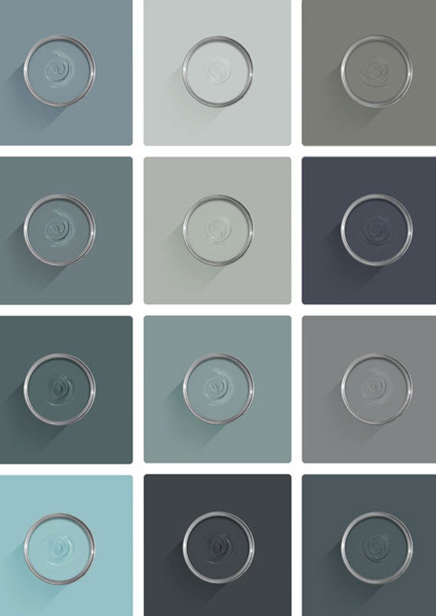
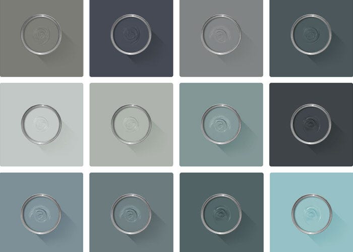
Colour Story
Complementary White
Ammonite
Neither too warm nor too cool, Ammonite's subtle grey tone create a hushed and calming feel in homes both old and new. Find out more about Ammonite No.274
.
Every colour in the Farrow & Ball palette is paired with a specific shade of white, these are selected to celebrate a shared undertone and create harmonious spaces alongside your chosen colour.
Based on the colour Bone, using our Mid Tones Primer & Undercoat adds the richest depth of colour to some of our best-selling shades.
Made with the same natural ingredients and pigments as our topcoats, our Primer & Undercoat is the crucial foundation for creating a rich, even and longer lasting finish.
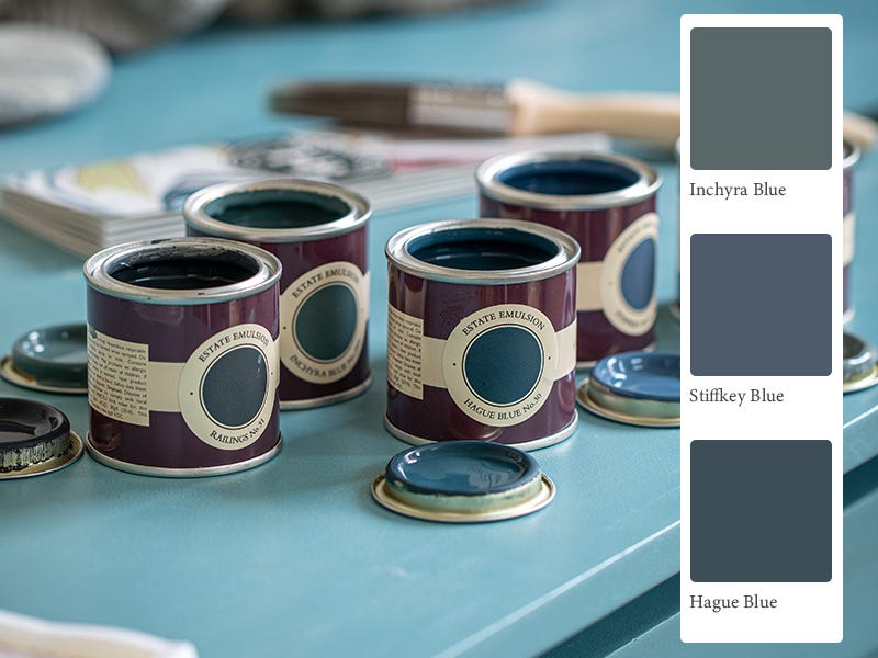
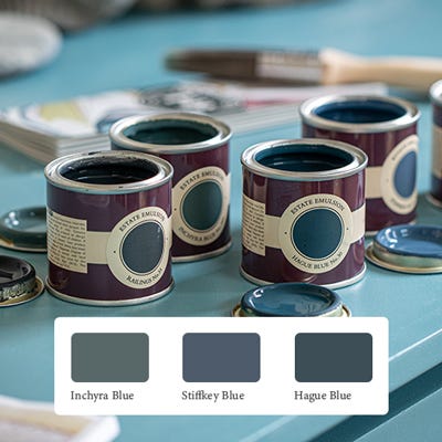
The best way to experience our colours before taking the plunge is with a true-to-colour paint sample. To help you narrow down your shortlist of shades, we've curated three of our most popular blue shades to help you find your perfect match.
Sample selection contains 3 x 100ml Sample Pots of our beautiful Inchyra Blue, Stiffkey Blue and Hague Blue.
Our expert Colour Consultants are ready and waiting to help bring your style to life. If you’d like personalised advice on how to use our paint and papers in your home, book an in-home or virtual appointment today.
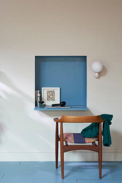
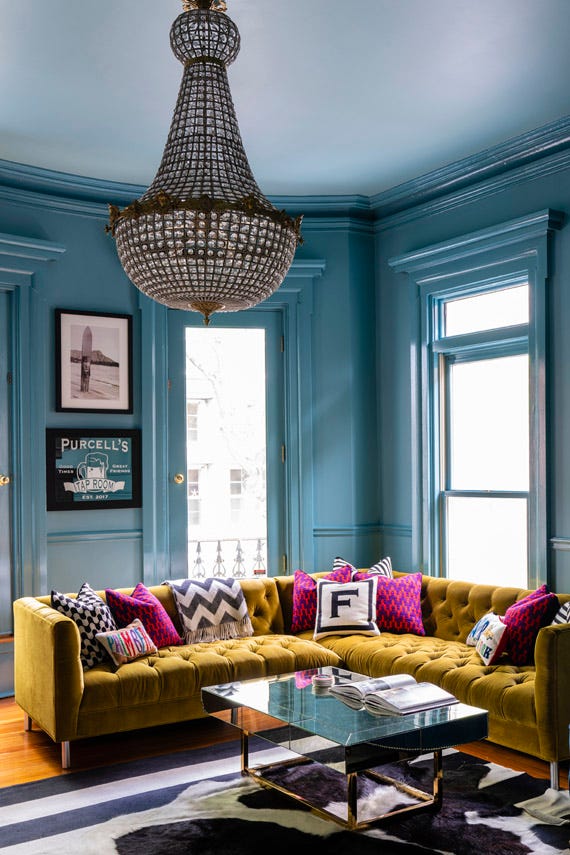
When it comes to creating colour schemes, blue paint is one of the most versatile options around. In some spaces it evokes calm and serenity, while in others it’s cosy and dramatic.
Rated 5 out of
5 by
Colourfulinteriors from
Perfect vibrant blueStone blue was the perfect choice for our colourful Victorian lounge. Beautiful in the sunlight and cosy in the evening and works perfectly with our yellow sofa and fuschia pink chair and accessories. I’ve had lots of compliments.
Date published: 2024-02-05
Rated 5 out of
5 by
Rls6o from
Stunning colourWe’ve had a bespoke media until painted in Stone Blue dead flat and we are in love with it. It’s a really cosy, warm blue (if there’s such a thing) in a north facing living room but also makes a real statement. We’ve had so many compliments.
We had this painted by a decorator and even though the paint is pricer, he was delighted we’d chosen F&B as it’s much easier for him!