You can use Apple Pay when shopping on Apple devices and on a Safari browser.
Klarna
Paint now, pay later with Klarna.
We’ve partnered with Klarna to offer you multiple ways to pay for your handcrafted paint and paper.
Available in United Kingdom, Austria, Spain, Finland, Ireland, Italy and The Netherlands only.
PayPal
With PayPal you can pay for your paint and paper in just a few easy steps.
Card Payments
We also accept card payments from Visa, Mastercard, Maestro and Amex
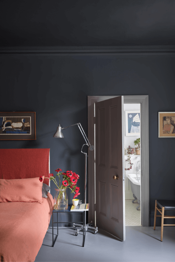
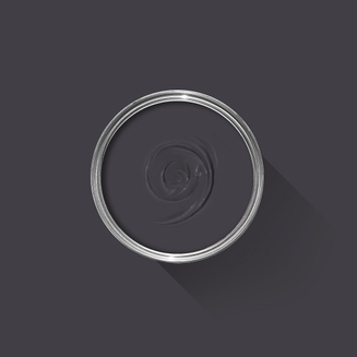
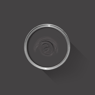
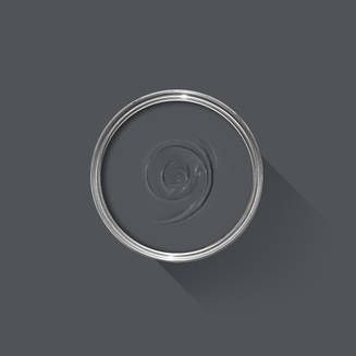
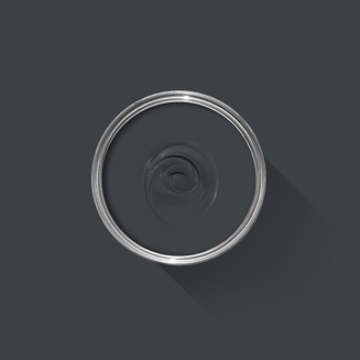
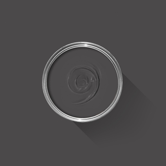
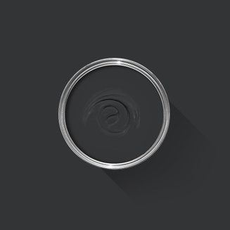
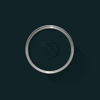
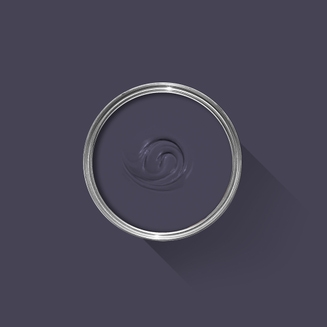
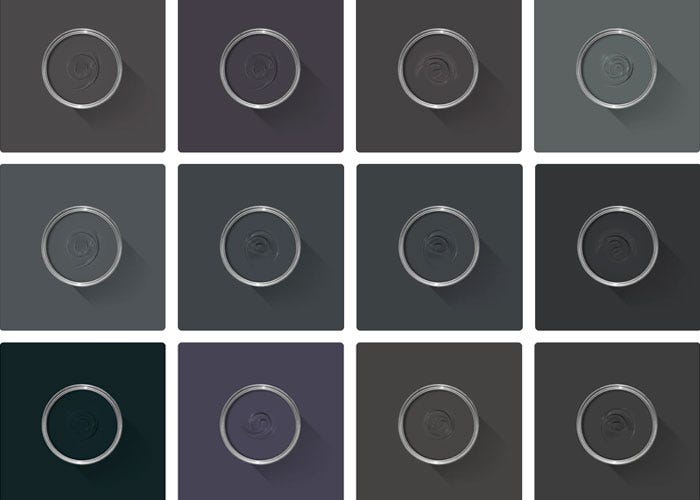
A classic charcoal
Sitting between the ever-popular Railings and Down Pipe, this classic charcoal colour is inspired by the attractively designed iron containers used to catch rainwater at the top of a downpipe. Ideal for creating inviting spaces, Hopper Head works beautifully with nearly any Farrow & Ball shade or can be used exclusively across walls, woodwork and the ceiling for a dramatic space.
We’re dedicated to perfecting the art of paint. At our home in Dorset, we combine the finest ingredients, 75 years of experience and technical precision to help you create beautiful spaces that stay beautiful. Even in our colour rich paints, less than 8% of the tin is the colour. The other 92% is what creates the quality, depth and extraordinary response to light that transforms your home.
Paint is like coffee. The colour is the froth on the top, but it’s the quality of the rest of the cup that makes it taste good. – Richard Ball, Farrow & Ball Co-founder
We use twelve exclusive pigments, all specifically selected for their colour intensity. We take colour seriously, so naturally, we only accept the very best. By using these same pigments to make every colour in our palette, all our shades combine effortlessly, making it easy for you to put together a cohesive colour scheme.
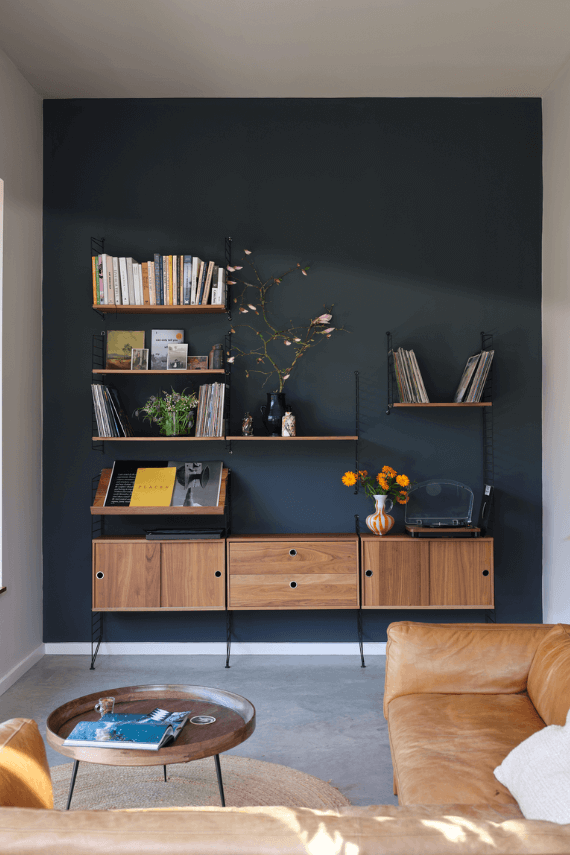
Deeper, richer colours
Deeper, richer colours
Packed with pigment for an extraordinary response to every kind of light.
We add generous helpings of rich pigment to create our signature look – deep colours with complex undertones. The same space that feels bright and airy in morning sun, can feel cosy and intimate by evening. Our teams design each shade under every kind of light, so it will be perfectly balanced in every setting.
Extraordinary response to light
Extraordinary response to light
We spend months carefully crafting and testing each of our paint colours to make sure they share our signature extraordinary response to light. This beautiful reaction to changing light, like bringing out different undertones or shifting intensity, is what makes our paint so special.
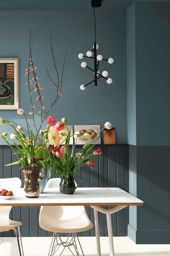
Interior and exterior finishes
Interior and exterior finishes
From walls, floors and furniture to radiators, skirtings and sheds, our range of paint finishes can help you transform almost any surface in your home (and outside it, too).
We even have multi-surface finishes like Dead Flat® and Full Gloss, so you can tackle walls, woodwork and metal at the same time.
Our comprehensive range is comprised of paint finishes that not only look beautiful, but offer different practical benefits. Designed for a variety of different surfaces, each finish is compatible with our high-performance Primers & Undercoats to ensure exceptional coverage, adhesion and depth of colour.
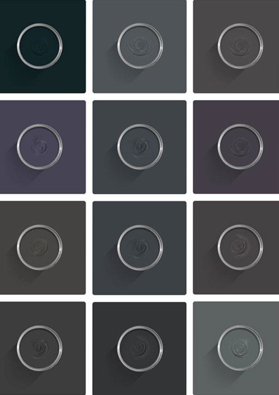
Colour Story
Complementary White
Blackened
Our coolest white, with the slightest hint of grey, Blackened sits perfectly with each of our Architectural Neutrals for a minimal look or stronger industrial feel. Find out more about Blackened No.2011
Every colour in the Farrow & Ball palette is paired with a specific shade of white, these are selected to celebrate a shared undertone and create harmonious spaces alongside your chosen colour.
When it comes to using dark colours, the deeper the better. So, for an irresistibly inviting finished look, pair darker shades with our Dark Tones Primer & Undercoat. Based on the colour of Down Pipe, combining this primer with your topcoat creates an unrivalled richness and makes quite the statement.
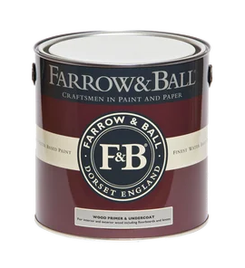
Made with the same natural ingredients and pigments as our topcoats, our Primer & Undercoat is the crucial foundation for creating a rich, even and longer lasting finish.
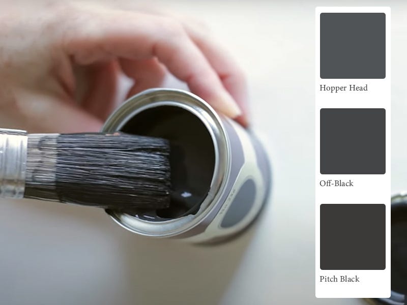
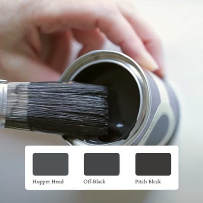
The best way to experience our colours before taking the plunge is with a true-to-colour paint sample. To help you narrow down your shortlist of shades, we've curated three of our most popular shades to help you find your perfect match.
Sample selection contains 3 x 100ml Sample Pots of our beautiful Hopper Head, Off-Black and Pitch Black.
Our expert Colour Consultants are ready and waiting to help bring your style to life. If you’d like personalised advice on how to use our paint and papers in your home, book an in-home or virtual appointment today.
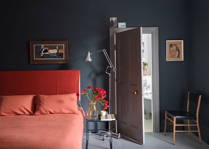
Far from dark and dreary, black paint creates intimate, inviting and thoroughly sophisticated spaces to escape to at the end of a long day. Go bold and take it all over or simply add a touch to your trim.
Rated 5 out of
5 by
BMAY from
Great colourLove this colour in Dead flat finish , used on Victorian metal fireplace and skirting in a room and covered really well with two coats
Date published: 2023-11-01
Rated 5 out of
5 by
Richard58 from
Hard finishThought product more expensive so bit concerned, but using dark colour, flat really crisp ,and the real value for money is how hard the dried finish is.
Date published: 2023-08-22
Rated 5 out of
5 by
Phillip James Bell from
BrilliantAbsolutely loved this colour. I am in the middle of painting my clients kitchen cabinets and although a very masculine colour is also very warm. The paint glides onto the woodwork and is a pleasure to work with
Date published: 2023-08-07
Rated 5 out of
5 by
Anonymous from
Bold and chicThe new downpipe for woodwork! Love this shade of grey. A deep grey with violet undertones.
Date published: 2023-08-07
Rated 5 out of
5 by
TomW from
Love itLove this colour, perfect for my hall. We are a massive fan of the colour railings. When it came to doing the hallway we wanted something similar but a bit more black. As soon as we saw hopper head we knew it was the one.
Date published: 2023-07-26
Rated 5 out of
5 by
Amanda H from
Beautiful neutralLove this on my media wall with All White in niches
Date published: 2023-05-11
Rated 5 out of
5 by
Nikki Nakki from
Smart, Sleek & stunningAbsolutely love the colour and finish of this beautiful paint. The detail in our Victorian ceiling is simply divine!
Date published: 2023-04-18
Rated 5 out of
5 by
Stasia from
A Dark NeutralPainted our south facing master bedroom before Christmas absolutely love it. It is beautiful and cozy in the winter months l, brings warmth to the room. Now the sun is out ready for spring the light makes it even more spectacular!
I am a huge fan of colours that don’t change too much in different light Hopper Head keeps its true colour through lout the whole day.
I have followed F&B insta account and went with the entire colour floor to ceiling info found that this has made the dark colour feel quite neutral and not at all obvious or imposing.
I have painted 1 door stirabout and one door Moles breath. I prefer Moles breath in our master.
Thank you F&B
Stasia
Date published: 2023-02-15
Rated 5 out of
5 by
Alton House from
Beautiful GreyThe perfect shade of grey that changes with light. Its unashamed dark grey that verges on black when light is low. The quality of the paint is as you expect from F&B - beautiful to use and the finish is superb
Date published: 2023-02-02
Rated 5 out of
5 by
00sez from
Hopper Head looks lovely in my east facing studyI used this on a panelled feature wall in an east facing study. It’s absolutely beautiful. Softer than black and has a very subtle blue undertone. Very classic and calming.
Date published: 2023-02-02
Rated 2 out of
5 by
Jengil from
Hopper Head Modern EmulsionI'm really disappointed in this. The Estate paint is lovely but opted for modern emulsion due to it being wipe clean. It's so shiny the plug sockets on the adjoining wall reflect off it. It shows every brush and roller mark too. I love F & B paint and have used modern emulsion in other rooms, in Stiffkey Blue and Oval Room, and neither of them are as shiny as this is. It looks like a silk finish of a much cheaper brand. Horrible. The colour itself is lovely just a shame about the overly shiny finish
Date published: 2023-04-15
Rated 2 out of
5 by
EmmaX from
Definitely not grey.Really disappointed with this, it definitely isn’t the same colour as the colour chip. It’s dark blue. Will now have to repaint as it clashes with our grey kitchen cabinets.
Date published: 2023-04-10
Rated 1 out of
5 by
Ava28 from
Odd colourI have recently painted our wardrobes in this colour. I am a huge Farrow & Ball fan but sadly this colour is so disappointing. It’s more blue than grey! Repaint required. Not a cheap mistake to make.