You can use Apple Pay when shopping on Apple devices and on a Safari browser.
Klarna
Paint now, pay later with Klarna.
We’ve partnered with Klarna to offer you multiple ways to pay for your handcrafted paint and paper.
Available in United Kingdom, Austria, Spain, Finland, Ireland, Italy and The Netherlands only.
PayPal
With PayPal you can pay for your paint and paper in just a few easy steps.
Card Payments
We also accept card payments from Visa, Mastercard, Maestro and Amex
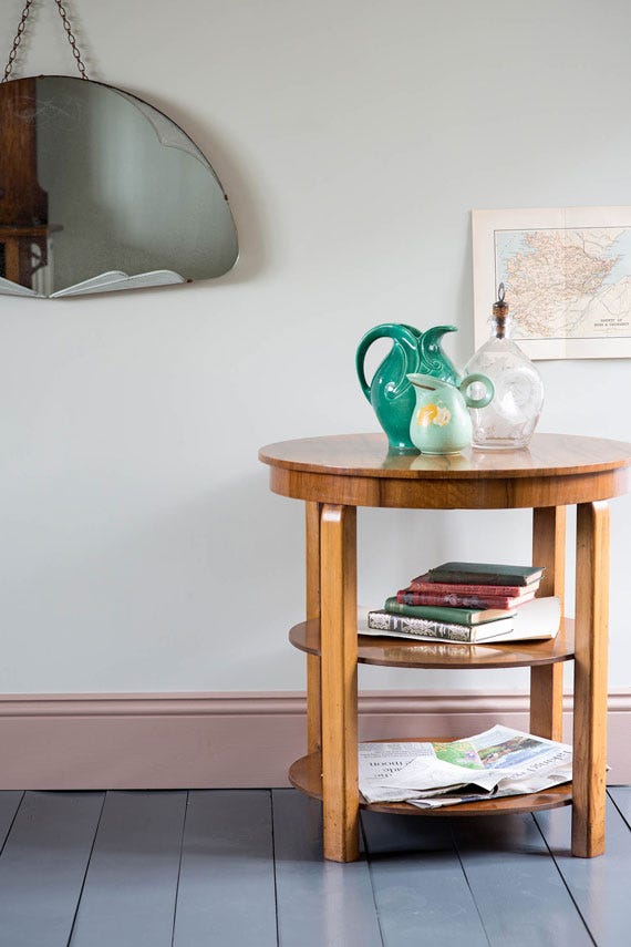
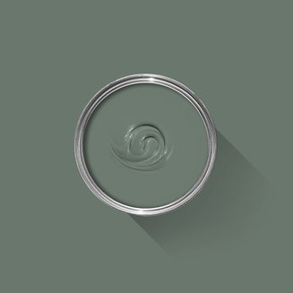
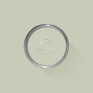
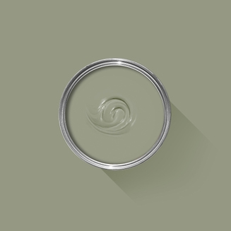
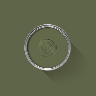
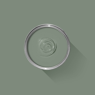
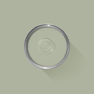
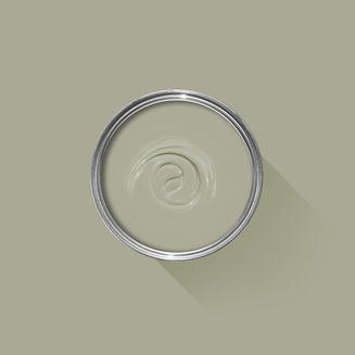
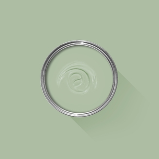
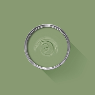
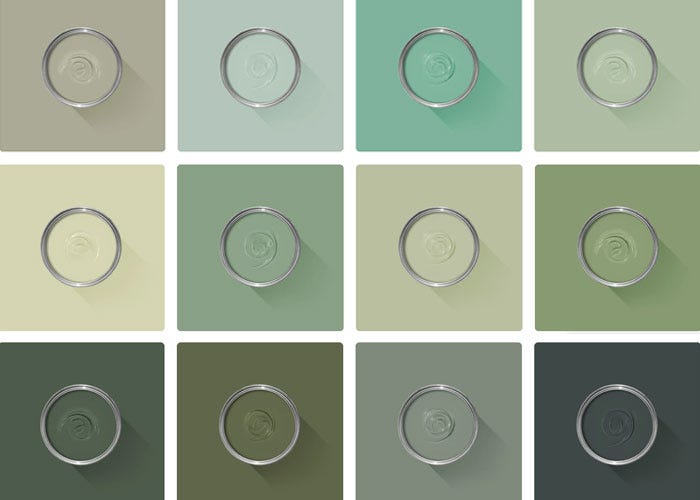
A muted green grey
This very light green grey is named after the Cromarty Firth estuary, a place of swirling mists mentioned daily in the Shipping Forecast. A neutral yet atmospheric colour, Cromarty brings a muted softness to any room, creating an easy to use finish that is neither too green nor too grey. A shade lighter than Mizzle, it works beautifully when grouped with Blue Gray or Pigeon.
We’re dedicated to perfecting the art of paint. At our home in Dorset, we combine the finest ingredients, 75 years of experience and technical precision to help you create beautiful spaces that stay beautiful. Even in our colour rich paints, less than 8% of the tin is the colour. The other 92% is what creates the quality, depth and extraordinary response to light that transforms your home.
Paint is like coffee. The colour is the froth on the top, but it’s the quality of the rest of the cup that makes it taste good. – Richard Ball, Farrow & Ball Co-founder
We use twelve exclusive pigments, all specifically selected for their colour intensity. We take colour seriously, so naturally, we only accept the very best. By using these same pigments to make every colour in our palette, all our shades combine effortlessly, making it easy for you to put together a cohesive colour scheme.
Deeper, richer colours
Deeper, richer colours
Packed with pigment for an extraordinary response to every kind of light.
We add generous helpings of rich pigment to create our signature look – deep colours with complex undertones. The same space that feels bright and airy in morning sun, can feel cosy and intimate by evening. Our teams design each shade under every kind of light, so it will be perfectly balanced in every setting.
Extraordinary response to light
Extraordinary response to light
We spend months carefully crafting and testing each of our paint colours to make sure they share our signature extraordinary response to light. This beautiful reaction to changing light, like bringing out different undertones or shifting intensity, is what makes our paint so special.
Interior and exterior finishes
Interior and exterior finishes
From walls, floors and furniture to radiators, skirtings and sheds, our range of paint finishes can help you transform almost any surface in your home (and outside it, too).
We even have multi-surface finishes like Dead Flat® and Full Gloss, so you can tackle walls, woodwork and metal at the same time.
Our comprehensive range is comprised of paint finishes that not only look beautiful, but offer different practical benefits. Designed for a variety of different surfaces, each finish is compatible with our high-performance Primers & Undercoats to ensure exceptional coverage, adhesion and depth of colour.
Colour Story
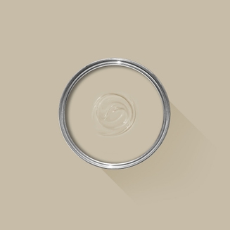
Complementary White
School House White
School House White is pared back, timeless and familiar without the cool undertones of the more contemporary neutral groups. Find out more about School House White No.291
Every colour in the Farrow & Ball palette is paired with a specific shade of white, these are selected to celebrate a shared undertone and create harmonious spaces alongside your chosen colour.
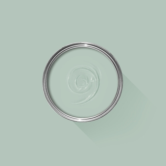
Based on the colour Bone, using our Mid Tones Primer & Undercoat adds the richest depth of colour to some of our best-selling shades.
Made with the same natural ingredients and pigments as our topcoats, our Primer & Undercoat is the crucial foundation for creating a rich, even and longer lasting finish.
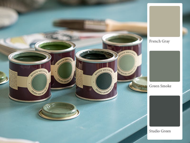
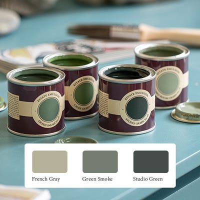
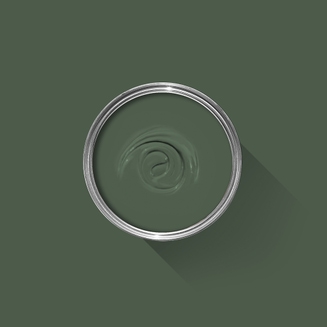
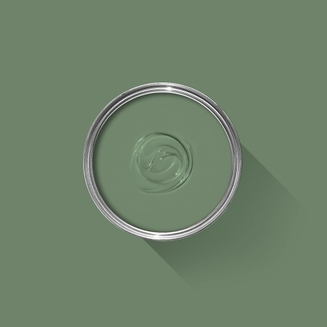
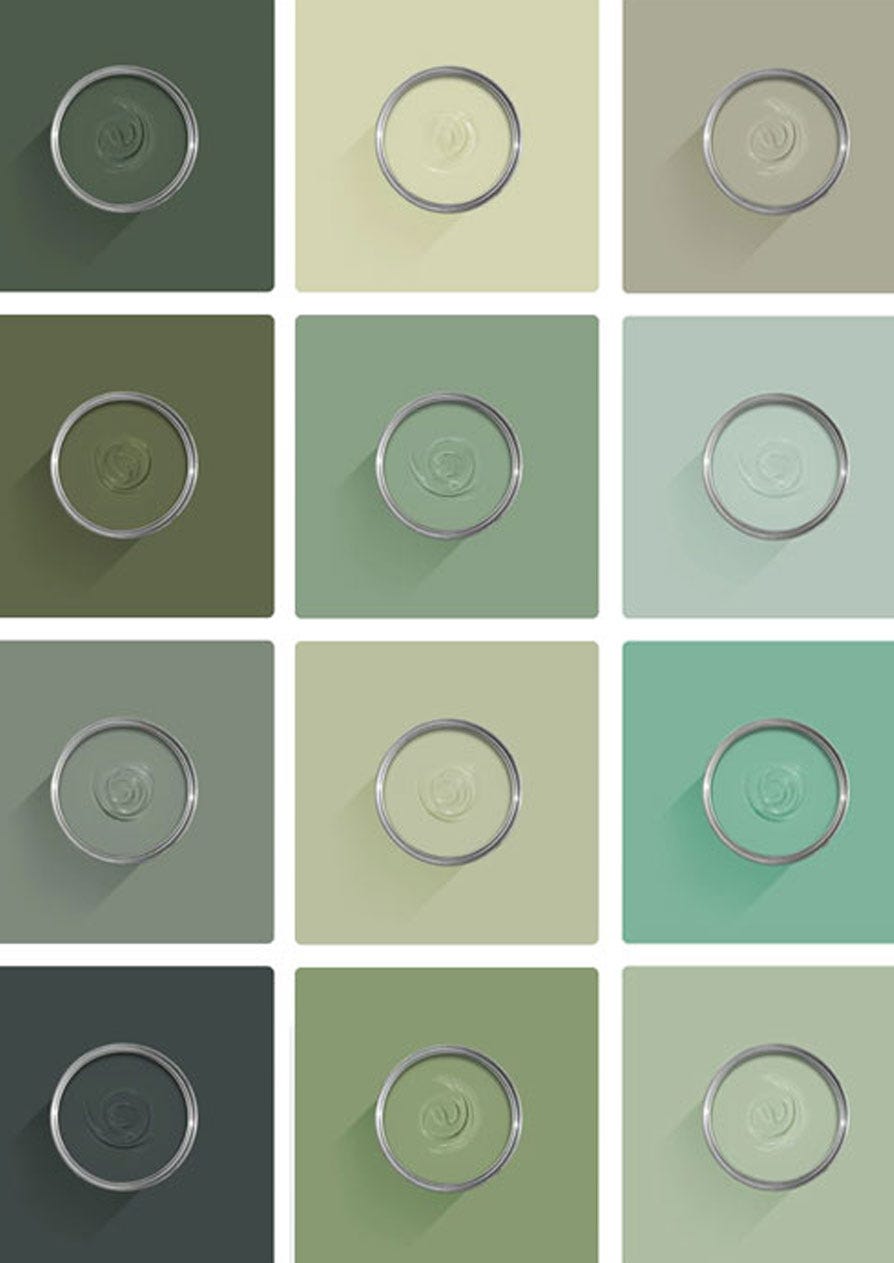
The best way to experience our colours before taking the plunge is with a true-to-colour paint sample. To help you narrow down your shortlist of shades, we've curated three of our most popular green shades to help you find your perfect match.
Sample selection contains 3 x 100ml Sample Pots of our beautiful French Gray, Green Smoke and Studio Green.
Our expert Colour Consultants are ready and waiting to help bring your style to life. If you’d like personalised advice on how to use our paint and papers in your home, book an in-home or virtual appointment today.
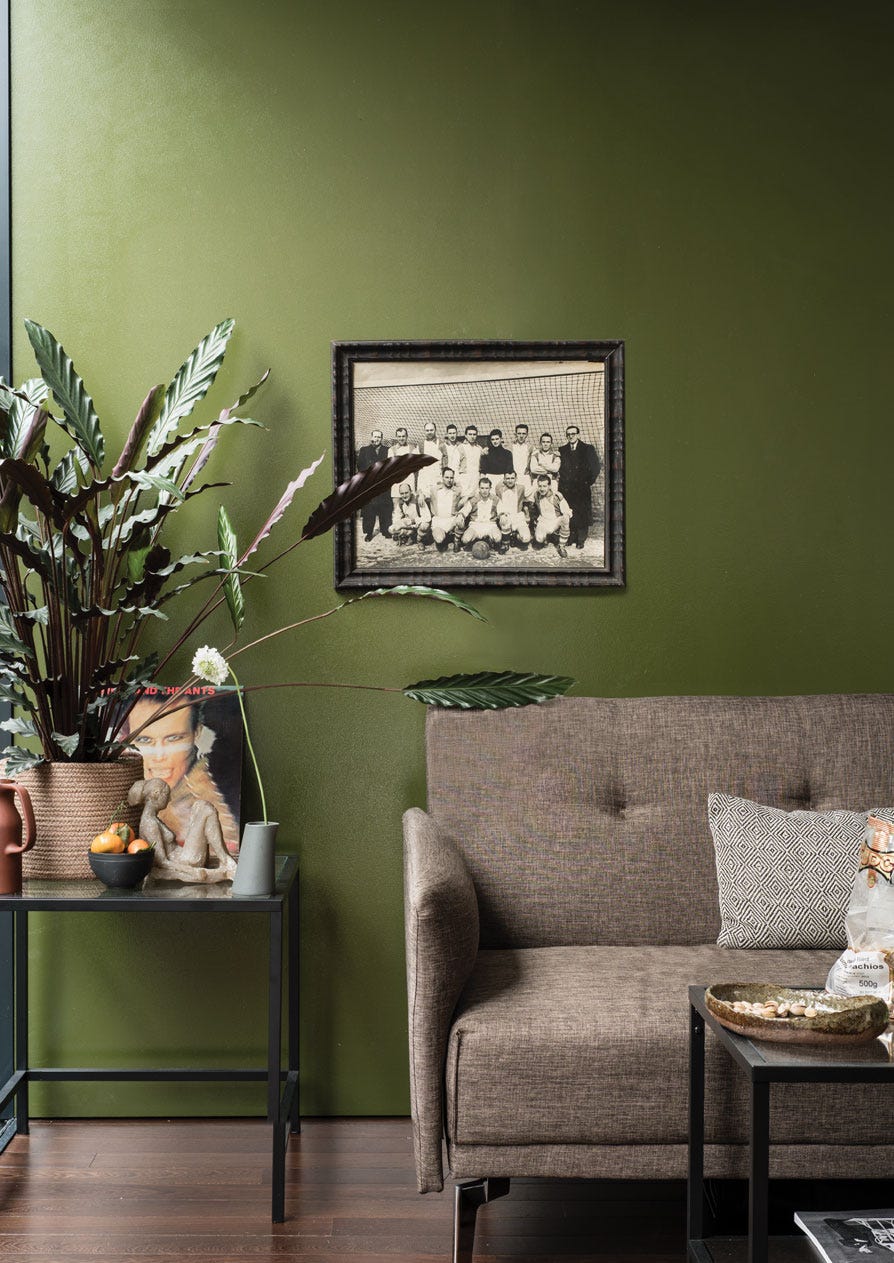
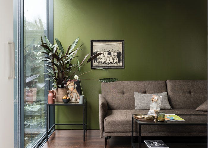
If you’re looking to bring life to your space, there’s one colour that always flourishes. Green paint is a lush and uplifting choice for every room of the house.
Rated 5 out of
5 by
Loulou13 from
The perfect colour for a child’s bedroomAdds colour to the roombut is still somehow completely neutral so it it works with all colours. A truly magical colour
Date published: 2024-02-12
Rated 5 out of
5 by
Henry from
Perfect Coastal GreenCromarty has an almost misty tone to it and is reflective of the description by Farrow and Ball. Lovely texture to the paint and it dries to a high quality matte finish.
Date published: 2023-11-24
Rated 5 out of
5 by
Arlac.c from
Beautiful ColourThis is a beautiful colour. A pale olive in early morning east, southeast facing room. Then changes throughout the day and becomes the colour exactly as described on the website. It's a very relaxing and calming colour. Estate emulsion gives a lovely Matt finish,hiding any imperfections but does mark and scratch easily. Customer service is excellent as always.
Date published: 2023-11-17
Rated 5 out of
5 by
Anonymous from
Cromarty No. 285 Modern EggshellI absolutely adore the colour and finish of your Cromarty No. 285 Modern Eggshell paint. We used it on both walls and ceiling in a bedroom and the sheen lights up the room. Would totally recommend
Date published: 2023-11-05
Rated 5 out of
5 by
Hrd123 from
Great colourColour and quality superb, have used F&B many times and it never disappoints.
Date published: 2023-10-30
Rated 5 out of
5 by
Anonymous from
Cromarty - perfect colour, matches the landscapeJust love the colour! Perfect for our cabin on the croft
Date published: 2023-06-18
Rated 5 out of
5 by
Anonymous from
Cromarty for the win!My taste is quite eclectic so I wanted just one room to be restful and calming. This colour is perfect, and painted by myself, proves it must be very forgiving too!
Date published: 2023-05-26
Rated 5 out of
5 by
JDepsom from
A great choice for a restful lookThe living room looks amazing in this colour and co-ordinates with our furniture. It makes it look more restful and at the same time more interesting. It replaced Matchstick
Date published: 2023-04-13
Rated 5 out of
5 by
Bebluecat from
Une belle couleur fidèle au nuancierJ'ai trouvé dans Cromarty la couleur de ma cuisine que je cherchais depuis longtemps. Ce que je trouve bien chez Farrow & Ball c'est que les couleurs ne changent pratiquement pas selon la lumière où l'orientation, elles restent assez fidèles à l'original et ca, c'est trés important !
Date published: 2023-04-06
Rated 5 out of
5 by
Maya79 from
A calm and peaceful colourI picked this colour for our north-facing room which overlooks the garden. I was worried that it maybe too dull with it being north-facing but I’m so glad I picked it. The colour is a sea-blue-green and I feel an instant feeling of calm when I enter my room and nicely reflects the lovely green outside too. Very happy with my choice :)
Date published: 2023-03-06
Rated 5 out of
5 by
Annebonny from
Calm and relaxingWas not sure about Cromarty, I thought it might look a bit dull and muddy but it doesn’t . It is fresh and calming. A lovely colour for the bedroom
Date published: 2023-03-04
Rated 5 out of
5 by
Nige71 from
Rich colour great paintPurchased this paint following my wife choosing the colour under protest as thought it was too expensive, how wrong I was it goes on great and looks fantastic will definitely buy farrow and ball again
Date published: 2022-11-03
Rated 5 out of
5 by
Lydia57 from
Calming green tonesThis looks gorgeous in any room. I personally love a dark moody bedroom over a light airy one, but this colour is just a breath of fresh air. It’s dark enough to wind down to, but light enough to open up your space.
I always buy farrow and ball so that I can actually remain in the room whilst painting (no harmful chemicals or smells) and not have to worry about polluting water sources when I rinse my brushes.
Lots of compliments on this one :) & would definitely recommend
Date published: 2022-10-24
Rated 5 out of
5 by
Ace of spades from
Soft and beautifulI bought this for my bedroom after seeing a photo review on here. It is lovely and changes with daytime and evening. Inspired by other reviews with photos is very much appreciated.
Date published: 2022-08-19
Rated 1 out of
5 by
Lucylu from
Lovely Colour ‘Dead Horrible Paint’Cromarty is a really lovely soft colour, but I am cursing buying ‘ Dead Flat’ paint. It should be renamed ‘dead horrible’, because that’s what it is like to paint with. I would class myself as a competent decorator, as I always do the decorating myself. I have used lots of F&B paint over the years, the last room being done in modern emulsion. I was so happy with the finish I even posted a picture on a review. Not it’s time, I am so annoyed I have spent a fortune on this paint for such a poor finish. I am heading into coat no.4 trying to get a non lined finish and I am seriously over it. My first and last foray into dead horrible, dead flat paint. I will spare you a photo!!!
Back in 2010, we moved to an entirely water based range of finishes, becoming the first in the industry to do so. These low-odour, low-VOC finishes are easy to clean without harmful solvents. They are also certified child- and baby-safe in accordance with Safety of Toys Part 3: Migration of certain elements (EN 71-3:2019+A1:2021).
Exclusions: Casein Distemper, Wood Primer & Undercoat and Metal Primer & Undercoat.
Quality Finishes
Every one of our paint colours is available in a range of durable interior and exterior paint finishes, each rigorously tested to ensure an exceptional depth of colour and long-lasting finish. For the very best results, we always recommend using a Farrow & Ball Primer & Undercoat - see above for the correct tone for this colour.
Safety Information
Always read and follow the information on the product label.
All Farrow & Ball finishes except Limewash contain isothiazolinones, which may produce an allergic reaction. Farrow & Ball Limewash contains calcium hydroxide which can cause severe damage in contact with skin or eyes. For further information about our products, including guidance on safe use and application, click here to view our advice pages.
Limewash: Danger. Causes skin irritation. Causes serious eye damage. May cause respiratory irritation.
Exterior Eggshell and Exterior Masonry: Harmful to aquatic life with long lasting effects. Contains isothiazolinones. May produce an allergic reaction.
All other finishes: Contains isothiazolinones. May produce an allergic reaction.