You can use Apple Pay when shopping on Apple devices and on a Safari browser.
Klarna
Paint now, pay later with Klarna.
We’ve partnered with Klarna to offer you multiple ways to pay for your handcrafted paint and paper.
Available in United Kingdom, Austria, Spain, Finland, Ireland, Italy and The Netherlands only.
PayPal
With PayPal you can pay for your paint and paper in just a few easy steps.
Card Payments
We also accept card payments from Visa, Mastercard, Maestro and Amex
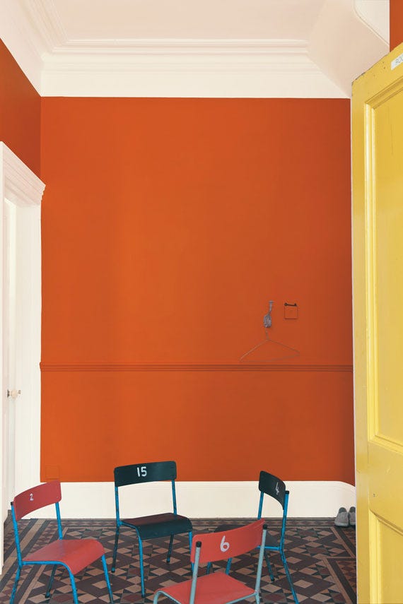
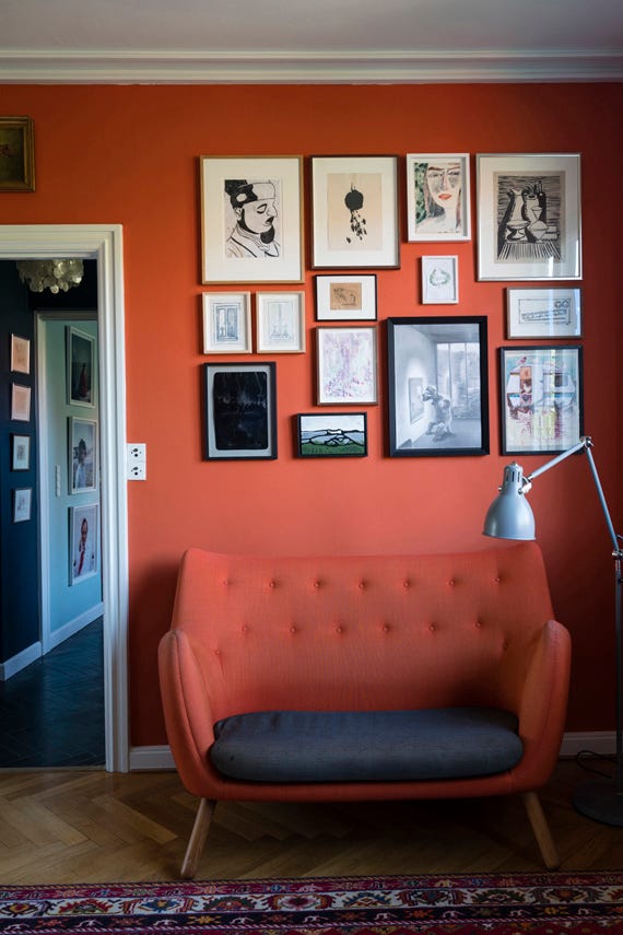
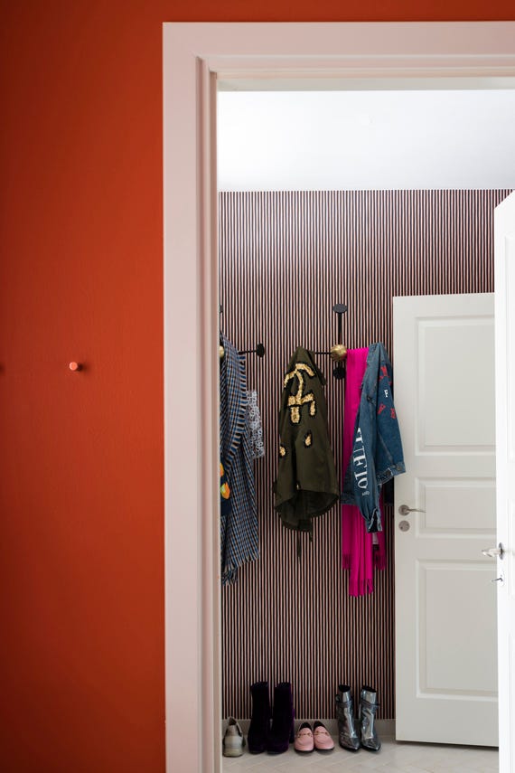
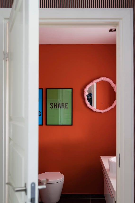
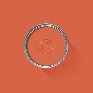
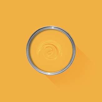
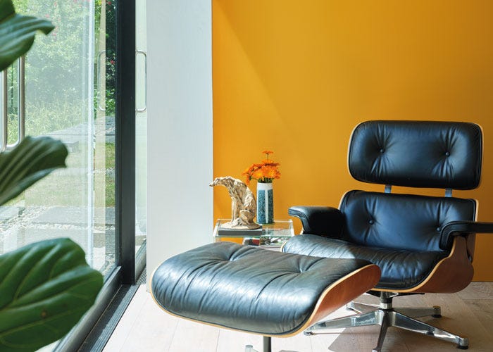
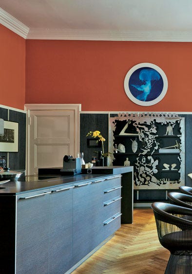
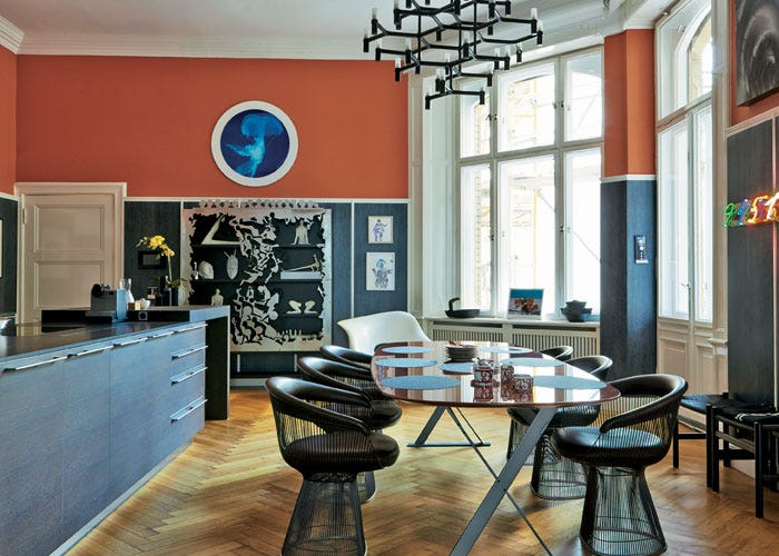
A deep and playful orange
Charlotte's Locks takes its inspiration from the flame red hair of our Head of Creative and brings a playful late 1970s look. This deep and dramatic orange is particularly spectacular when used in small areas with a sharp contrast either in All White or Black Blue - for the very brave, do try in Full Gloss!
We’re dedicated to perfecting the art of paint. At our home in Dorset, we combine the finest ingredients, 75 years of experience and technical precision to help you create beautiful spaces that stay beautiful. Even in our colour rich paints, less than 8% of the tin is the colour. The other 92% is what creates the quality, depth and extraordinary response to light that transforms your home.
Paint is like coffee. The colour is the froth on the top, but it’s the quality of the rest of the cup that makes it taste good. – Richard Ball, Farrow & Ball Co-founder
We use twelve exclusive pigments, all specifically selected for their colour intensity. We take colour seriously, so naturally, we only accept the very best. By using these same pigments to make every colour in our palette, all our shades combine effortlessly, making it easy for you to put together a cohesive colour scheme.
Deeper, richer colours
Deeper, richer colours
Packed with pigment for an extraordinary response to every kind of light.
We add generous helpings of rich pigment to create our signature look – deep colours with complex undertones. The same space that feels bright and airy in morning sun, can feel cosy and intimate by evening. Our teams design each shade under every kind of light, so it will be perfectly balanced in every setting.
Extraordinary response to light
Extraordinary response to light
We spend months carefully crafting and testing each of our paint colours to make sure they share our signature extraordinary response to light. This beautiful reaction to changing light, like bringing out different undertones or shifting intensity, is what makes our paint so special.
Interior and exterior finishes
Interior and exterior finishes
From walls, floors and furniture to radiators, skirtings and sheds, our range of paint finishes can help you transform almost any surface in your home (and outside it, too).
We even have multi-surface finishes like Dead Flat® and Full Gloss, so you can tackle walls, woodwork and metal at the same time.
Our comprehensive range is comprised of paint finishes that not only look beautiful, but offer different practical benefits. Designed for a variety of different surfaces, each finish is compatible with our high-performance Primers & Undercoats to ensure exceptional coverage, adhesion and depth of colour.
Colour Story
Complementary White
Strong White
One of our Contemporary Neutrals, the subtle urban feel of its light grey undertones add a contemporary twist to period homes, while staying in keeping with modern properties. Find out more about Strong White No.2001
Every colour in the Farrow & Ball palette is paired with a specific shade of white, these are selected to celebrate a shared undertone and create harmonious spaces alongside your chosen colour.
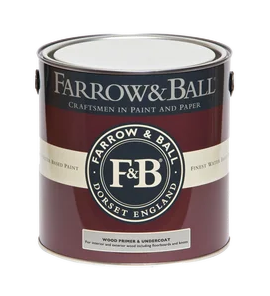
Our Red & Warm Tones Primer & Undercoat is the perfect first step towards truly cosy colour schemes. Based on the shade Porphyry Pink, it makes topcoats look even richer, so you can enjoy the fullest expression of your chosen hue.
Made with the same natural ingredients and pigments as our topcoats, our Primer & Undercoat is the crucial foundation for creating a rich, even and longer lasting finish.
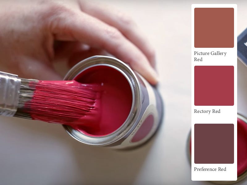
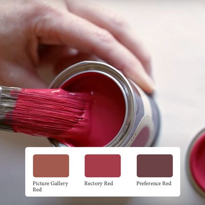
The best way to experience our colours before taking the plunge is with a true-to-colour paint sample. To help you narrow down your shortlist of shades, we've curated three of our most popular red shades to help you find your perfect match.
Sample selection contains 3 x 100ml Sample Pots of our beautiful Picture Gallery Red, Rectory Red and Preference Red.
Our expert Colour Consultants are ready and waiting to help bring your style to life. If you’d like personalised advice on how to use our paint and papers in your home, book an in-home or virtual appointment today.
Rated 5 out of
5 by
Babs55 from
Great paintI’ve been using Farrow and Ball paints for years the colour and ease of use is the best. Now and again I buy someone else’s paint and always regret it!
Date published: 2023-09-17
Rated 5 out of
5 by
Highland Julie from
Gorgeous Charlottes Locks!Gorgeous colour that I had always wanted to use and finally applied to an outdoor chair. It looks fabulous.
Date published: 2023-09-04
Rated 5 out of
5 by
Highland Julie from
Charlottes Locks and Bancha Mid Century Modern FabI have wanted to use this colour for the longest time and finally used it on a Adirondack chair that a neighbour made for me. I painted one in Charlotte's Locks and the other in Bancha. Mid century modern fabulous.
Date published: 2023-08-31
Rated 5 out of
5 by
Raffie123 from
Zing with depthMy favourite colour of all F&B. Depth, clarity and application is second to none as with all F&B but this just has that ‘extra’ for me. It’s ‘zing’ with no sting!
Date published: 2023-08-31
Rated 5 out of
5 by
Raffie123 from
Always perfection with F&B.Love this elegant zingMost beautiful colour, dream to use,finish perfect
Date published: 2023-08-12
Rated 5 out of
5 by
Annebonny from
Blood orangeDramatic change to room really worked. Updated room and colour words well with rustic wood
Date published: 2023-08-08
Rated 5 out of
5 by
Shaun72 from
Charlotte's Locks great colour!!!We did our bedroom with Charlotte's Locks and Elephants breath.
Date published: 2023-04-10
Rated 4 out of
5 by
BexinScotland from
Goegeous colour, 3 coats neededI absolutely love this colour, adds a vibrant warmth to a dark hallway. On the advice of F&B i actually used an eggshell on the wall, to give a higher sheen and bounce the light better, which really helps too. One star deducted because ive needed 3 coats (and therefore a second pot of paint) to get a smooth coverage, 2 coats was still really patchy. Made it a more expensive project than planned.
Date published: 2023-12-26
Rated 4 out of
5 by
Dinny from
Not as vibrant as hopedBought this without a tester in dead flat, I do love the finish the dead flat gives. Needed 3 coats, the coverage didn’t seem as good as over FB colours. Kinda reminds me of tomato soup! I was a bit disappointed that it wasn’t more of a vibrant orange colour, has a lot of red/ brown in it. Don’t know if I got a funny batch? Have paired with Strong White on the other walls and All White trim. Overall am pleased.
Date published: 2023-07-02
Rated 1 out of
5 by
Viti from
Lovely colour but....The colour in itself is a particularly wonderful orange colour, with a warm depth and a softness that you don’t often get with oranges.
However, the application was a nightmare. We applied this on a stairwell, with modern emulsion. We applied one coat of the correct primer and then after four coats of the emulsion we managed to call it a day, although in certain lights one can still see a tiny bit of primer showing through! This is ridiculous by any stretch of the imagination!
If you wanted to use this colour, I would suggest either applying enough coats of the primer so that the primer colour is totally even all over, or else apply the orange over a white or light coloured wall. The problem is that the paint is incredibly transparent and the primer is quite a dark reddish colour which keeps showing through the top coats if the primer is not applied until you have a completely even finish with the undercoat.
I’m glad we only used this on a small area!