
Orange Paint Schemes

Walls: Dutch Orange No.W76 | Image: @karlottamatthies
Combining the excitement of red with the positivity of yellow, orange paint represents the best of both worlds – and in a surprising number of ways, too. Ranging from soft peach and terracotta to deep, earthy almost-reds, our orange paint colours run the gamut of styles and moods, offering a take on this most joyful of colours for every room of the home.
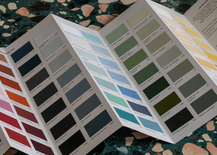
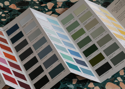
Complimentary Colour Card
Our coveted colour card is the perfect tool for starting your home transformation.
Order your complimentary colour card with free delivery.
How to Use Orange Paint
For spaces that exude calm and relaxation, try a light-touch orange paint like Faded Terracotta or Orange Coloured White, or a deep yet muted burnt orange such as Red Earth.
Where cheerfulness, stimulation and excitement are the order of the day, you can go bold with a bright orange like Dutch Orange or Charlotte’s Locks. This shade’s alleged appetite-stimulating properties, for example, mean that an orange kitchen is always a good idea.
When it comes to creating a colour scheme, zingy yellow-orange, intense coral or burnt orange paint can handle equally bold pairings, like emerald greens, blues and teals. With a more muted orange, try adding earthy shades of moss, sage, denim and off-white for a harmonious look.
Light Orange Paint
Want to harness the benefits of orange paint without straying too far out of your comfort zone? Try Orange Coloured White on for size. This soft peach paint contains just a whisper of creamy yellow-orange pigment for a look that’s overall neutral, but with a warmth and luminosity that you’ll feel the moment you step into the room.

Walls: Orangery No.70 | Image: @crosbydesignsllc

Walls: Orange Coloured White No.W5
Find your light orange
Feeling something more overtly orange? You can’t go wrong with Orangery. Bright, juicy, and packed with warm yellow tones, it creates rooms that feel like they’re drenched in sunshine (just see this inviting orange living room by @crosbydesignsllc for proof). If you’re working with a small space and feeling extra bold, try it on the ceiling as well – you won’t regret it.
Bright Orange Paint
Bright orange paint works just as beautifully with bold, contrasting colours as it does with neutrals, making it an incredibly versatile option for walls, woodwork and more.
Dutch Orange feels positively tropical combined with Verdigris Green, palm leaves and bright wall art in this fun landing by @cosy_little_home.

Walls: Dutch Orange No.W76; Bannister: Verdigris Green No.W50 | Image: @cosy_little_home

Door: Charlotte’s Locks No.268 | Image: @cotedefolk
Find your bright orange
In a modern, minimal bedroom, the spiced orange tones of Charlotte’s Locks are both attention-grabbing and perfectly at home with the surrounding neutrals. Using a bright orange on a single feature or piece of furniture, as @cotedefolk has done here, is a great trick for anyone who might find more intense tones overwhelming on all four walls.
Terracotta Paint
Combining softness, earthiness and warmth, terracotta paint is the ultimate feel-good addition to any bedroom, living room or kitchen. Symbolising a renewed loved of warm-toned palettes, these earthy orange paint colours are firmly back in favour for the 2020s – and they’re super versatile, too, as you’ll see in these two very different orange bedroom ideas.

Walls and Ceiling: Faded Terracotta No.CC8 | Image: @sophiecarpenter

Walls: Red Earth No.64 and Pointing No.2003 | Image: @daddelicious
Find your terracotta
A softer, peachier tone like Faded Terracotta works a treat on both walls and ceilings, blurring the boundaries of the room to create an incredibly cosy space. For an orange feature wall, you can get away with something a little more intense, like Red Earth. The trick to a harmonious look is choosing a neutral with the same undertone, like the red-based Pointing, for your remaining walls.
Colours That Go With Orange
Orange and Green
An unexpected but winning combination, orange and green can create all sorts of different moods. Vibrant coral Bisque alongside Olive and Bancha creates a charming mid-century modern feel, while Red Earth, Green Smoke and Mahogany create a more aged appeal that’s perfect for period properties.
Scheme 1:
Scheme 2:
Scheme 3:
Orange and White
Choosing a neutral to go with a statement wall colour like orange can be surprisingly simple. Just choose your favourite orange paint, go to its page right here on our site, and you’ll find its complementary white – a neutral tone hand-picked by our experts to suit each colour in our palette.
Scheme 1:
Scheme 2:
Orange and Grey
Orange and grey is a contemporary classic, and one that can be adapted to lots of different interior styles. For something crisp and architectural, try the Charlotte’s Locks and Easy Neutrals combination below. For a softer touch, try Red Earth with our warmer Contemporary Neutrals.
Scheme 1:
Scheme 2:
Orange and Blue
Ever wondered why orange and blue look so right together? It’s because they’re opposite each other on the colour wheel, making what’s known as a complementary colour pair. This works for red with green and yellow with purple, too.