We accept card payments from Visa, Mastercard, Maestro and Amex.
Simply choose card payment and fill in your details at checkout to choose this option. In some cases, you’ll be asked to authorise the payment through your bank for additional security.
PayPal
With PayPal you can pay for your paint and paper in just a few easy steps.
Simply choose PayPal at checkout, confirm the payment on their website (you’ll need to log in or create an account if you don’t have one already), and then you’ll be redirected back to farrow-ball.com with your order complete.
Apple Pay
You can use Apple Pay when shopping on Apple devices and on a Safari browser. But you need to activate it in your Apple account and device first.
Choose Apple Pay at checkout, confirm the payment on your Apple device and you’ll be redirected back to farrow-ball.com with your order complete.
Klarna
Paint now, pay later with Klarna.
We’ve partnered with Klarna to offer you multiple ways to pay for your handcrafted paint and paper. Just look for the Klarna logo at checkout or visit our FAQ page to find out more.
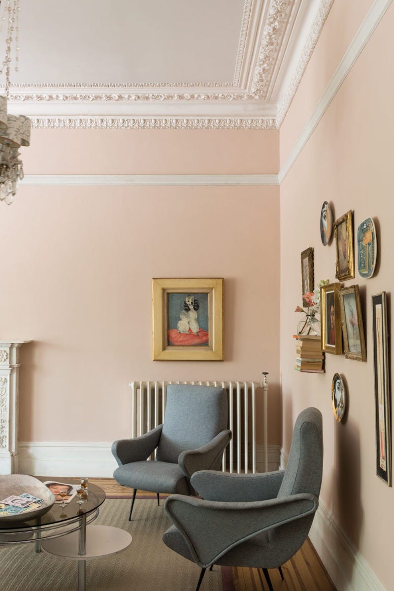
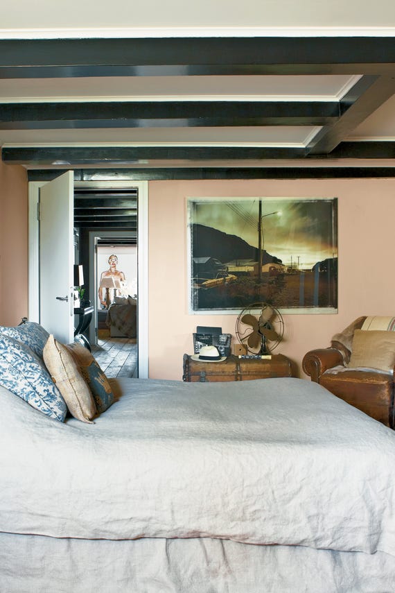
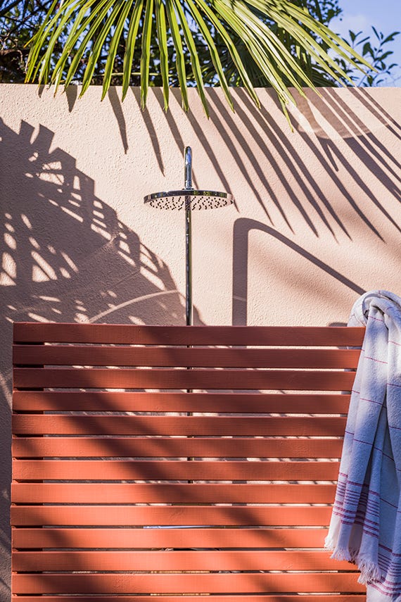
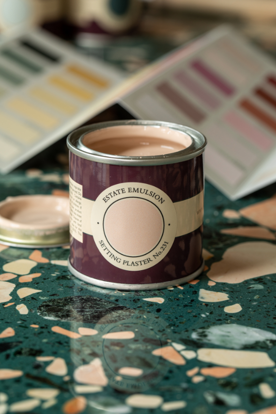
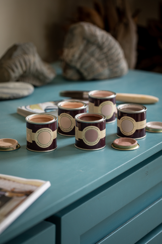
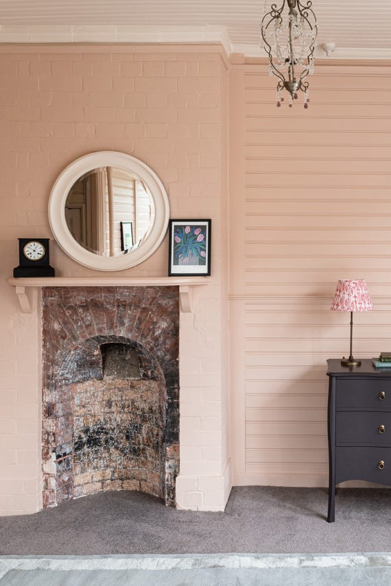
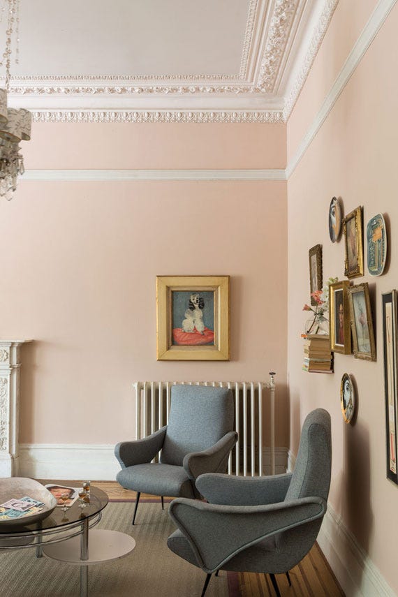
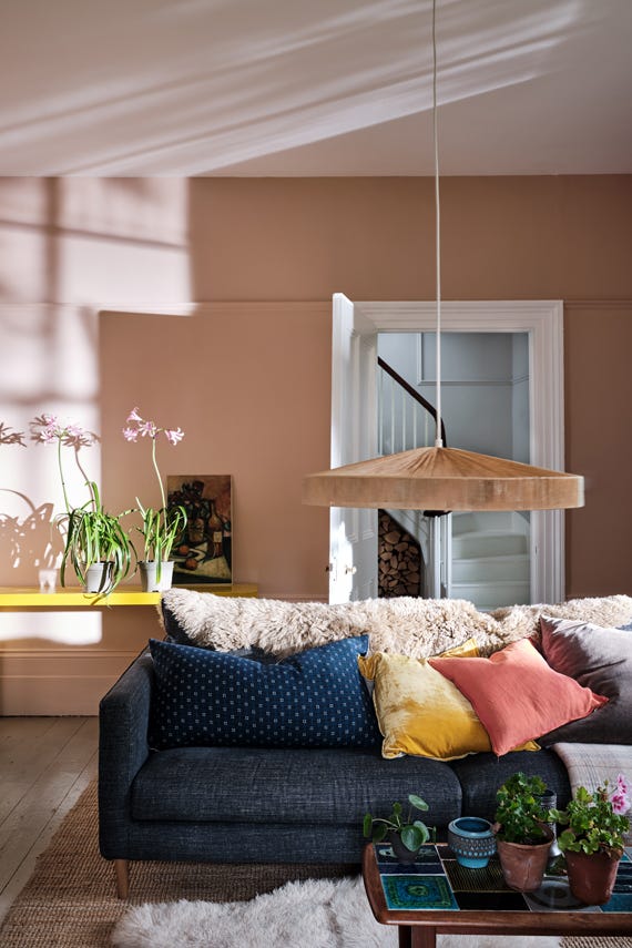
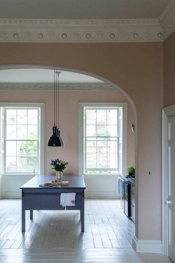
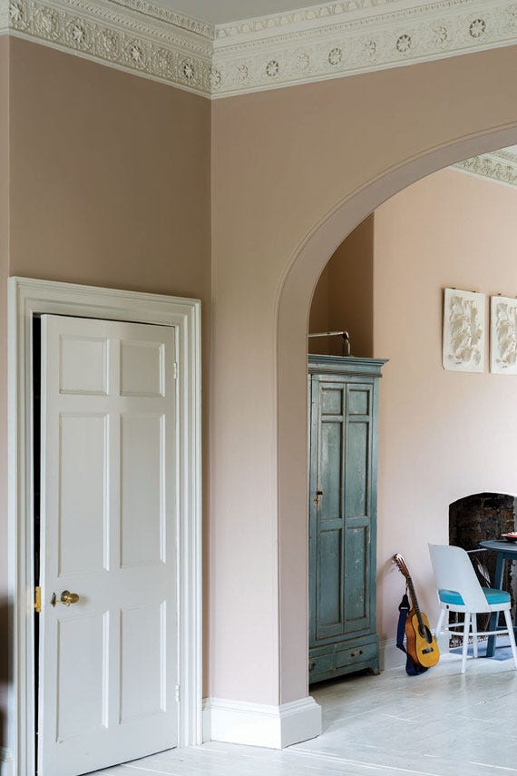
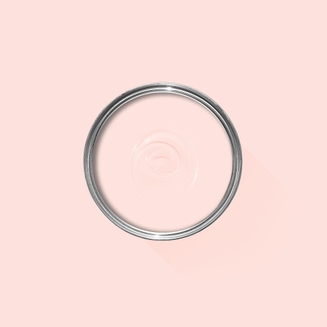
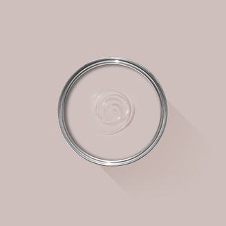
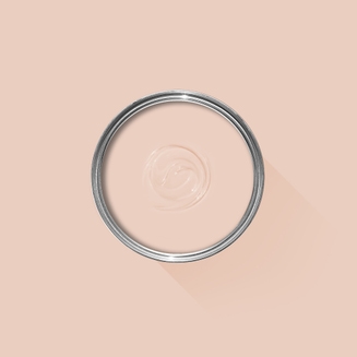
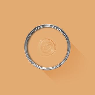
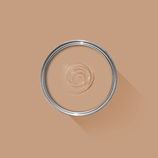
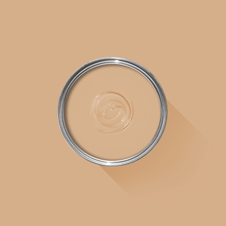
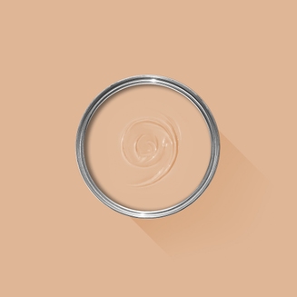
A dusty plaster pink
This dusty pink is named after the blushing walls we often admire in newly plastered houses. It is definitely a pink in historic terms, but has a certain softness to it due to the inclusion of yellow pigment. Our timeless Setting Plaster creates a wonderful backdrop to antique furniture, and also works incredibly well when paired with Mahogany in a more contemporary home.
Recommended Primer & Undercoat:White and Light Tones
We’re dedicated to perfecting the art of paint. At our home in Dorset, we combine the finest ingredients, 75 years of experience and technical precision to help you create beautiful spaces that stay beautiful. Even in our colour rich paints, less than 8% of the tin is the colour. The other 92% is what creates the quality, depth and extraordinary response to light that transforms your home.
Paint is like coffee. The colour is the froth on the top, but it’s the quality of the rest of the cup that makes it taste good. – Richard Ball, Farrow & Ball Co-founder
We use twelve exclusive pigments, all specifically selected for their colour intensity. We take colour seriously, so naturally, we only accept the very best. By using these same pigments to make every colour in our palette, all our shades combine effortlessly, making it easy for you to put together a cohesive colour scheme.
Deeper, richer colours
Deeper, richer colours
Packed with pigment for an extraordinary response to every kind of light.
We add generous helpings of rich pigment to create our signature look – deep colours with complex undertones. The same space that feels bright and airy in morning sun, can feel cosy and intimate by evening. Our teams design each shade under every kind of light, so it will be perfectly balanced in every setting.
Extraordinary response to light
Extraordinary response to light
We spend months carefully crafting and testing each of our paint colours to make sure they share our signature extraordinary response to light. This beautiful reaction to changing light, like bringing out different undertones or shifting intensity, is what makes our paint so special.
Interior and exterior finishes
Interior and exterior finishes
From walls, floors and furniture to radiators, skirtings and sheds, our range of paint finishes can help you transform almost any surface in your home (and outside it, too).
We even have multi-surface finishes like Dead Flat and Full Gloss, so you can tackle walls, woodwork and metal at the same time.
Our comprehensive range is comprised of paint finishes that not only look beautiful, but offer different practical benefits. Designed for a variety of different surfaces, each finish is compatible with our high-performance Primers & Undercoats to ensure exceptional coverage, adhesion and depth of colour.
Colour Story
Complementary White
School House White
School House White is pared back, timeless and familiar without the cool undertones of the more contemporary neutral groups. Find out more about School House White No.291
Every colour in the Farrow & Ball palette is paired with a specific shade of white, these are selected to celebrate a shared undertone and create harmonious spaces alongside your chosen colour.
Our White & Light Tones Primer & Undercoat creates a wonderful base for our softest shades. Covering imperfections on your surface and adding extra depth of colour, this primer is based on our simplest colour, All White.
Made with the same natural ingredients and pigments as our topcoats, our Primer & Undercoat is the crucial foundation for creating a rich, even and longer lasting finish.
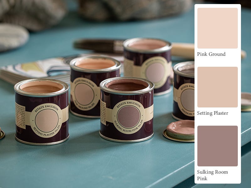
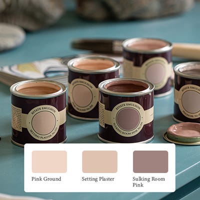
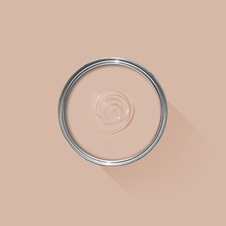
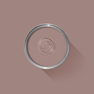
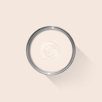
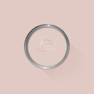
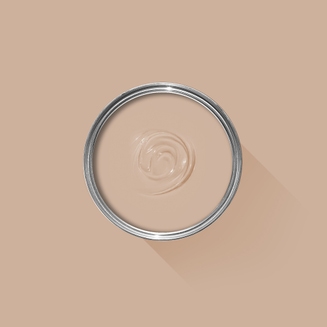
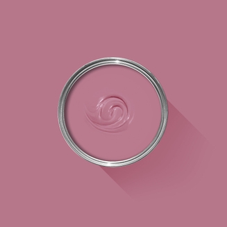
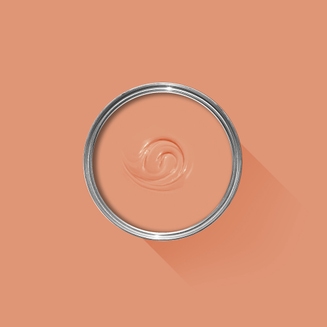
The best way to experience our colours before taking the plunge is with a true-to-colour paint sample. To help you narrow down your shortlist of shades, we've curated three of our most popular pink shades to help you find your perfect match.
Sample selection contains 3 x 100ml Sample Pots of our beautiful Pink Ground, Setting Plaster and Sulking Room Pink.
Rated 5 out of
5 by
Harrie from
Cosy colourColour drenched the hallway in setting plaster and woodwork/door in pointing. Initially I thought it was too much. However, a week later I love this space. Setting plaster dries slightly lighter. It can feel dark at night but it is not a space I spend time in at night (so that is fine). Throughout the day the walls look fab in the west facing hall with light from the east facing kitchen. Also, matches with arsenic on the kitchen wall.
Date published: 2024-04-06
Rated 5 out of
5 by
Breagha from
Very pleased with resultsGreat service and The Estate Emulsion went on like a dream and gave excellent coverage. This was my first time to use Farrow and Ball paint and I will definitely be using it again.
Date published: 2024-04-02
Rated 5 out of
5 by
Lisa W from
Love this!Lovely colour, covers really well, even a dark grey with 2 coats. Reflects the light beautifully.
Date published: 2024-03-24
Rated 5 out of
5 by
Sian A from
Beautiful dusty pink.Used Setting Plaster to paint my office space in our new home, could not be more pleased with this colour. It is a dusty blush pink that is neither dull and unsaturated nor overpowering. It has warmth and changes in light throughout the day really do bring out different tones and qualities in the paint.
Date published: 2024-02-13
Rated 5 out of
5 by
Lesleyrmc from
Our family room now feels lovely & cosyD Salmon & Templeton Pink just both felt too dark so this was a good alternative. 2 coats as usual worked a treat.
Date published: 2023-11-26
Rated 5 out of
5 by
msmac from
Stunning shadeBeautiful blush pink shade, unfortunately the lighting coming into my hallway from the West (with only the light from door window) darkened it just too much. 😢 All is not lost as I think I've found another favourite, keeping my fingers crossed re the light coming from the West.
Date published: 2023-11-20
Rated 5 out of
5 by
yyadiloh from
Soft, deep and full of characterI love this colour. It has a beautifully creamy texture with wonderful depths.
Date published: 2023-11-06
Rated 5 out of
5 by
Georgieb1234 from
HallwayChose Setting Plaster for my hallway it’s fabulous
Date published: 2023-10-12
Rated 5 out of
5 by
Nicki A from
Warm yet neutral, beautiful!I had seen this colour in a F&B promotion and fallen in love with it. I decided to use it in my kitchen and it is absolutely beautiful, really warm but neutral and a perfect colour to use as a neutral background with personality.
Date published: 2023-10-12
Rated 5 out of
5 by
KimC from
Beautiful Color!This is such a beautiful color! Not sure why I waited so long to make this choice! Pics to come once the project is finished
Date published: 2023-10-10
Rated 5 out of
5 by
KTatHome from
A lovely calm, warm yet neutral colour.This is a lovely neutral, warm colour. I bought a house with a room already painted this colour - it was badly scuffed by a visitor and I needed to 're-touch' a small area. Thankfully, I managed to guess which of Farrow & Balls many subtle colours this was and got the right match with a small sample pot - always a challenge! (wonder if there's a recommended method of colour matching previously painted areas?)....Whole room as good as newly painted now - very handy!
Also wondering what to do if colour was a different finish and one only needed a sample pot to 'touch up'??
Date published: 2023-10-09
Rated 5 out of
5 by
Udor from
A wonderfully elegant colourSetting Plaster is a fantastic colour. It is very versatile and elegant, and really makes your space come alive. It changes the mood into something enticing and relaxing. Once you are finished painting, suspend your judgement for a few days. It takes some time for the final colour to set in as the paint cures. Once it is ready, you will be very happy. The Dead Flat finish is just amazing. It breathes new life into your walls. I highly recommend this paint. I used it in our upstairs landing and on the door of our main bathroom. It works really well with metal accessories, marble, and wood. A+
Date published: 2023-09-15
Rated 5 out of
5 by
Grace3 from
Wonderful chameleon-like colourWe chose Setting plaster for the woodwork in our girls’ bedroom, with Pink Ground on the walls. They are gorgeous together. I had seen them recommended for use together by Joa Studholme, but there aren’t many examples of this to view online. The room is west facing with another velux window to the east, so quite bright. The colours change beautifully through the day. It’s a colour that appeals to my pink-obsessed girls, and to the adults of the house equally.
Date published: 2023-08-14
Rated 5 out of
5 by
Anonymous from
Bedroom BlissBeautiful colour. Used in a bedroom -very calming and relaxing
Date published: 2023-08-10
Rated 5 out of
5 by
LynnM from
Changed my mind and love itI previously tried a sample and was unimpressed with the finish but loved the colour. When the new dead flat came out I decided to give it a go and I’m so glad I gave it a chance. This covered really well in two coats (some small patches will need 3), and went on much better than the paint I’m used to using (top tier BM drips). It’s a chameleon and sometimes it leans a bit mauve or dusty, and sometimes it glows the most beautiful peach, but always it looks really good in the space and works well with my trim. I just painted it so I can’t speak to how well it will wear. I painted directly over a BM white, no primer.
Date published: 2023-08-05
Rated 5 out of
5 by
aepyornises from
Just better.Just better.
Easier to apply, better coverage, longer lasting. Worth the extra £.
Date published: 2023-07-25
Rated 5 out of
5 by
@anno1884 from
Fantastic color!We are renovating an old house and for the living room this color was perfect! So cosy, warm and elegant.
To add a little wow factor we choose to decorate one wall with the lotus wallpaper. Trims and doors is painted with London Stone. This products is a bit more expensive than others, but could not be happier with the resault! Will defenitly choose F&B again.
Date published: 2023-07-22
Rated 5 out of
5 by
Anonymous from
Used in my living room and landing.I love this colour. It feels like a very warm neutral, especially in my living room where it’s next to the Calke Green in my hallway. F&B is always wonderful quality and easy to put on the wall.
Date published: 2023-05-30
Rated 5 out of
5 by
JoWack from
Subtle Mediterranean colourLovely subtle colour used outside to enhance the greens in garden and sandstone
Date published: 2023-04-12
Rated 5 out of
5 by
H_arrie_t from
TimelessSuch a gorgeous colour and works with so many other colours to create either a vintage feel or a modern feel. I’m about to go over the walls and skirting in the new Dead Flat because, well - Kids.
Date published: 2023-03-28
Rated 5 out of
5 by
ZHappy from
This colour brings me joy!Using the right undercoat I used estate emulsion and estate eggshell on the picture rail. The rest of the woodwork is painted in Hague blue. It makes my north facing bedroom feel so warm and it’s a pleasure to spend time there which is great as I work from home in the same room. The colour offsets my newly restored fireplace too! Just love it! It is more expensive than some paints but the coverage is very good and the depth of colour is unbeatable.
Date published: 2022-09-26
Rated 4 out of
5 by
J.J.Kirk from
ColourwayF & B has the best colourways in the market ...Have not used paint as yet, but have no doubt it will be exemplary
Date published: 2023-11-24
Rated 3 out of
5 by
Paola S from
Amazing paint, same day delivery a failureThe paint is fabulous, but this is the second time I pay extra to have it delivered on the same day, and despite my order is placed well before the established deadline to be eligible, the order gets delivered the day after... These are things to which a company like this should definitely pay more attention. I will keep buying, of course, but never paying for the same day delivery anymore.
Date published: 2024-03-22
Rated 3 out of
5 by
AYuk from
DisappointingFarrow and Ball were the only company (out of 3) who didn’t send a little paint brush with their sample pots. Despite their paint being more expensive than other companies, this makes it feel less luxurious. A rethink on marketing required @farrow and ball
Date published: 2023-10-14
Rated 3 out of
5 by
KT72 from
Nice, but sucked all the light out of our kitchenWe bought this to decorate our kitchen which has a fair amount of natural light. We chose the dead flat finish, to minimise imperfections in our 15th century cottage walls Whilst it's a beautiful colour, and does minimise imperfections, it has sucked all the natural light out of the room. In daylight it's a bit dim, but as soon as we turn on the electric lights the walls close in on us. The colour is rich and intense, the paint quality is lovely, but it absorbs natural light and made our room feel much smaller. We're changing the colour, which is a fairly costly mistake.
Date published: 2023-07-07
Rated 2 out of
5 by
LucyandPaul from
When is a Sample not a Sample?Ordered sample pots from the Dead Flat range but when they arrived they were Estate Emulsion. When I queried this I was told the sample was for colour purposes. So I squandered money on the smallest pot of Dead Flat Stony Ground only to find the colour is significantly different from the Estate Emulsion sample pot, but the finish isn't.
It shouldn't be necessary to spend £36 to assess a paint before buying, and finish is as important as colour so to be sent sample pots of Estate Emulsion against an order for Dead Flat. It's not as if the sample pots are free!!
Date published: 2023-11-06
Rated 1 out of
5 by
simmi98 from
not the quality I was expectingI recently bought and used this paint and I absolutely love the colour however the quality and durability of the paint is shockingly poor. I've only had this paint on my walls for under a month and today my cat knocked over a mug of water that was placed on the window sill. I quickly wiped the wall as soon as the spillage occurred but to my surprise the paint flaked off!! I usually buy from one of F&B main competitors however I fell in love with colour and assumed both companies would be the same quality as they both charge a premium price, however I was clearly wrong.
Date published: 2024-01-29
Rated 1 out of
5 by
Susan k from
I will never buy Farrow and Ball againI painted my living room with Estate Emulsion Setting Plaster sometime in June 2022 it's now March of 2023 and it's cracking. I'm so disappointed in this brand.
Back in 2010, we moved to an entirely water based range of finishes, becoming the first in the industry to do so. These low-odor, low-VOC finishes are easy to clean without harmful solvents. They also meet child- and baby-safe requirements in accordance with The Canada Cribs, Cradles and Bassinets Regulations, Canada Toy Regulations (SOR/2011-17) – Section 23 and ASTM F963 – 17 - Standard Consumer Safety Specification for Toy Safety.
Quality Finishes
Every one of our paint colours is available in a range of durable interior and exterior paint finishes, each rigorously tested to ensure an exceptional depth of colour and long-lasting finish. For the very best results, we always recommend using a Farrow & Ball Primer & Undercoat - see above for the correct tone for this colour.
Safety Information
Always read and follow the information on the product label.
All Farrow & Ball finishes except Limewash contain isothiazolinones, which may produce an allergic reaction. Farrow & Ball Limewash contains calcium hydroxide which can cause severe damage in contact with skin or eyes. For further information about our products, including guidance on safe use and application, click here to view our advice pages.
WARNING: This product can expose you to chemicals including acetaldehyde, which is known to the State of California to cause cancer. For more information, go to www.P65Warnings.ca.gov.