We accept card payments from Visa, Mastercard, Maestro and Amex.
Simply choose card payment and fill in your details at checkout to choose this option. In some cases, you’ll be asked to authorise the payment through your bank for additional security.
PayPal
With PayPal you can pay for your paint and paper in just a few easy steps.
Simply choose PayPal at checkout, confirm the payment on their website (you’ll need to log in or create an account if you don’t have one already), and then you’ll be redirected back to farrow-ball.com with your order complete.
Apple Pay
You can use Apple Pay when shopping on Apple devices and on a Safari browser. But you need to activate it in your Apple account and device first.
Choose Apple Pay at checkout, confirm the payment on your Apple device and you’ll be redirected back to farrow-ball.com with your order complete.
Klarna
Paint now, pay later with Klarna.
We’ve partnered with Klarna to offer you multiple ways to pay for your handcrafted paint and paper. Just look for the Klarna logo at checkout or visit our FAQ page to find out more.
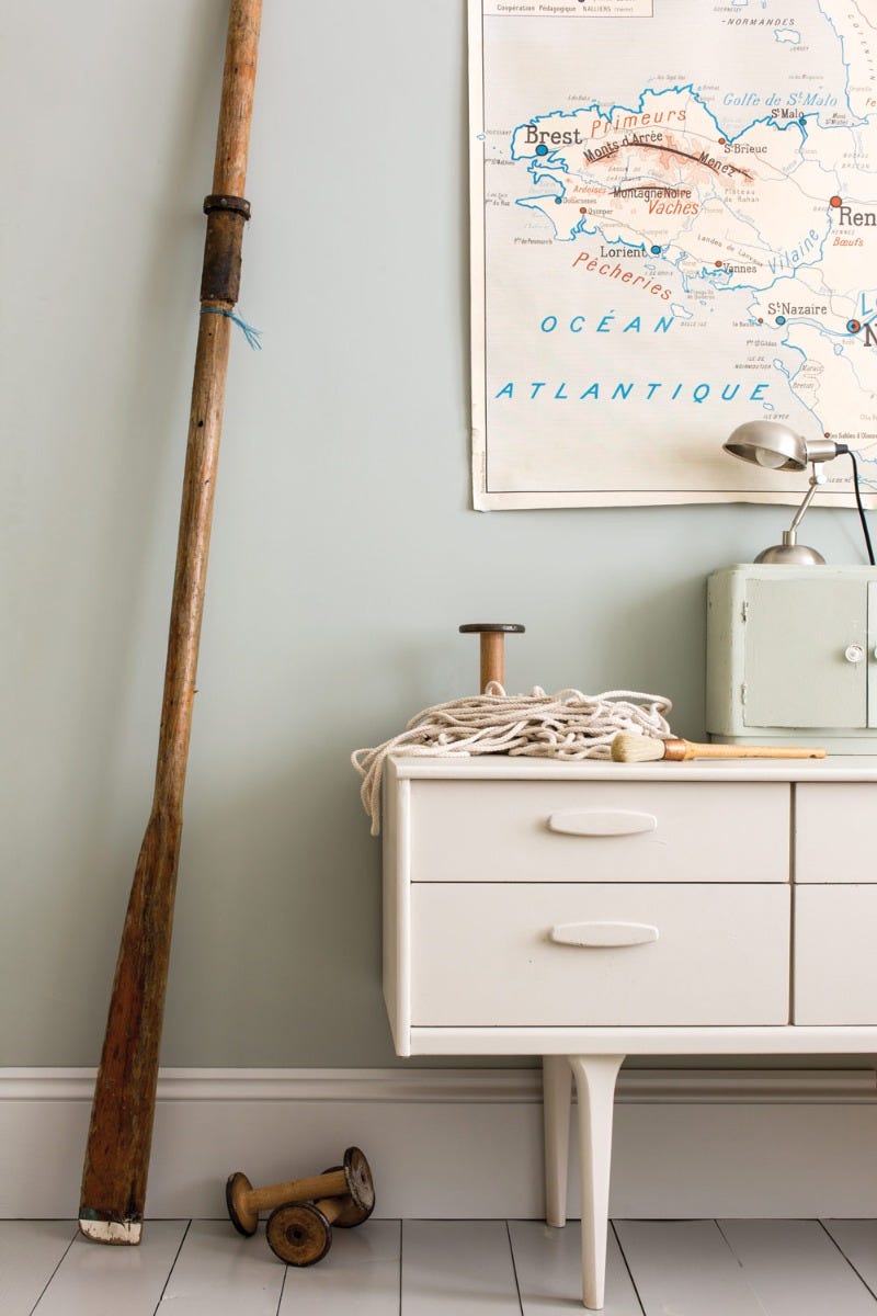
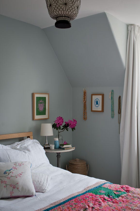
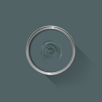
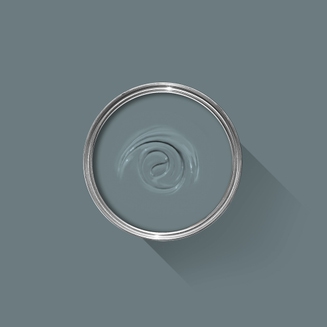
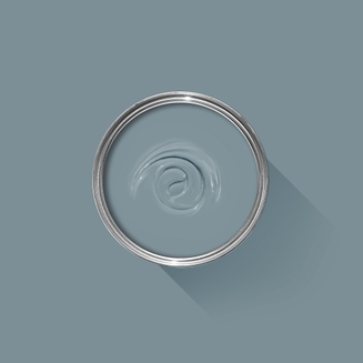
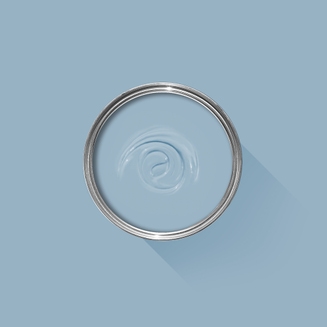
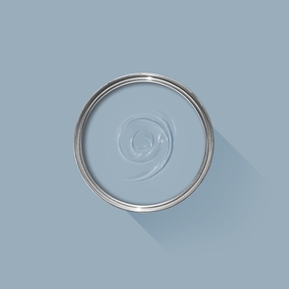
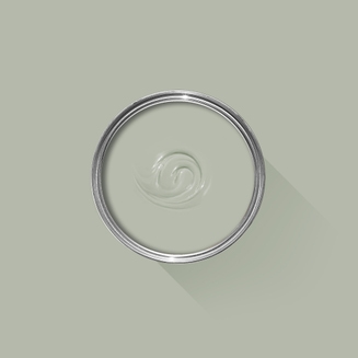
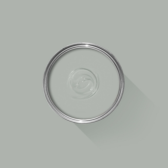
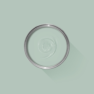
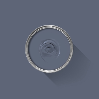
A light silvery blue
This silvery blue was so named because it was the lightest blue Farrow & Ball made in its first collection of colours. Light Blue becomes a little more silver in tone when used in shaded areas so is very popular for use on the walls of internal halls, especially when the remainder of the house is painted in cooler, more neutral greys. When used in well lit areas it feels both peaceful and calming, especially when paired with a cool white like Blackened.
We’re dedicated to perfecting the art of paint. At our home in Dorset, we combine the finest ingredients, 75 years of experience and technical precision to help you create beautiful spaces that stay beautiful. Even in our colour rich paints, less than 8% of the tin is the colour. The other 92% is what creates the quality, depth and extraordinary response to light that transforms your home.
Paint is like coffee. The colour is the froth on the top, but it’s the quality of the rest of the cup that makes it taste good. – Richard Ball, Farrow & Ball Co-founder
We use twelve exclusive pigments, all specifically selected for their colour intensity. We take colour seriously, so naturally, we only accept the very best. By using these same pigments to make every colour in our palette, all our shades combine effortlessly, making it easy for you to put together a cohesive colour scheme.
Deeper, richer colours
Deeper, richer colours
Packed with pigment for an extraordinary response to every kind of light.
We add generous helpings of rich pigment to create our signature look – deep colours with complex undertones. The same space that feels bright and airy in morning sun, can feel cosy and intimate by evening. Our teams design each shade under every kind of light, so it will be perfectly balanced in every setting.
Extraordinary response to light
Extraordinary response to light
We spend months carefully crafting and testing each of our paint colours to make sure they share our signature extraordinary response to light. This beautiful reaction to changing light, like bringing out different undertones or shifting intensity, is what makes our paint so special.
Interior and exterior finishes
Interior and exterior finishes
From walls, floors and furniture to radiators, skirtings and sheds, our range of paint finishes can help you transform almost any surface in your home (and outside it, too).
We even have multi-surface finishes like Dead Flat and Full Gloss, so you can tackle walls, woodwork and metal at the same time.
Our comprehensive range is comprised of paint finishes that not only look beautiful, but offer different practical benefits. Designed for a variety of different surfaces, each finish is compatible with our high-performance Primers & Undercoats to ensure exceptional coverage, adhesion and depth of colour.
Colour Story
Complementary White
School House White
School House White is pared back, timeless and familiar without the cool undertones of the more contemporary neutral groups. Find out more about School House White No.291
Every colour in the Farrow & Ball palette is paired with a specific shade of white, these are selected to celebrate a shared undertone and create harmonious spaces alongside your chosen colour.
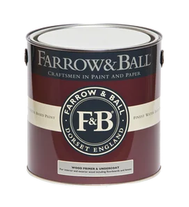
Based on the colour Bone, using our Mid Tones Primer & Undercoat adds the richest depth of colour to some of our best-selling shades.
Made with the same natural ingredients and pigments as our topcoats, our Primer & Undercoat is the crucial foundation for creating a rich, even and longer lasting finish.
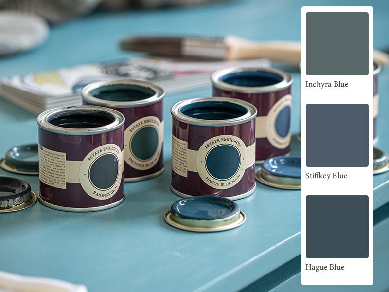
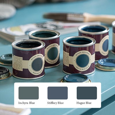
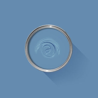
The best way to experience our colours before taking the plunge is with a true-to-colour paint sample. To help you narrow down your shortlist of shades, we've curated three of our most popular blue shades to help you find your perfect match.
Sample selection contains 3 x 100ml Sample Pots of our beautiful Inchyra Blue, Stiffkey Blue and Hague Blue.
Rated 5 out of
5 by
Mil84 from
A stunning transformationWe used Light Blue in our son’s bedroom in our new home. The walls were not in a great condition so we fixed up whatever we could. The primer gave off a sheen showing every little imperfection; I was dreading the painting as I thought we had wasted so much time plastering, filling, sanding etc. that the finish would just look rubbish. Boy was I wrong, the Dead Flat finish covered up everything and the walls look impeccable. The colour is just stunning, I can’t stop going into his room at different times of the day just to admire the various shades. We had been recommended 5l for the size of the bedroom so now we’re stuck with 2.5l left over as the paint went on so well with just two coats. We are extremely happy with the result!
Date published: 2024-02-05
Rated 5 out of
5 by
Marles from
Love this paint!Beautiful color and amazing coverage. One can painted our entire living room.
Date published: 2023-12-13
Rated 5 out of
5 by
Anonymous from
Beautiful soft green/grey .Very happy with this colour . Its name is slightly confusing as it’s not light blue at all . It’s more of a very warm green grey depending on the light . I’m extremely happy with the finished result and everyone has commented on the colour .
Date published: 2023-11-23
Rated 5 out of
5 by
Anonymous from
Versatile blueThis is the 3rd time I’ve used Light Blue in 3 different homes. It is such a versatile colour, goes with anything and as usual the quality is amazing.
Date published: 2023-11-15
Rated 5 out of
5 by
J Wells from
Light Blue modern emulsion paintBeautiful colour, covered easily in one coat completely changed the look of my bedroom
Date published: 2023-10-10
Rated 5 out of
5 by
Gin1 from
Fantastic paint!Gorgeous rich matt colour, just as described blue/grey. As always goes on really easily.
Date published: 2023-10-08
Rated 5 out of
5 by
Herb Spindler from
Sleigh Bed transformedWonderful color with hints of blue, green and gray!
Date published: 2023-10-01
Rated 5 out of
5 by
Anonymous from
Lovely paintLove this paint. Nobody does paint like this the colour is beautiful
Date published: 2023-07-03
Rated 5 out of
5 by
Jo1971 from
TransformationThis beautiful greeny greyish light blue transformed a dark and dingy flat into a bright yet restful space…accents of burnt orange really make it sing!
Date published: 2023-04-17
Rated 5 out of
5 by
Love to paint from
Its name doesn’t do it justice.This is a fabulous colour. It changes with the different lights of the day. I love it. Xx
Date published: 2023-04-13
Rated 5 out of
5 by
@sylvielondoner from
Delightful and Ever ChangingLight Blue is now one of my favourite Farrow & Ball colours. It's ever changing in our East facing master bedroom; warm blue in the bright morning sun, green-blue in the afternoon and grey-green at night in lamplight. I would say it looks more green than blue during most of the day, but that's what I wanted. I like the blue-green hue and prefer it over a yellow based green. It may appear mostly blue in a South facing room though, so use a tester for your room. The depth is a kind you can only achieve with Farrow & Ball colours. Coverage was absolutely incredible (I used Estate Emulsion) and you could nearly get away with one coat, but I did two and it covered the previous colour (Skimming Stone) wonderfully. Gold framed art and brass details look beautiful against this colour. The moody light that comes through our bedroom during the majority of the day just makes this colour look so cosy and interesting. I also love how it suits our 100 year old home in London. You can see more images on my ig @sylvielondoner.
Date published: 2023-04-08
Rated 5 out of
5 by
Anna109 from
Light blueThis colour has such complexity to it. I didn’t want a bright bold blue to go in my bedroom but more of a muted blue. This is the paint!
The bedroom is north facing however the en suite is south facing so lets a lot of light into the bedroom. Through out the day the colour changes from blue, to blue-green and to blue-grey, perfect for a nautical themed bedroom.
The quality of the paint is great. I would definitely recommend using a primer especially on newly plastered walls, as it makes the paint go further. I only needed one 250ml pot to do two coats of the whole bedroom with some remaining.
The colour is so cosy and looks really expensive. I would definitely recommend.
Date published: 2023-02-04
Rated 4 out of
5 by
Necklacegirl from
Try a test pot!Ordered 5L to paint a bedroom. I was very surprised when I started painting - the colour is definitely more green than blue. Having said that it was a room that I was creating from scratch and so could be flexible with accessories. Overall I like the colour in my south facing room but it is not light silvery blue!
Date published: 2023-01-19
Rated 4 out of
5 by
Professor Mark from
Definitely not blue!We are in the process of painting our walls using Modern Emulsion. This paint claims to be “light blue”. It’s nothing of the sort - it’s green!
Date published: 2022-11-11
Rated 3 out of
5 by
Bristolfoodiemum from
Damaged tins.Nice paint but tins arrived damaged and leaking. Not the first time this has happened with F&B paint unfortunately
Date published: 2023-06-23
Rated 1 out of
5 by
Lilyf from
Very disappointing. Not blue nor light.I am so disappointed by this colour, which I chose for my newborn's nursery and was soooo looking forward to applying. I was looking forward to a happy, optimistic light blue, instead, I got a sad greyish green in the morning and dark grey in the afternoon, especially with the mid undertone they recommended in store. I am going to have to spend an awful lot of money again to try to cover it back to a real "light blue" colour. I don't understand why Farrow & Ball don't rename this colour given it's clearly not light nor blue and it sounds like everyone knows that.
Date published: 2024-01-15
Rated 1 out of
5 by
HannaJ from
It’s green!!!Have redone my living room from scratch, plastered the walls and used the primer, today was first coat of Light Blue, but it’s not at all as the sample pot! It’s green, nothing silvery blue about it! The room is south-east facing so lots of sunlight. Before this I painted the kitchen, hallway. D dining room in Dimity, that went on like a dream and looks amazing. But this is not what I expected, and am kind of shattered as to what to do now. I need to move in before end of June and was counting on having the living room finished by this weekend! I’ve bought Skylight for the bedroom, that might be an option instead, but then I’ll not have enough for the bedroom. And would I need to prime again? Also, it seems that two coats of Light Blue would not be enough, it’s really bad coverage. But again, since it’s green it’s not what I expected or wanted. Bought the paint from your retailer ABC Färgekonomi in Stockholm, had previously used F&B paint and loved it. So disappointed and distraught about this.
Date published: 2023-06-10
Rated 1 out of
5 by
AmyGregory89 from
Very disappointed - would not recommendChoosing this colour has been a costly disappointment. The colour represented in the promotional images online is nothing like the colour in real life. The colour is so dingy and terrible to apply. I bought a 5L tin of emulsion for an average sized bedroom. The decorator applied 3 coats of top coat but the walls are still patchy. I’m now left with this situation: do I buy more of this paint colour and hope that one more coat will make a difference or do buy a completely different colour and start again. Not an ideal situation as I’m 37 week pregnant, and I needed the room ready before my baby arrives. Plus we’ve already spent over £500 on painting this room so my husband is not happy about these options. I’ve never had an issue with F&B paints before so I’m confused about why this colour has been so problematic. The decorator was confused, too, with the outcome of the colour and coverage.
Back in 2010, we moved to an entirely water based range of finishes, becoming the first in the industry to do so. These low-odor, low-VOC finishes are easy to clean without harmful solvents. They also meet child- and baby-safe requirements in accordance with The Canada Cribs, Cradles and Bassinets Regulations, Canada Toy Regulations (SOR/2011-17) – Section 23 and ASTM F963 – 17 - Standard Consumer Safety Specification for Toy Safety.
Quality Finishes
Every one of our paint colours is available in a range of durable interior and exterior paint finishes, each rigorously tested to ensure an exceptional depth of colour and long-lasting finish. For the very best results, we always recommend using a Farrow & Ball Primer & Undercoat - see above for the correct tone for this colour.
Safety Information
Always read and follow the information on the product label.
All Farrow & Ball finishes except Limewash contain isothiazolinones, which may produce an allergic reaction. Farrow & Ball Limewash contains calcium hydroxide which can cause severe damage in contact with skin or eyes. For further information about our products, including guidance on safe use and application, click here to view our advice pages.
WARNING: This product can expose you to chemicals including acetaldehyde, which is known to the State of California to cause cancer. For more information, go to www.P65Warnings.ca.gov.