You can use Apple Pay when shopping on Apple devices and on a Safari browser.
Klarna
Paint now, pay later with Klarna.
We’ve partnered with Klarna to offer you multiple ways to pay for your handcrafted paint and paper.
Available in United Kingdom, Austria, Spain, Finland, Ireland, Italy and The Netherlands only.
PayPal
With PayPal you can pay for your paint and paper in just a few easy steps.
Card Payments
We also accept card payments from Visa, Mastercard, Maestro and Amex
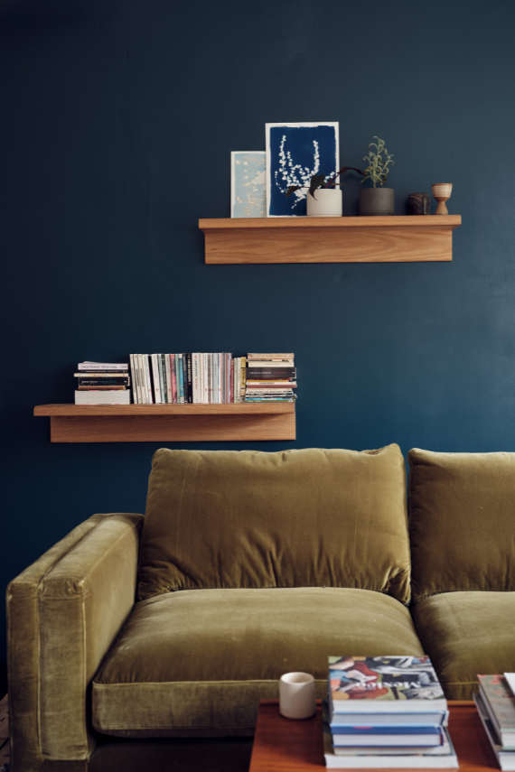
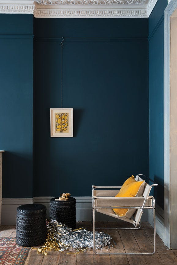
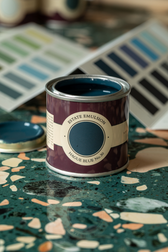
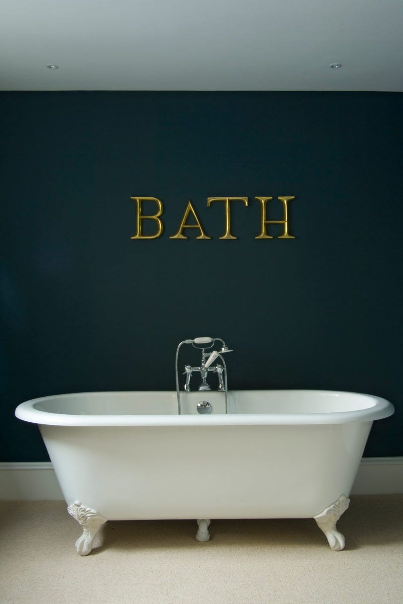
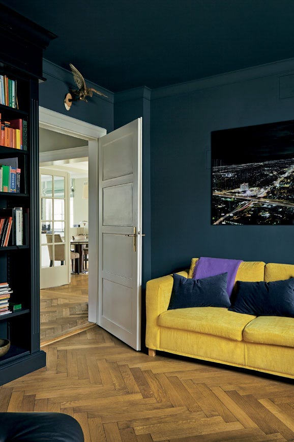
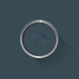
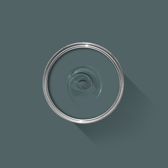
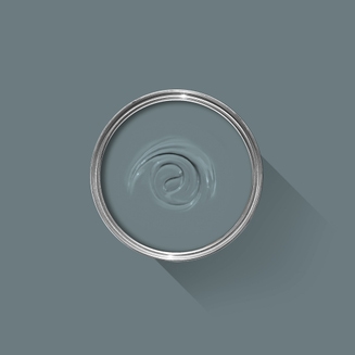
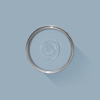
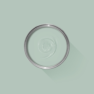
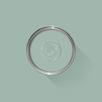
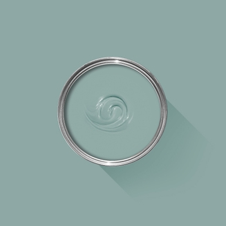
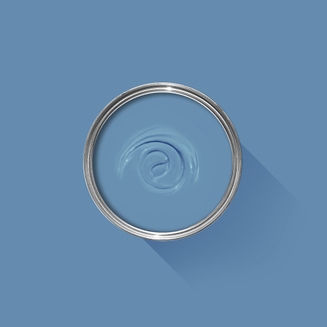
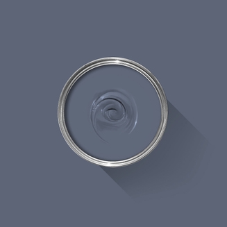
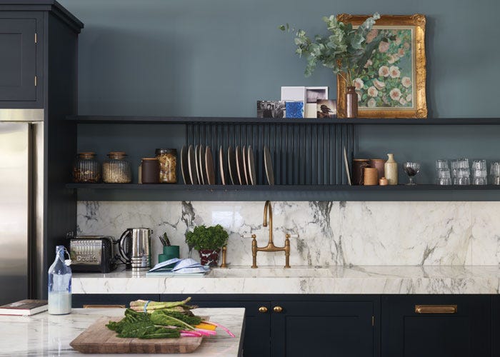
A deep dark blue
This strong blue takes its name from the fantastically coloured woodwork much used by the Dutch, and still works wonderfully to ground skirtings or as an accent colour on the walls when teamed with Borrowed Light. The green undertones of this timeless, deep and dramatic blue means it sits as happily outside as it does in small dark rooms.
We’re dedicated to perfecting the art of paint. At our home in Dorset, we combine the finest ingredients, 75 years of experience and technical precision to help you create beautiful spaces that stay beautiful. Even in our colour rich paints, less than 8% of the tin is the colour. The other 92% is what creates the quality, depth and extraordinary response to light that transforms your home.
Paint is like coffee. The colour is the froth on the top, but it’s the quality of the rest of the cup that makes it taste good. – Richard Ball, Farrow & Ball Co-founder
We use twelve exclusive pigments, all specifically selected for their colour intensity. We take colour seriously, so naturally, we only accept the very best. By using these same pigments to make every colour in our palette, all our shades combine effortlessly, making it easy for you to put together a cohesive colour scheme.
Deeper, richer colours
Deeper, richer colours
Packed with pigment for an extraordinary response to every kind of light.
We add generous helpings of rich pigment to create our signature look – deep colours with complex undertones. The same space that feels bright and airy in morning sun, can feel cosy and intimate by evening. Our teams design each shade under every kind of light, so it will be perfectly balanced in every setting.
Extraordinary response to light
Extraordinary response to light
We spend months carefully crafting and testing each of our paint colours to make sure they share our signature extraordinary response to light. This beautiful reaction to changing light, like bringing out different undertones or shifting intensity, is what makes our paint so special.
Interior and exterior finishes
Interior and exterior finishes
From walls, floors and furniture to radiators, skirtings and sheds, our range of paint finishes can help you transform almost any surface in your home (and outside it, too).
We even have multi-surface finishes like Dead Flat® and Full Gloss, so you can tackle walls, woodwork and metal at the same time.
Our comprehensive range is comprised of paint finishes that not only look beautiful, but offer different practical benefits. Designed for a variety of different surfaces, each finish is compatible with our high-performance Primers & Undercoats to ensure exceptional coverage, adhesion and depth of colour.
Colour Story
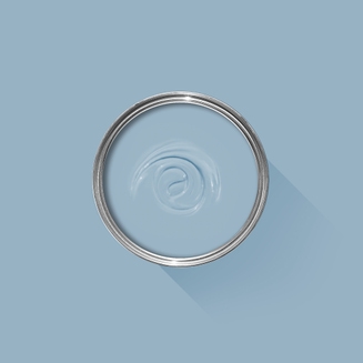
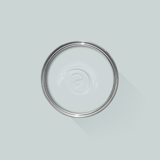
Complementary White
Wevet
One of our Easy Neutrals, Wevet is clean, understated and incredibly easy to live with. Find out more about Wevet No.273
Every colour in the Farrow & Ball palette is paired with a specific shade of white, these are selected to celebrate a shared undertone and create harmonious spaces alongside your chosen colour.
When it comes to using dark colours, the deeper the better. So, for an irresistibly inviting finished look, pair darker shades with our Dark Tones Primer & Undercoat. Based on the colour of Down Pipe, combining this primer with your topcoat creates an unrivalled richness and makes quite the statement.
Made with the same natural ingredients and pigments as our topcoats, our Primer & Undercoat is the crucial foundation for creating a rich, even and longer lasting finish.
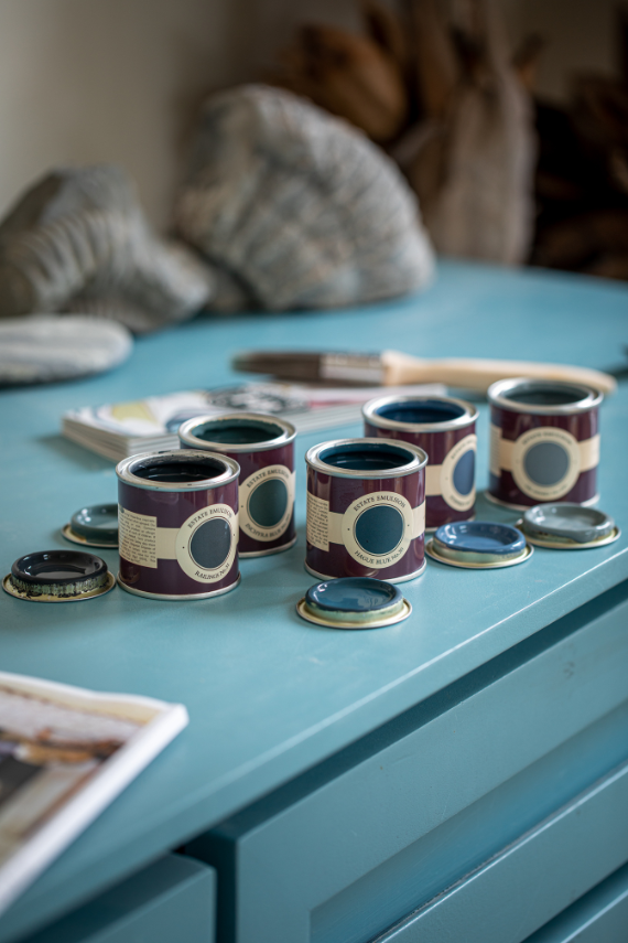
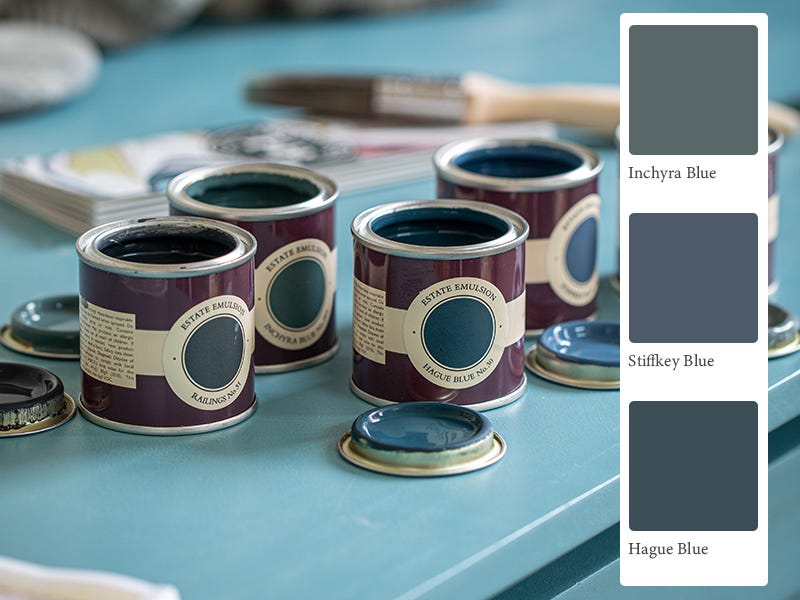
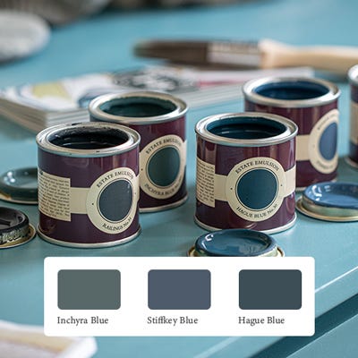
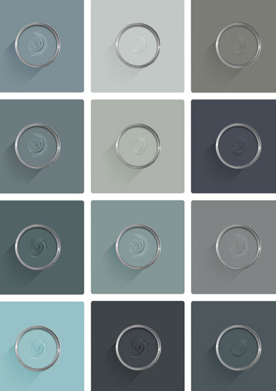
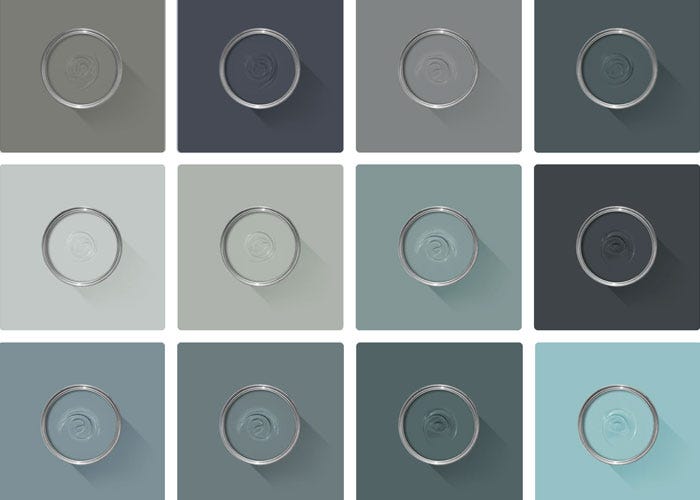
The best way to experience our colours before taking the plunge is with a true-to-colour paint sample. To help you narrow down your shortlist of shades, we've curated three of our most popular blue shades to help you find your perfect match.
Sample selection contains 3 x 100ml Sample Pots of our beautiful Inchyra Blue, Stiffkey Blue and Hague Blue.
Our expert Colour Consultants are ready and waiting to help bring your style to life. If you’d like personalised advice on how to use our paint and papers in your home, book an in-home or virtual appointment today.
When it comes to creating colour schemes, blue paint is one of the most versatile options around. In some spaces it evokes calm and serenity, while in others it’s cosy and dramatic.
Rated 5 out of
5 by
Joe m from
Outstanding dark blue woukd use multiple timesClassic Dark blue, have used this multiple times from Farrow and Ball and would use again
Date published: 2024-03-27
Rated 5 out of
5 by
Lord Charles from
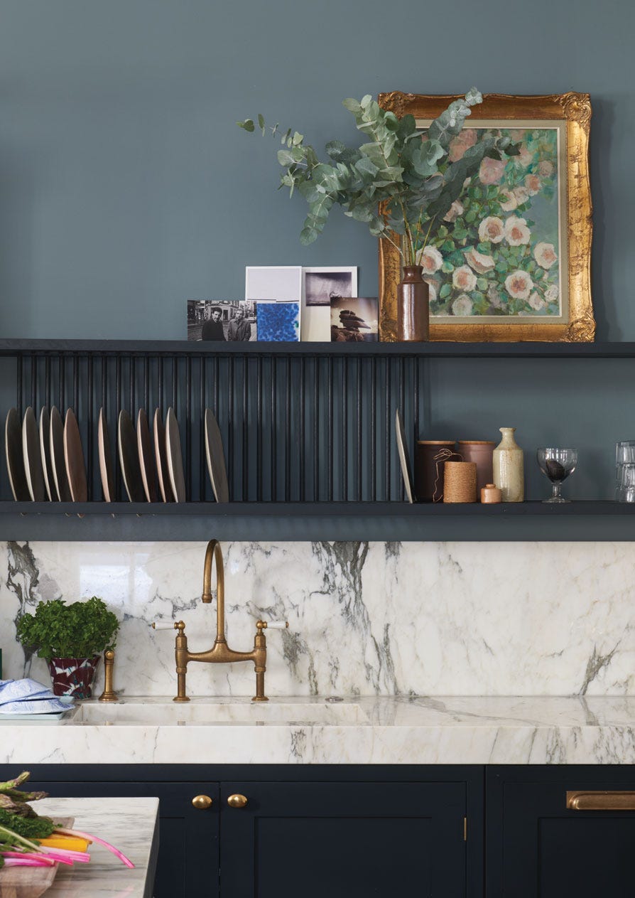
Deep & luxuriousI decided to drench my guest bedroom in Hague blue, well my decorator did , ha .. I have always loved the colour and I have been feeling brave wiit my darker colour choices around my home lately so I decided to take the plunge. The room was painted in Denim before which I loved, I just cannot stand white ceilings and white woodwork anymore so the drenching a room on one colour is perfect for me and I love how different it has made the room . I would highly recommend this colour if you want a room to just feel luxurious and quite calming , I decided to have no pictures on the wall in my newly painted guestroom as I wanted the only art to be the window and the view which is really lush when a whole room is drenched in one colour and i love how sexy it has made my white radiator too.
Date published: 2024-03-26
Rated 5 out of
5 by
Chapelrose from
Over the moon with this colour!Love this colour! It’s slightly different shades in different light adding interest to our dining room. Will definitely use this colour again.
Date published: 2024-02-28
Rated 5 out of
5 by
Liz1511 from
Gorgeous deep blueBought this last week for a large living room. Have never gone for blue before but loved this colour so decided to dive in. So glad we did it is stunning.
Date published: 2024-02-08
Rated 5 out of
5 by
Pammlerob from
Perfect finishPerfect finish and a delightful colour that works wonderfully on the porch ceiling.
Date published: 2023-11-27
Rated 5 out of
5 by
Ian Paint from
Hague Blue 10/10Hague Blue Dead Flat is an excellent quality, dramatic paint and looks great in my Victorian house.
Date published: 2023-10-27
Rated 5 out of
5 by
Pickles_88 from
Beautiful paint!I was looking to refresh the colour scheme in our North-facing bedroom, and chose Hague Blue. It is such a beautiful colour, the pigment is so rich and the colour changes from a blue to a green as the light changes throughout the day. It looks fantastic against our oak doors and skirtings and has given the room a really welcoming feel.
Date published: 2023-10-15
Rated 5 out of
5 by
Yasmiininteriorhome from
Exquisite dark blueHave used this in the lounge and office/smallest bedroom and it just looks opulent. I have paired with sulking room pink and receive many compliments on the depth of the colour. There is nothing else like it. You do have to be careful though as the paint does show all marks so if you have kids with grubby fingers, just be cautious. Try it, you won’t be disappointed! Find me on instagram #yasmininteriorhome
Date published: 2023-09-10
Rated 5 out of
5 by
Reading room from
BeautifulLove this in my reading room. Looks so rich and cosy
Date published: 2023-09-02
Rated 5 out of
5 by
CoastCottage5ley from
Just so deeply strikingWe took the plunge ! we wanted a cosy dark tv room and i wanted ceiling in same colour , it is the best interiors decision i have made , love the depth of this colour !
Date published: 2023-08-29
Rated 5 out of
5 by
Anonymous from
Worth every penny... or cent.This paint is amazing! I love the dead flat finish and the coverage is excellent. The color is rich and the finish is durable and doesn't get chalky like other flat paints that I have used in the past.
Date published: 2023-08-23
Rated 5 out of
5 by
akimbo714 from
Beautiful Rich blueI've had this color up in our breakfast room for about a year now. It looks so lovely against the walnut trim and built-ins!
Date published: 2023-07-18
Rated 5 out of
5 by
Crawfy from
rich and classy colourReally beautiful, rich, deep and classy colour. It has transformed our shower room.
Date published: 2023-07-04
Rated 5 out of
5 by
Petra M from
Dared to go darkBeautiful paint, goes on like a dream. Decided to be bold and go dark, my paintings will look great against this backdrop. A very sophisitcated colour.
Date published: 2023-07-03
Rated 5 out of
5 by
KHPR from
Front door of dreams!A beautiful deep, rich blue. Perfect for a front door.
Date published: 2023-06-22
Rated 5 out of
5 by
LouB67 from
Great room updateNeeded to revamp old children’s play room to work study. Great colour & texture, west facing room gives a very calm feel, really pleased with results
Date published: 2023-05-30
Rated 5 out of
5 by
Uwe F. from
Unsagbares BlauErneut Farbe bei F&B bestellt. Wie auch zuletzt, einfache Schritte auf der Website, schelle Lieferung und vernünftiges Preis/Leistungsverhältnis.
Date published: 2023-05-29
Rated 5 out of
5 by
kate28 from
Gorgeous colorHague Blue is a very sophisticated, rich color. My son chose it for his bedroom and while moody, it also reflects light beautifully. His room feels sophisticated and much more grown up. The first coat looked teal and worried me but the end result is better than I imagined.
Date published: 2023-05-11
Rated 5 out of
5 by
DipDipDipam from
Love the depth and colourAbsolutely transformed my living space to have a far more adult refined look.
Date published: 2023-05-11
Rated 5 out of
5 by
Jill F from
Strong and vibrant colour.We are refurbishing a Victorian terrace and are using the opportunity to bring strong colour back to the house (after many years of a neutral palette!). I fell in love with the wallpaper on the chimney breast and wanted a deep blue to compliment the overall feel of the dining room, without being too dark.
We've gone for the Hague Blue to the picture rail and Wevet from the picture rail to the coving and absolutely delighted with the results. Combined with the white woodwork and oak furniture, this is the 'grown up' room I've longed for and look forward to many happy hours here.
Date published: 2023-04-17
Rated 5 out of
5 by
Sandyann64 from
Easy to use and great resultsPaint went on well and dried to a lovely finish. Pleased with the depth of colour. Vardo was used on the wall behind the bed.
Date published: 2023-04-06
Rated 5 out of
5 by
Mikee2112 from
Perfect ColourI was looking for a deep blue and tried a few. This turned out to be the perfect colour, covered well and very happy with the results.
Date published: 2022-11-21
Rated 4 out of
5 by
Joie from
Hague Blue libraryWe painted the library/den fireplace walls and trim in Hague Blue. It’s a gorgeous color but coordinating paint colors seem to be limited- the curtains in here are a dark plaid and they work well with it It’s as if it wants to be the star of the room. We had the first coat sprayed and top coat brushed for a more historical look. Used different formulas for walls and trim.
Date published: 2023-05-14
Rated 3 out of
5 by
Lizzieo from
Dead flat. Hard workTook 6 coats in some places.Very patchy. I did wonder if the batch was damaged as gave me an almost eggshell finish (left a day between coats so had dried). Still not perfect, still patchy in places but gave up the will to live after 5th coat. Beautiful colours, reflects back the shimmer of my tears. Have always used F&B, no problems. 1st time using dead flat. 2 pieces of advice. Defo Use coat of f&b undercoat before you start, and buy the most expensive rollers you can find to avoid considering a descent in alcoholism.
Date published: 2023-11-27
Rated 3 out of
5 by
RudeJude from
Using Estate Emulsion was a VERY BAD IDEA!!We decided to use estate emulsion for our spare bedroom, as we wanted a matt chalk finish (tick!) and it was a low traffic room (tick!). We love the colour - really rich and lustrous. HOWEVER… once the paint had dried, we found that even touching the wall (eg to put up picture hooks) left really obvious and nasty greasy marks, so we followed the F&B technical advice and used a clean, damp cloth to remove marks, only to find that the paintwork was marked even worse! It looks awful! To be fair to F&B they listened to our complaint and have supplied some “dead flat” finish paint which apparently doesn’t suffer from these problems. My advice to anyone choosing a dark shade of paint is, steer clear of the estate emulsion version!
Date published: 2023-04-28
Rated 3 out of
5 by
Mims64 from
Chips and peels really easily.I painted my hallway in Hague Blue, stunning colour. I love it but found that I am continually repainting areas around the door that chip and peel. It’s been a year and you’d expect the paint to settle. I’m still touching up.
Date published: 2023-04-23
Rated 2 out of
5 by
Maxime E from
Gorgeous colour but disappointing finishI was very much looking forward to working with Farrow & Ball paint as this was the first time I was ordering paint from them. I was absolutely delighted by how quickly the paint was sent over and how securely packed it arrived. The Colour (Hague Blue) is a stunning shade of dark blue with a rich green undertone, that looks very pleasant and relaxing in a bedroom. While applying the first coat I noticed that the result was relatively uneven and followed the instructions by applying a second coat over it. The overall result was much better after that second coat, although I could still notice a few slightly uneven area once the second coat was fully dry, which for the price of the paint I thought was a little upsetting. The (unpleasant) surprise came a few days later, once one would assume the pain would be fully dried/set, I noticed a few marks here and there on the paint. Realizing that every time someone would brush, even lightly against the wall it would leave some sort of mark on the paint. I did opt for the Modern Emulsion as it was advertised as a super-tough, easy to clean finish for interior walls and ceilings. I would have thought a paint that is recommended for bathroom and kitchen would definitely stand the test of time in a bedroom but apparently I was wrong. I have used a lot of paint from many different brands but I have never seen a paint getting so many marks so quickly. Which is a shame because I think the colours from Farrow & Ball are absolutely stunning and probably unmatched, but given the price and the fact the paint marks so easily I am not sure I will be purchasing from them again.
Date published: 2023-07-03
Rated 2 out of
5 by
Rachel13 from
DisappointedI purchased Hague Blue (dead flat) with the intent to make a cozy office for my husband and making an 'investment' with a high quality, durable paint, and this seemed to fit the bill. I give a star for the color - it is beautiful. I am however very disappointed with the paint itself. It did not go on smoothly like other paints I have used and despite primer + 3 coats, there are still streaky spots. The texture seems to be so matte that every single spec of dust clings to the walls - if your finger accidentally brushes the wall when flicking on the light switch, you are going to see it. It seems to scratch easily. For example, I *very* gently leaned a plastic bin against the wall while moving furniture back in and it dinged. After the cost, time and effort to renovate the room, I'm disappointed and lament thinking I might just have to repaint it again soon because its just not practical. I expected luxury and that is not what I have.
Date published: 2023-06-21
Rated 1 out of
5 by
Disappointed Dan from
Do not recommendI just finished painting an office room and shelving unit in dead flat Hague blue. The reasonably delicate act of adding a book to the shelf completely lifted the paint. For that reason I consider this a completely unusable and overpriced product, and will no longer be a customer.
Date published: 2024-02-05
Rated 1 out of
5 by
Anonymous from
Worst paint everPossibly the worst paint I’ve ever used, painted some bespoke wardrobes with this and it took over three weeks to dry!!! It was still so tacky after two weeks that when I turned the doors over painted ripped off and finger marks were all over any part that I touch. Beyond dissatisfied it’s ended up costing me over £1000 to and that’s not counting the hours and hours I’ve wasted painting and repainting! So upset.
Back in 2010, we moved to an entirely water based range of finishes, becoming the first in the industry to do so. These low-odour, low-VOC finishes are easy to clean without harmful solvents. They are also certified child- and baby-safe in accordance with Safety of Toys Part 3: Migration of certain elements (EN 71-3:2019+A1:2021).
Exclusions: Casein Distemper, Wood Primer & Undercoat and Metal Primer & Undercoat.
Quality Finishes
Every one of our paint colours is available in a range of durable interior and exterior paint finishes, each rigorously tested to ensure an exceptional depth of colour and long-lasting finish. For the very best results, we always recommend using a Farrow & Ball Primer & Undercoat - see above for the correct tone for this colour.
Safety Information
Always read and follow the information on the product label.
All Farrow & Ball finishes except Limewash contain isothiazolinones, which may produce an allergic reaction. Farrow & Ball Limewash contains calcium hydroxide which can cause severe damage in contact with skin or eyes. For further information about our products, including guidance on safe use and application, click here to view our advice pages.
Limewash: Danger. Causes skin irritation. Causes serious eye damage. May cause respiratory irritation.
Exterior Eggshell and Exterior Masonry: Harmful to aquatic life with long lasting effects. Contains isothiazolinones. May produce an allergic reaction.
All other finishes: Contains isothiazolinones. May produce an allergic reaction.