


Living Room Inspiration
Choosing the right colors for your living room starts with the space and how you use it. Soft, pale shades can make the room feel bigger, while warm neutrals and muted greens bring timeless appeal to traditional interiors. For a minimalist look, carry a muted palette across walls and woodwork. A deeper shade can anchor a feature wall or make a reading nook feel especially cosy.


Which paint finish is best for living rooms?
We have durable paint to suit every space. Browse our collection of handcrafted finishes to find the perfect paint for your project.

Order our free color card
Our carefully curated palette of 132 shades, with an intriguing story behind each color name, will help you to choose colors you love for your home.

Painted in Wimborne White No.239, Green Smoke No.47 | Estate Emulsion; Green Smoke No.47 | Modern Eggshell; India Yellow No.66 | Modern Emulsion & Modern Eggshell
Strong Tones
Darker tones can give living rooms a magical quality, especially in the evening light. For interest no matter the time of day, try contrasting tones of equal intensity on walls and ceilings, or where one room flows into another.


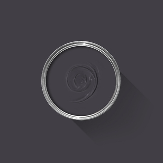


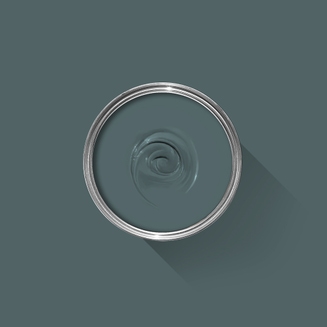

Grounding Greens
Living room painted in De Nimes No.299 & Treron No.292 | Estate Emulsion; Bancha No.298 & De Nimes No.299 | Estate Eggshell


Find colors that feel like home.
Start your next project with expert guidance and a palette that’s tailored to your space, light and lifestyle, for both the inside and outside of your home.

Living room painted in Lichen No.19, Setting Plaster No.231 | Estate Emulsion & Estate Eggshell; Blue Gray No.91 | Estate Eggshell
Softly Does It
Powdery pinks and muted neutrals can create a calming and restorative living space. To add the illusion of height, or to keep things feeling soft, try carrying your wall color over chair rails and base boards, too.


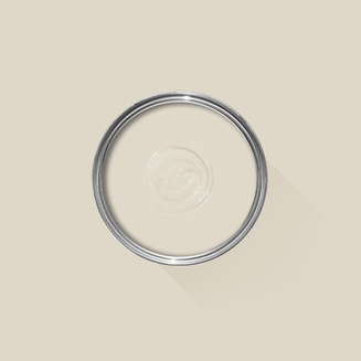


Sample our Colors
The best way to experience is with a true-to-color paint sample (or two, or five) - with free delivery. To help you narrow down your shortlist of shades, our 100ml sample pots are available in every signature Farrow & Ball color.


Let Nature In
Living room wallpapered in Hegemone BP 5705
The simplicity of soft greys and off-whites works especially well with lush botanical touches, from a tropical houseplant to a simple vase of flowers – even a riot of blooms on a floral feature wall.


Natural Textures
Living room painted in Purbeck Stone No.275 | Estate Emulsion & Wevet No.273 | Estate Eggshell


Need More Inspiration?
For more ideas on your next decoration project, why not sign up to our email communications?